In the early days of working with HTML, most end users accessed the websites through their desktop computers or laptops only. Web developers used to develop for the large screen real estate and style their websites accordingly. However, in recent times, the number of users accessing the web from their mobile devices has increased exponentially. User adoption of mobile devices has seen massive growth in the last decade, along with the availability of cheap data plans. For example, back in 2012, there were more mobile phones than people in the UK.
As a result, web developers need to take into account the smaller screen size of such devices and style their websites so that they are optimized for all screen sizes. For the same purpose, responsive web design had been introduced and is being adopted by most as a defacto standard for designing web pages.
Responsive Web Design
Responsive web design is simply defined as the practice of building websites for every device and screen size, no matter the size. It involves providing a uniform user experience across multiple platforms. The term was coined and further developed by Ethan Marcotte in 2010.
While researching about responsive design, it’s common for one to also come across the terms adaptive or mobile. Although these terms are used interchangeably, there’s a slight difference between them. Responsive design refers to that which reacts quickly and effectively to any environment, while adaptive design involves having a base design that can be easily modified for any special purposes. Mobile design, on the other hand, refers specifically to designing a separate website only for mobile users.
Responsive design is beneficial in that it fulfills the requirements of all three designs and hence is widely preferred. Responsive design consists of mainly three components, namely flexible layouts, flexible media, and media queries. Let us now see in detail how one can go about implementing each of them on their websites.
Flexible Layouts
The use of flexible layouts involves encapsulating the HTML elements in a flexible container or grid, which resizes dynamically according to the screen width. The dimensions of these layouts are specified in percentage or em units, rather than as static values. This ensures that the layout (and the elements inside it) adjusts itself automatically according to the screen size.
Let us see the same with an example
    * {
      box-sizing: border-box;
    }

    .container:before,
    .container:after {
      content: "";
      display: table;
    }

    .container:after {
      clear: both;
    }

    .container {
      *zoom: 1;
    }

    span {
      padding: 20px;
      text-align: center;
      float: left;
    }

    .span--1 {
      width: 200px;
      background: #ff6347;
    }

    .span--2 {
      width: 300px;
      background: #0eb36d;
    }
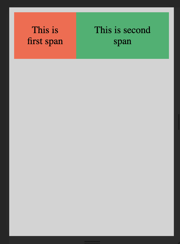
As you can see above, we have a container that holds two elements of width 200px and 300px each. In a desktop browser, the elements appear normally without any hiccups. Let us see how it appears on a mobile device of dimensions 240x320.

We can see that the second span is running into the next line. It’s because the width of the mobile device was 240px, which was less than the combined width of the two elements which was 200+300=500px. Moreover, the second span also seems to be running off-screen as its width of 300px is greater than the screen width. Now let’s try to fix this by making the layout flexible by specifying percentages instead for the spans.
    * {
      box-sizing: border-box;
    }

    .container:before,
    .container:after {
      content: "";
      display: table;
    }

    .container:after {
      clear: both;
    }

    .container {
      width: 100%;
      *zoom: 1;
    }

    span {
      padding: 20px;
      text-align: center;
      float: left;
    }

    .span--1 {
      width: 40%;
      background: #ff6347;
    }

    .span--2 {
      width: 60%;
      background: #0eb36d;
    }
We can see that the above layout works well for both mobile and desktop screens. Using the same method of applying percentages, we can create a completely dynamic website that adapts itself to all screen sizes. For more control over your layouts, you can also try using the min-width and max-width properties as well.
Flexible Media
Media elements need to be resized according to the screen size and dimensions in order to obtain a smooth and undistorted viewing experience. A quick way to ensure that media elements are scalable is to set the max-width property to 100%. This works for media elements like img, video, and canvas.
However, this method does not work on all forms of media, especially for iframe and embedded media. In order to make them scalable too, they must be placed within a parent element and their position set as absolute. The parent element then needs to have a width of 100%, so that it may scale according to the viewport. You also need to set the height of the parent element to 0 in order to enable the haslayout mechanism of Internet Explorer.
Media Queries
Media queries are used to specify different CSS properties based on the device properties, such as the viewport width or the screen orientation. There are different ways to embed media queries in CSS, using the @media rule inside of an existing style sheet, importing a new style sheet using the @import rule, or by linking to a separate style sheet from within the HTML document. However, the preferred method is to use the @media rule inside of an existing style sheet to avoid any additional HTTP requests.
Media queries are written as rules with specifications. Each media query begins with the type of media its targeting, for example all, screen, print, tv, braille, etc. The rule is then followed by logical operators and certain CSS properties with values. If the value holds true for the current scenario, then the rule is applied. Let’s see an example
    // For mobile devices
    .container {
      width: 800px
    }

    // For desktop devices
    @media all and (min-width: 1024px) {

      .container {
        width: 1200px
      }
    }
In the above CSS, the elements with the class container would have a width of 800px. However, the media rule which we have applied specifies that for all devices that have a minimum viewport width of 1024px, set the width to 1200px instead. By following this approach, one can style pages for both mobile and desktop devices without having to create separate HTML files for different layouts.
This post was originally published here on Medium.


Top comments (0)