In this story, we have seen how we can use floats to create columns on our page. However, using floats come with a caveat: You need to clear the floats after using them. Let us see with an example of why this needs to be done.
    <body>
      <div class="div-1">This is 33.33%</div>
      <div class="div-2">This is 66.66%</div>
    </body>
    div {
      display: inline-block;
      padding: 20px;
      text-align: center;
    }
    .div-1 {
      width: 33.33%;
      background: #FF6347;
    }
    .div-2 {
      width: 66.66%;
      background: #0EB36D;
    }

The above example shows two divs that occupy one-third and two-thirds of the screen width respectively. Let’s see what happens when we try to add a third div below them of size 200x200 pixels, but without the float property.
    <body>
        <div class="div-1">This is 33.33%</div>
        <div class="div-2">This is 66.66%</div>
        <div class="div-3">This is the third div</div>
    </body>
    div {
      display: inline-block;
      padding: 20px;
      text-align: center;
    }
    .div-1 {
      width: 33.33%;
      background: #FF6347;
      float:left;
    }
    .div-2 {
      width: 66.66%;
      background: #0EB36D;
      float:left;
    }
    .div-3 {
      width: 200px;
      height: 200px;
      background: #2958B3;
    }

We can see that the third div seems to be appearing below the first two divs. Let us inspect the page to understand further.
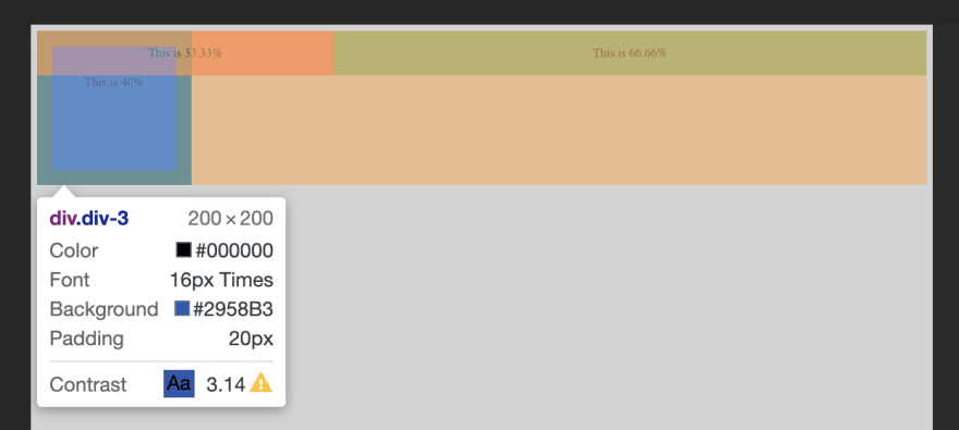
We can see that the third div indeed hasn’t appeared below the two divs, as is the normal flow of HTML. Rather it has aligned itself to the starting position of the page, almost as if the first two divs don’t exist. The reason this happens is that when you apply a float to an element in HTML, that element is removed from the normal flow of the page. This causes the rest of the elements appearing after it to bleed into its space. In order to overcome this issue, we need to ‘clear’ the floats in order for the browser to render the remaining elements properly. Let us look at some of the methods for the same:
Clearing the float of the next element
We can add a clear: both property to the element immediately proceeding the floated elements, as below
    .div-3 {
      width: 200px;
      height: 200px;
      background: #2958B3;
      clear: both;
    }
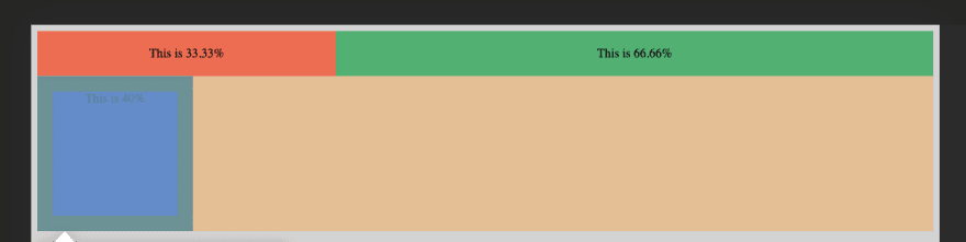
We can see that the third div element is behaving as intended, by positioning itself below the first two divs. This is because by applying clear: both property, you tell the browser that the float property is no longer in effect from that point onwards and that the normal flow of the page can resume.
However, applying the clear property to proceeding elements alone doesn’t solve the issue of floats every time. Consider the following situation where the floated elements are enclosed in a parent main element.
    <body>
      <main>
        <div class="div-1">This is 33.33%</div>
        <div class="div-2">This is 66.66%</div>
      </main>
      <div class="div-3">This is the third div</div>
    </body>
    div {
      display: inline-block;
      padding: 20px;
      text-align: center;
    }
    .div-1 {
      width: 33.33%;
      background: #FF6347;
      float:left;
    }
    .div-2 {
      width: 66.66%;
      background: #0EB36D;
      float:left;
    }
    .div-3 {
      width: 200px;
      height: 200px;
      background: #2958B3;
    }
If you try to run the above code and inspect the page, you can see that the height of the parent element ‘main’ is 0px, even though it has a few elements inside it that occupy space. This is because, in the absence of the clear: both property in the proceeding element, the parent main element hasn’t retrieved back its styles. So, in order for the parent element to gain back its styles, we must try to look into containing the floats rather than clearing them. There are different approaches to containing floats. However, we’re gonna look at three of the most popular: placing an empty div with clear: both, overflow technique and the clearfix technique.
Placing an empty div
In this method, we place an empty div before the closing tag of the parent element and set its style to clear: both.
    <body>
      <main>
        <div class="div-1">This is 33.33%</div>
        <div class="div-2">This is 66.66%</div>
        <div class-"clear></div>
      </main>
      <div class="div-3">This is the third div</div>
    </body>
    div {
      display: inline-block;
      padding: 20px;
      text-align: center;
    }
    .div-1 {
      width: 33.33%;
      background: #FF6347;
      float:left;
    }
    .div-2 {
        width: 66.66%;
        background: #0EB36D;
        float:left;
    }
    .div-3 {
      width: 200px;
      height: 200px;
      background: #2958B3;
    }
    .clear {
      clear: both;
    }
Containing floats in this manner is not efficient due to the need to add an empty div element every place float is used. Morever, the use of additional empty divs is also not semantically correct.
Overflow technique
In this method, we apply overflow: auto property to the parent element and set its style to clear: both.
    <body>
      <main>
        <div class="div-1">This is 33.33%</div>
        <div class="div-2">This is 66.66%</div>
      </main>
      <div class="div-3">This is the third div</div>
    </body>
    main {
      overflow: auto;
    }

    div {
      display: inline-block;
      padding: 20px;
      text-align: center;
    }
    .div-1 {
      width: 33.33%;
      background: #FF6347;
      float:left;
    }
    .div-2 {
      width: 66.66%;
      background: #0EB36D;
      float:left;
    }
    .div-3 {
      width: 200px;
      height: 200px;
      background: #2958B3;
    }
This method has a few drawbacks as well. There is a chance that adding the overflow property might add a scrollbar in Internet Explorer. We can fix that by setting overflow: hidden. However, that would, in turn, lead to certain styles like box-shadow to not be visible.
Clearfix technique
This is by far, the most effective as well as the most popular way to contain floats. In this method, we create a CSS class that includes certain rules and then apply that class to the parent element housing the floated elements. Let us name that class as ‘clearfix’.
    <body>
        <main class="clearfix">
            <div class="div-1">This is 33.33%</div>
            <div class="div-2">This is 66.66%</div>
        </main>
        <div class="div-3">This is the third div</div>
    </body>
    div {
      display: inline-block;
      padding: 20px;
      text-align: center;
    }
    .div-1 {
      width: 33.33%;
      background: #FF6347;
      float:left;
    }
    .div-2 {
      width: 66.66%;
      background: #0EB36D;
      float:left;
    }
    .div-3 {
      width: 200px;
      height: 200px;
      background: #2958B3;
    }

    .clearfix: before, .clearfix: after {
      content: "";
      display: table;
    }
    .clearfix: after {
      clear: both;
    }
In the above code, we use pseudo elements of before and after on the clearfix class to create dynamic content above and below the element it’s applied on. We also set the content as an empty string in order to make the elements hidden. Morever, we set the display property to table in order to make them block level elements that span the entire width of the page, both above and below the class. Setting the display property to block also works, but we apply it as table in order to ensure backwards compatibility on older browsers. These dynamically created pseudo elements are placed in a hidden manner above and below the content and ensure that the floats are properly contained within the confines of the element itself. We also apply clear: both property to the after element, in order to ensure that the next element does not get wrapped around the floated element(s).
This post was originally published here on Medium.


Top comments (0)