
There are various CSS frameworks out there, which makes styling your website easier, it is still important to know the CSS rules and properties behind it. One of the main layout technique in CSS is using Grid layout, some people may say that Flexbox would be better for responsiveness, but Grid layout definitely do have their uses as well. Just recently, I built a working calendar using CSS Grid layout! 😊
First of all, if you enjoy learning through doing/gaming Grid Garden is an excellent starting point to play around with Grid layout properties.
Grid Layout set up
To start, you need an element which you will set the property display: grid; on. This element is known as the Grid Container, and the items/children elements inside this Grid Container are known as Grid Items. You need to know the difference because there are some CSS properties which you can use on the Grid Container and some you can use on the Grid Items.
Let's begin with a simple example.
------- HTML Set up --------
  <div class="grid-container">
    <div class="grid-item"></div>
    <div class="grid-item"></div>
    <div class="grid-item"></div>
    <div class="grid-item"></div>
    <div class="grid-item"></div>
    <div class="grid-item"></div>
  </div>
Here, we have a simple div element which has class name grid-container just to be clear and the elements inside has class name grid-item. After some simple sizing of the container and the elements, this is what the has been rendered.
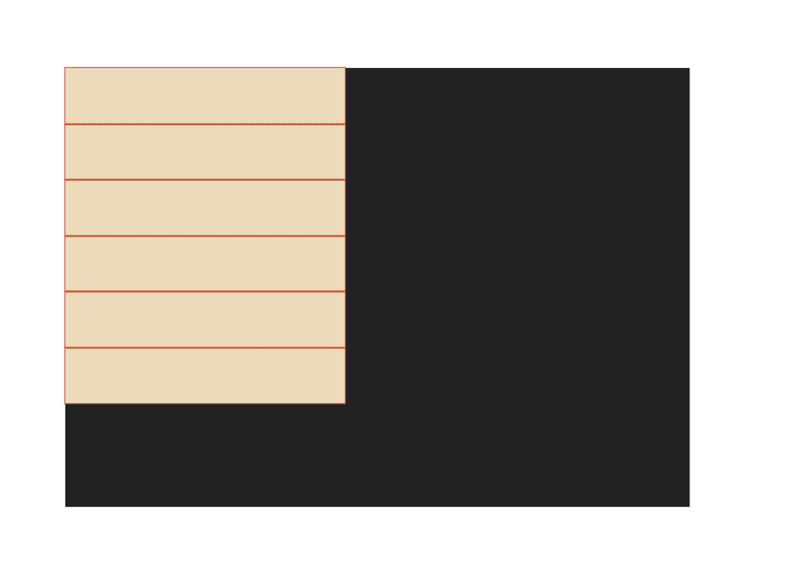
Setting the display: grid property on the container
To make the container a Grid Container, we just have to set the display property to be grid (you can also use inline-grid, if you prefer the grid to not be a block element).
------CSS Setup --------
.grid-container {
  background: #222;
  width: 50vw;
  height: 60vh;
  display: grid;
}

.grid-item {
  width: 250px;
  height: 50px;
  background-color: #ECDBBA;
  outline: 1px solid #C84B31;
}

Instantly, you don't see much difference, but if you open up the DevTool on the browser, you can view the grid layout, and you will see that the Grid Container has been automatically split up in even rows.
Grid Container properties
To define the rows and columns of the grid layout, you can use grid-template-columns and grid-template-rows. This allow you to set the number of rows and columns base on size. The units which you can use to set the rows and columns are length units, percentages and grid's own unit fr. The fr unit are like fractions, as it takes the remaining available space of the Grid Container and divide it into fractions give each columns/rows the requested fr.
.grid-container {
  background: #222;
  width: 50vw;
  height: 80vh;
  display: grid;
  grid-template-columns: auto 100px 1fr 2fr;
  grid-template-rows: 200px auto;
}

.grid-item {
  width: 50px;
  height: 50px;
  background-color: #ECDBBA;
  outline: 1px solid #C84B31;
}
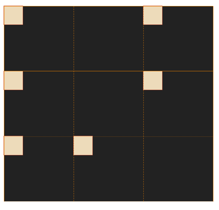
In the above code, the length of the Grid-Items has been changed so they fit the Grid cells. The grid-template-columns: column1 column2 column3 column4 the spaces between each unit indicates the next column. In the example, we have auto width for column one, 100px for column two, and the remaining space is divided into 3 parts, 1 part of it goes to column three and 2 parts of it go to column four. See image below, with grid lines showing the layout.

Grid-template-areas
You can use grid-template-areas if you want to name each individual Grid-Items with grid-area property and reference them on the Grid Container property grid-template-areas. Doing so, you can almost visualizing where each item will go on the grid.
Example - The code below sets up a 3 columns, auto rows using previous property. The grid-template-areas values places the named Grid Item into the respective cell. Repeated name will span the cells and . value denote an empty cell.
.grid-container {
  background: #222;
  width: 50vw;
  height: 80vh;
  display: grid;
  grid-template-columns: 1fr 1fr 1fr;
  grid-template-rows: auto;
  grid-template-areas:
    "first first second"
    "third . fourth"
    "fifth sixth .";
}

.grid-item {
  width: 50px;
  height: 50px;
  background-color: #ECDBBA;
  outline: 1px solid #C84B31;
}

.grid-item.a {
  grid-area: first;
}
.grid-item.b {
  grid-area: second;
}
.grid-item.c {
  grid-area: third;
}
.grid-item.d {
  grid-area: fourth;
}
.grid-item.e {
  grid-area: fifth;
}
.grid-item.f {
  grid-area: sixth;
}
Justify-items and Align-items properties
To align the Grid-Items inside it's own cell along the inline axis (normally horizontal) you can use justify-items, and along the block axis (normally vertical) you can use align-items.
These are the options:
.grid-container {
  justify-items: start | end | center | stretch;
}
.grid-container {
  align-items: start | end | center | stretch;
}
I recommend playing around and experiment with this on your own to truly understand what each property does. Normally, you would want to center items, so I will show the center property value.
.grid-container {
  background: #222;
  width: 50vw;
  height: 80vh;
  display: grid;
  grid-template-columns: 1fr 1fr 1fr;
  grid-template-rows: auto;
  grid-template-areas:
    "first first second"
    "third . fourth"
    "fifth sixth .";
  justify-items: center;
  align-items: center;
}

Summary
Today, we talked about setting up Grid Container with display: grid, defining columns and rows using grid-template-columns, grid-template-rows and we also talked about using grid-template-area to visualize items in your grid layout by naming each Grid Items. We also touched on aligning the Grid Items within the Grid Cell using justify-items, align-items for inline and block axes respectively.
The best way to learn these properties, is to go out there and experiment, copy the above HTML code and CSS code to Code Pen and begin experimenting.
That's all for part 1 of Grid Layout, there are many more grid properties which we will explore next time. This is by no mean an in-depth guide, but it serves as a reminder to me (and hopefully some of you), some of the grid layout properties. I am writing to solidify my knowledge, so if you have feedback or comments please let me know. 😃


Top comments (2)
Honestly I struggle to get my head around grid but I’m trying to use it instead of tables where possible! Thank you for your post 🙂
I am glad to hear that! Thank you for your comment. I will bring out part 2 so let me know if you need any help :)