Lately I’ve been publishing screencasts demonstrating how to use the tidymodels framework, from just getting started to tuning more complex models. Today’s screencast explores how to fluently apply tidy data principles to the task of building many models using with this week’s #TidyTuesday dataset on crop yields.
Here is the code I used in the video, for those who prefer reading instead of or in addition to video.
Explore the data
Our modeling goal is to estimate how crops yields are changing around the world using this week’s #TidyTuesday dataset. We can build many models for the country-crop combinations we are interested in.
First, let’s read in two of the datasets for this week.
library(tidyverse)

key_crop_yields <- read_csv("https://raw.githubusercontent.com/rfordatascience/tidytuesday/master/data/2020/2020-09-01/key_crop_yields.csv")
land_use <- read_csv("https://raw.githubusercontent.com/rfordatascience/tidytuesday/master/data/2020/2020-09-01/land_use_vs_yield_change_in_cereal_production.csv")
I’m going to use the land_use dataset only to find the top population countries. Let’s create a vector of their names.
top_countries <- land_use %>%
  janitor::clean_names() %>%
  filter(!is.na(code), entity != "World") %>%
  group_by(entity) %>%
  filter(year == max(year)) %>%
  ungroup() %>%
  slice_max(total_population_gapminder, n = 30) %>%
  pull(entity)

top_countries


## [1] "China" "India"
## [3] "United States" "Indonesia"
## [5] "Pakistan" "Brazil"
## [7] "Nigeria" "Bangladesh"
## [9] "Russia" "Mexico"
## [11] "Japan" "Ethiopia"
## [13] "Philippines" "Egypt"
## [15] "Vietnam" "Democratic Republic of Congo"
## [17] "Germany" "Turkey"
## [19] "Iran" "Thailand"
## [21] "United Kingdom" "France"
## [23] "Italy" "South Africa"
## [25] "Tanzania" "Myanmar"
## [27] "Kenya" "South Korea"
## [29] "Colombia" "Spain"
Now let’s create a tidy version of the crop yields data, for the countries and crops I am interested in.
tidy_yields <- key_crop_yields %>%
  janitor::clean_names() %>%
  pivot_longer(wheat_tonnes_per_hectare:bananas_tonnes_per_hectare,
    names_to = "crop", values_to = "yield"
  ) %>%
  mutate(crop = str_remove(crop, "_tonnes_per_hectare")) %>%
  filter(
    crop %in% c("wheat", "rice", "maize", "barley"),
    entity %in% top_countries,
    !is.na(yield)
  )

tidy_yields


## # A tibble: 6,032 x 5
## entity code year crop yield
## <chr> <chr> <dbl> <chr> <dbl>
## 1 Bangladesh BGD 1961 wheat 0.574
## 2 Bangladesh BGD 1961 rice 1.70
## 3 Bangladesh BGD 1961 maize 0.799
## 4 Bangladesh BGD 1961 barley 0.577
## 5 Bangladesh BGD 1962 wheat 0.675
## 6 Bangladesh BGD 1962 rice 1.53
## 7 Bangladesh BGD 1962 maize 0.738
## 8 Bangladesh BGD 1962 barley 0.544
## 9 Bangladesh BGD 1963 wheat 0.607
## 10 Bangladesh BGD 1963 rice 1.77
## # … with 6,022 more rows
This data structure is just right for plotting crop yield over time!
tidy_yields %>%
  ggplot(aes(year, yield, color = crop)) +
  geom_line(alpha = 0.7, size = 1.5) +
  geom_point() +
  facet_wrap(~entity, ncol = 5) +
  scale_x_continuous(guide = guide_axis(angle = 90)) +
  labs(x = NULL, y = "yield (tons per hectare)")

Notice that not all countries produce all crops, but that overall crop yields are increasing.
Many models
Now let’s fit a linear model to each country-crop combination.
library(tidymodels)

tidy_lm <- tidy_yields %>%
  nest(yields = c(year, yield)) %>%
  mutate(model = map(yields, ~ lm(yield ~ year, data = .x)))

tidy_lm


## # A tibble: 111 x 5
## entity code crop yields model
## <chr> <chr> <chr> <list> <list>
## 1 Bangladesh BGD wheat <tibble [58 × 2]> <lm>
## 2 Bangladesh BGD rice <tibble [58 × 2]> <lm>
## 3 Bangladesh BGD maize <tibble [58 × 2]> <lm>
## 4 Bangladesh BGD barley <tibble [58 × 2]> <lm>
## 5 Brazil BRA wheat <tibble [58 × 2]> <lm>
## 6 Brazil BRA rice <tibble [58 × 2]> <lm>
## 7 Brazil BRA maize <tibble [58 × 2]> <lm>
## 8 Brazil BRA barley <tibble [58 × 2]> <lm>
## 9 China CHN wheat <tibble [58 × 2]> <lm>
## 10 China CHN rice <tibble [58 × 2]> <lm>
## # … with 101 more rows
Next, let’s tidy() those models to get out the coefficients, and adjust the p-values for multiple comparisons while we’re at it.
slopes <- tidy_lm %>%
  mutate(coefs = map(model, tidy)) %>%
  unnest(coefs) %>%
  filter(term == "year") %>%
  mutate(p.value = p.adjust(p.value))

slopes


## # A tibble: 111 x 10
## entity code crop yields model term estimate std.error statistic p.value
## <chr> <chr> <chr> <list> <lis> <chr> <dbl> <dbl> <dbl> <dbl>
## 1 Bangla… BGD wheat <tibbl… <lm> year 0.0389 0.00253 15.4 5.11e-20
## 2 Bangla… BGD rice <tibbl… <lm> year 0.0600 0.00231 26.0 6.05e-31
## 3 Bangla… BGD maize <tibbl… <lm> year 0.122 0.0107 11.3 1.82e-14
## 4 Bangla… BGD barl… <tibbl… <lm> year 0.00505 0.000596 8.47 4.34e-10
## 5 Brazil BRA wheat <tibbl… <lm> year 0.0366 0.00222 16.5 2.55e-21
## 6 Brazil BRA rice <tibbl… <lm> year 0.0755 0.00490 15.4 4.96e-20
## 7 Brazil BRA maize <tibbl… <lm> year 0.0709 0.00395 18.0 4.37e-23
## 8 Brazil BRA barl… <tibbl… <lm> year 0.0466 0.00319 14.6 5.05e-19
## 9 China CHN wheat <tibbl… <lm> year 0.0880 0.00141 62.6 1.72e-51
## 10 China CHN rice <tibbl… <lm> year 0.0843 0.00289 29.2 1.47e-33
## # … with 101 more rows
Explore results
Now we can visualize the results of this modeling, which is estimating how crop yields are changing around the world.
library(ggrepel)
slopes %>%
  ggplot(aes(estimate, p.value, label = entity)) +
  geom_vline(
    xintercept = 0, lty = 2,
    size = 1.5, alpha = 0.7, color = "gray50"
  ) +
  geom_point(aes(color = crop), alpha = 0.8, size = 2.5, show.legend = FALSE) +
  scale_y_log10() +
  facet_wrap(~crop) +
  geom_text_repel(size = 3, family = "IBMPlexSans") +
  theme_light(base_family = "IBMPlexSans") +
  theme(strip.text = element_text(family = "IBMPlexSans-Bold", size = 12)) +
  labs(x = "increase in tons per hectare per year")
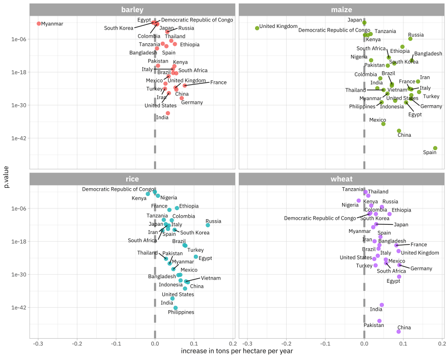
On the x-axis is the slope of these models. Notice that most countries are on the positive side, with increasing crop yields. The further to the right a country is, the larger the increase in crop yield over this time period. Corn yields have increased the most.
On the y-axis is the p-value, a measure of how surprising the effect we see is under the assumption of no relationship (no change with time). Countries lower in the plots have smaller p-values; we are more certain those are real relationships.
We can extend this to check out how well these models fit the data with glance(). This approach for using statistical models to estimate changes in many subgroups at once has been so helpful to me in many situations!

Top comments (0)