For the past couple of weeks, I’ve been working on a “Design System” that is using Stencil. Today I want to share some basics on how I build a drawer with Stencil, with you, the community 🙏🏻.
What is a drawer
A drawer is a component, designed to add collapsible side content (often navigation) alongside some content. Further, in this article, you will see the end result of our drawer (that won’t be a perfectly styled example😆).
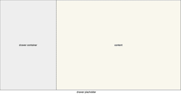
The architecture of the drawer
Our drawer has three main parts:
- A container
- A slot for the drawer content
- A slot for the content
The container will serve as a wrapper. It will help us with the styling of our internal parts. The content slot is our placeholder for the content that will be served in the slot. Often this will be navigation. Finally, we have a slot for application content. Here you will provide the main content of your application.
Project setup
As the focus of this article is on creating a drawer container I will provide a brief introduction on setting up a new project.
First, we are going to create a new Stencil project, with some simple steps provided by the Getting Starred of Stencil
Create a new project:
npm init stencil
You will be prompt to choose a project type, choose component
? Pick a starter › - Use arrow-keys. Return to submit.

❯ ionic-pwa Everything you need to build fast, production-ready PWAs
   app Minimal starter for building a Stencil app or website
   component Collection of web components that can be used anywhere
Now you need to provide a project name, let’s fill in example-drawer. And that is it now we are ready to start working on our component.
Code
After opening the project in your favorite editor open the my-component.tsx file and remove all of the default code and replace it with the following:
import { Component, Host, h, State, Method } from '@stencil/core'

@Component({
  tag: 'my-component',
  styleUrl: 'my-component.css',
  shadow: true,
})
export class MyComponent {
  /**
   * Show or hide the drawer
   */
  @State() open = true
}
First, we set up some internal data with the use of @State. When changing the State property it will cause the components to render again. With this, we are going to toggle a CSS class.
import { Component, Host, h, State, Method } from '@stencil/core'

@Component({
  tag: 'my-component',
  styleUrl: 'my-component.css',
  shadow: true,
})
export class MyComponent {
  @State() open = true

  @Method()
  async toggleDrawer() {
    this.open = !this.open
  }
}
We have added a @Method decorator and a method that toggles the property open. Doing this allows us to call the toggleDrawer method from the outside of the component.
import { Component, Host, h, State, Method } from '@stencil/core'

@Component({
  tag: 'my-component',
  styleUrl: 'my-component.css',
  shadow: true,
})
export class MyComponent {
  @State() open = true

  @Method()
  async toggleDrawer() {
    this.open = !this.open
  }
  render() {
    return (
      <Host>
        <div class="drawer-container">
          <div class={{ drawer: true, open: this.open }}>
            <div class="drawer-content">
              <slot name="drawer-content" />
            </div>
          </div>
          <div class={{ content: true, left: !this.open }}>
            <slot name="content" />
          </div>
        </div>
      </Host>
    )
  }
}
In this last part, we defined the HTML template. Earlier in this article, I said we would toggle some CSS classes based on the State property open. Now you can see what I meant with this. When the property open equals true the open class will be added to the div, similar behavior will be on the content div as shown in the code.
Now open the my-component.css file and replace the code with:
:host {
  display: block;
  width: 100%;
}

.drawer-container {
  position: relative;
  display: flex;
  box-sizing: border-box;
  overflow: hidden;
  border: 1px solid #ccc;
}

.drawer {
  padding-right: 20px;
  background: gray;
  border-right: 1px solid #ccc;
  position: relative;
  width: 280px;
  transform: translate3d(-100%, 0, 0);
  z-index: 2;
  box-sizing: border-box;
  will-change: transform;
}
.drawer-content {
  width: 100%;
  height: 100%;
}
.drawer.open {
  transform: none;
}

.content {
  margin-left: 0px;
  margin-right: 0px;
  flex-grow: 1;
  flex-shrink: 1;
  display: block;
  height: 100%;
  overflow: auto;
  will-change: contents;
}
.content.left {
  margin-left: -280px;
}
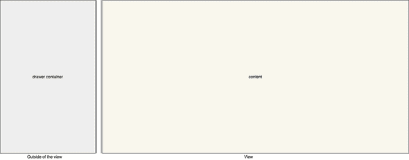
We will focus on the open and left behaviors. In our drawer class we have defined transform: translate3d(-100%, 0, 0);. This will place our div out of the view. When we append the open class we will set transform to none, now we have our div back on the screen.
Our other focus point is the left class. Because the width of our drawer is fixed at 280px we can use margin-left to “slide” to the left when this class is appended.
Putting it all together
Now that we have all the parts together we have to do one more thing. When we created our new project Stencil provides us with an index.html within this file it has already created all thing for the “example” component.
Yet because we made changes we should reflect these changes in the index.html file. To speed things up copy the code below and replace this in your index.html file.
<!DOCTYPE html>
<html dir="ltr" lang="en">
  <head>
    <meta charset="utf-8" />
    <meta
      name="viewport"
      content="width=device-width, initial-scale=1.0, minimum-scale=1.0, maximum-scale=5.0"
    />
    <title>Stencil Component Starter</title>

    <script type="module" src="/build/example-drawer.esm.js"></script>
    <script nomodule src="/build/example-drawer.js"></script>
    <style>
      html,
      body {
        height: 100%;
        margin: 0;
      }
    </style>
  </head>
  <body>
    <my-component>
      <ul slot="drawer-content">
        <li>Menu 1</li>
        <li>Menu 2</li>
        <li>Menu 3</li>
        <li>Menu 4</li>
        <li>Menu 5</li>
      </ul>
      <div slot="content">
        Main
      </div>
    </my-component>
    <button id="toggleBtn">Toggle drawer</button>
  </body>
  <script>
    const btn = document.getElementById("toggleBtn");
    const = document.querySelector('my-component');
       btn.addEventListener("click", () => {
         drawer.toggleDrawer();
       });
  </script>
</html>
What did we change? We have added an unsorted list that will be placed in slot: drawer-content and we have a div that will be placed in slot: content. To toggle our drawer we have added a simple button that on-click will call the toggleDrawer method on our drawer
Summary
So what did we do in summary? We have created a simple drawer that slides out of the view. We have created a drawer with basic styling that can be enhanced to your own needs. The great thing is it that we can use this drawer in ANY frontend application that is using Vanilla JS, Angular, React or Vue, etc.
To see the full source have a look at this repo
I hope this article inspired you, gave you some insights on how to build a component with the use of Stencil and have had some fun!😁
A Thank you
At last, a thank you to some people how reviewed my article


Top comments (0)