Motivation
Recently, I came across this excellent interview with the graphic designer Peter Saville describing the origin of Joy Division’s famous cover for Unknown Pleasures.
I hadn’t realized that the image was a scientific visualization of the data from a pulsar (actually data from the first discovered pulsar PSR B1919+21), but now that I know the history I somehow find it even more compelling.
I decided to recreate the visual form of the image, but needed an appropriate data source. Since I’d been experimenting with the visualization of open source commit histories recently, I thought I’d start with that data and see how things looked.
Approach
One of the challenges with data visualization (at least for me) is dealing with the mismatches that inevitably happen between the image I had in my mind and the one that the data actually creates. I guess that’s pretty common, as both Nadieh Bremer and Shirley Wu both mention it in Data Sketches. (The Data Sketches book is excellent, by the way. If you’re interested in data visualization you should definitely get it.)
Anyway, my intuition was that, if you aggregated the changes made over the history of the project, there would be some interesting patterns that would fit the pseudo-3D layout of the original image. So I set about to pull some data from various projects to see if that was true.
Exploring the Data
I usually start a new visualization project by putting a dataset into Observable and then interactively experimenting with various visualizations to better understand the shape of the data. Because this is exploratory visualization, I want to be able to quickly create many different types of visualizations to open/close exploration options. I use Vega Lite (specifically the Vega Lite API JS wrapper) to do this. Take a look at this introduction if you’re interested in seeing how the combination of Observable and Vega Lite can really accelerate data exploration.
I first exported the git commit history from the Visual Studio Code repository, taking care not to normalize the commit times. I wanted the author’s local commit times so that they could be aggregated in a way that represented an author’s day, not the project-wide perspective. I was also curious as to whether there might be interesting information in the timezone offsets, so I exported the author commit time and parsed it by hand into these various components.
I also needed to aggregate the commits in some way that made it possible to layer timespans on the y-axis. I started by counting the number of commits (circle radius) in each minute of the day (x-axis), and then combining the year and month as the y-axis. This looked promising:
That is an amazingly consistent lunch hour! 😆
Unfortunately, once I put this data into d3 to actually create the visualization, the results were not very compelling:

Even though I could see that there was a clear pattern to the data, aggregating by minute obscured it by providing too much detail. I experimented with a variety of aggregation windows until I landed on 30 minutes, which seemed to best capture the pattern that I saw in Observable while not smoothing things out to such an extent that it was no longer visually interesting.
Results
A couple of titles later and I had the final version. Each line represents a full month of commits, broken into 30 minute bins.

I thought that the clear separation between morning and afternoon was pretty interesting, and I was honestly surprised at the consistency over time. I realized that the reason for this was that, even though Visual Studio Code is an open source project, it’s primarily a Microsoft-driven effort.
I decided to run the commit history of some other open source projects through the same pipeline, unmodified, to see how they compared.
React

I started with React. React’s repository has 14,010 commits over its eight year commit history, compared to Visual Studio’s 79,457 (as of this writing).
I thought it was interesting to see how React seems to have had a period of time where contributions leveled off, and then increased dramatically again for another several months.1
The React team also seems to have a few more night owls working on it, with the far left side showing pretty regular post-midnight contributions.
TensorFlow

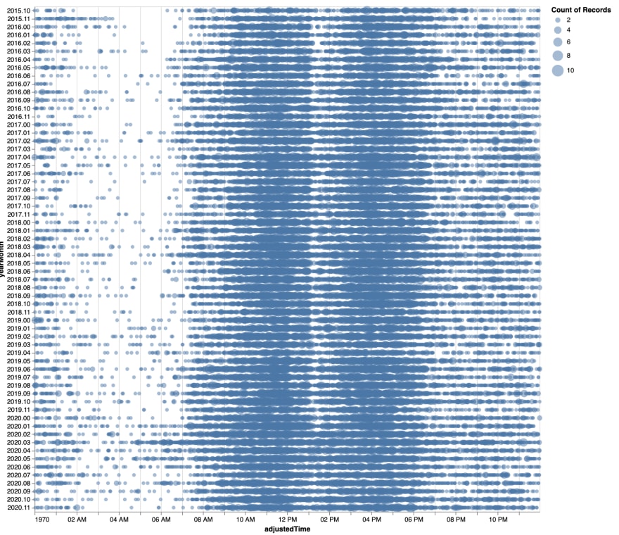
Then I decided to take a look at Google’s TensorFlow. 108,084 commits, starting in November of 2015.
The distribution here seems closer to that of Visual Studio, although without the very distinct morning/afternoon separation.
I’d also guess that there’s something automated happening in the early morning. You can see it shift by an hour forward and backward every few months. Everyone’s favorite villain, daylight saving time. 😭
Git

Finally I pulled in the Git commit history, which I had just been digging through for my recent Git commit history visualization. 62,574 commits, starting in April of 2005.
What I like about this is that it’s clear that the project has gone through some big changes over time. At the beginning, there was a lot of late night hacking happening, and the contributions seem pretty consistent over that time period.
There’s a major change in contributions, however, starting about one third into the project history. You can see the number of contributions increase dramatically compared to the first third, and stay that way.
It also seems not to have such a clear “company project” vibe, as the contribution times are all over the place.
Conclusion
For the small-ish amount of work that I put into this, I found the results to be pretty interesting, and I’m glad I did it. Being able to compare various projects against one another was something that I hadn’t planned to do, but once the tools had been created, that was effectively free.
I hope you found these interesting. As always, if you have any feedback please let me know on Twitter or feel free to contact me here.
-
If I wasn’t creating a stylized visualization, I think it’d be helpful to have a margin histogram for each month showing the total contributions for that month. At the moment the aggregate contributions for the month are hard to see. ↩︎

Top comments (0)