This is the final post in my series on how I created the various visualizations in my Visual Studio Code 2020 Year in Review. In this post I cover how I recreated the final visualization type from Nicholas Felton’s 2013 Annual Report, the “volume chart,” shown below.

This stacked set of charts breaks down each type of interaction and displays the aggregated volumes of those interactions by hour (y-axis) for each week in the year (x-axis). There is a histogram at the top of the visualization that provides summary context for the hourly measures below. Finally, a yellow highlight color represents the top 25% of volume measures for that type.
The approach I took to build this visualization was to break it into two Svelte components: WeeklyVolumeHeader and HourlyVolume. WeeklyVolumeHeader generates the weekly summary histogram SVG at the top of the visualization, and HourlyVolume generates an SVG for each of the volume visualizations. This separation made it easy to repeat the volume visualization with a different slice of the dataset for each event.
Before all of that, however, the data needed to be loaded.
Transforming the Data
As I previously mentioned, all of the data used to create this visualization was obtained via queries to the ClickHouse GitHub archive that they have generously made available to the public.
I used the following query to aggregate event counts by week and hour, and then save the data into a JSON file for use in this visualization.
select
  toStartOfWeek(toTimeZone(created_at, 'CET')) as week
  , toHour(toTimeZone(created_at, 'CET')) as hour
  , countIf(1, event_type = 'PullRequestEvent') as pull_requests
  , countIf(1, event_type = 'IssuesEvent') as issues
  , countIf(1, (event_type = 'CreateEvent' or event_type='DeleteEvent')) as branches
from github_events
where repo_name='microsoft/vscode'
  and toYear(toTimeZone(created_at, 'CET'))=2020
  and event_type in ('CreateEvent', 'DeleteEvent', 'PullRequestEvent', 'IssuesEvent')
group by week, hour
into outfile '/data/volume-weekly-activity-by-hour.json'
format JSON;
This query produces a JSON file that has two top-level entries, meta and data. The data entry contains the query results, and is what needs to be processed to create usable data for visualization. It looks like this:
[
  {
    "week": "2019-12-29",
    "hour": 12,
    "pull_requests": "0",
    "issues": "4",
    "branches": "0"
  },
  {
    "week": "2020-08-02",
    "hour": 13,
    "pull_requests": "0",
    "issues": "87",
    "branches": "0"
  },
...
Ideally, the data would look like this:1
[
  {
    "week": "2019-12-29",
    "hour": 12,
    "event": "pull_requests",
    "count": 0
  },
  {
    "week": "2019-12-29",
    "hour": 12,
    "event": "issues",
    "count": 4
  },
  {
    "week": "2019-12-29",
    "hour": 12,
    "event": "branches",
    "count": 0
  }
]
You can see that the original row that contained a column for every event has been “unrolled” into three rows, and the type of event is itself now a column. This type of format, where every observation is represented as a row in the dataset, is often referred to as “tidy” data. It was first described in Tidy Data, by Hadley Wickham, and has since become a popular way of preparing/structuring data for analysis within the data science community.
As more and more teams have been working with tidy data, a number of tools/libraries that simplify the process of “tidying” data have been developed. For TypeScript, I’ve been using a library called Arquero (developed by the folks at the UW Interactive Data Lab), and I’ve been really pleased with it so far.
Tidying the Data with D3 and Arquero
To get things rolling, the data needs to be loaded from the JSON file into memory. I used d3.json to load the JSON data from its file on disk, and then ran a series of data transformations on the data using Arquero to get it into the format I described above.
import * as d3 from "d3";
import * as aq from "arquero";
async function loadData() {
  const rawData = await d3.json("/data/volume-weekly-activity-by-hour.json");
  aq.addFunction("d3_parse_date", d3.timeParse("%Y-%m-%d"), {override: true,});
  const allData = aq
    .from(rawData.data)
    .fold(["pull_requests", "issues", "branches"], {
      as: ["event", "count"],
    })
    .derive({
      count: (d) => aq.op.parse_int(d.count),
      week: (d) => aq.op.d3_parse_date(d.week),
    });
  return allData;
}
In line 8 I extend the standard Arquero operators so that I can use the d3.timeParse function instead of relying on the wonky default Javascript Date constructor that Arquero uses internally (and warns you about).
Lines 11-20 actually transform the data. Line 12 converts the JSON array into the Arquero table format, and lines 13-15 use the fold verb to convert column names and values into rows.
Once that’s done, lines 16-19 convert strings to integers or dates, with line 18 using the d3_parse_date custom operator that was defined above, and the cleanup is complete.
In Svelte, you can await the result of an asynchronous call using the #await construct.2 This makes it easy to retrieve the data asynchronously directly in the markup, like so:
<div class="p-5">
  {#await loadData() then data}
    <WeeklyVolumeHeader {data} {width} />
    <HourlyVolume
      data={data.filter((d) => d.event === "pull_requests").objects()}
      {width}
      {highlightColor}
      {normalColor}
      title="PULL REQUESTS"
    />
    <HourlyVolume
      data={data.filter((d) => d.event === "issues").objects()}
      {width}
      {highlightColor}
      {normalColor}
      title="ISSUES"
    />
    <HourlyVolume
      data={data.filter((d) => d.event === "branches").objects()}
      {width}
      {highlightColor}
      {normalColor}
      title="BRANCHES"
    />
  {/await}
</div>
With that done, it was time to start building the weekly summary component.
The Weekly Volume Header Histogram
This histogram is a slightly modified version of the two histograms that I described in earlier posts. The new element in this version is the addition of a vertical dashed line indicating the month boundary.
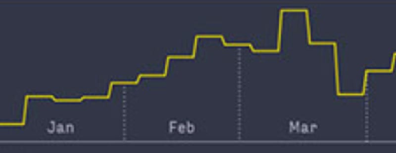
Each of these separators is a dashed line from the x-axis to the measurement at the time of the start of the month. However, because the solid line represents a histogram that is aligned with week boundaries, it’s necessary to find the weekly measure into which the start of the month falls. It turns out that you can use a d3.bisector to efficiently find these entries, which can then be used to find the height at the start of the month.
A bisector function is used to search a sorted array for the location at which a new value should be inserted to keep all array values properly sorted. This search takes advantage of the sorted nature of the array and uses a binary search to find the insertion point, which is very efficient as the number of entries being searched increases.
Here’s how it’s put into action:
// generate a set of month boundary dates
$: months = d3.timeMonth.range(
  weeklyTotals[0].week,
  weeklyTotals[weeklyTotals.length - 1].week
);
const dateFinder = d3.bisector(xAccessor);
function findHeightAtDate(data, date) {
  const index = dateFinder.left(data, date) - 1;
  return yScale(yAccessor(data[index]));
}
Provided with any date, findHeightAtDate will provide the height of the histogram at that date. This can then be used to draw the dashed line that corresponds to the start of each month:
<svg viewBox="0 0 {width} {height}">
  {#each months as month}
    <line
      class="dashed-line"
      x1={xScale(month)}
      x2={xScale(month)}
      y1={yScale(0)}
      y2={findHeightAtDate(weeklyTotals, month)}
    />
  {/each}
  <path class="total" d={yLine} />
</svg>
which results in this:

That is quite close, but there’s a problem. The start of March happens to coincide with the transition element between histogram measurements, and as a result the dashed line extends above transition line. This problem is one of my own devising. 😬
I decided that the easiest thing to do3 was to try to figure out a heuristic that would allow me to figure out when I needed to blend two histogram measurements together. In this case, the week boundaries are all on Sundays, so I was able to simply calculate an average measurement for any month that started on a Sunday.
function findHeightAtDate(data, date) {
  const index = dateFinder.left(data, date) - 1;
  // if the current date is a sunday (the start of the week) we'll
  // have some issues with the Felton line transitions, so work around
  // that by averaging neighboring measure heights
  if (date.getDay() === 0) {
    return (
      ( yScale(yAccessor(data[index])) +
        yScale(yAccessor(data[index + 1]))) / 2
      );
  } else {
    return yScale(yAccessor(data[index]));
  }
}
This result was good enough for me.

On to the volume visualization component.
Creating the Volume Visualization
It turns out that the HourlyVolume component was a very straightforward application of several d3 scales. In the end this visualization required five separate scales, each of which was responsible for mapping a certain aspect of the volume measurement to its visual representation. These included:
-
xScale,yScaleto map weeks and hours to coordinates -
radiusScaleto map count of events to circle size -
colorScaleto map count of events to a color fill -
opacityScaleto map count of events to an opacity4
Sizing the circles
I’ve covered how to create xScale and yScale scales in previous posts, so I’ll move straight to the radiusScale.
When using a filled circle to visually represent a quantity, it’s important not to overstate amounts accidentally. With a circular representation this is easy to do because the area of a circle varies as the square of the radius. To address this, when using a filled circle the scale for the radius should use d3.scaleSqrt, which will scale a value according to the square root of the parameter.
I also wanted to ensure that outliers in the aggregated data didn’t end up overwhelming or obscuring parts of the the volume visualization. The easiest way to do that is to calculate a value that represents the high end of the collection of measurements without outliers, and use that instead of the maximum value. One way to do this is to calculate the 99th percentile for the dataset and use that as the maximum value for the domain of the scale. This can be done using d3.quantile.
Finally, once the scale has been created, the clamp function can be used to ensure that values that fall outside of the specified domain are clamped to the extents of the domain. This ensures that the largest radius the scale will generate is the one that is specified with maxRadius.
const maxRadius = 2.5;
const boundPercentile = 0.99;
// find an upper limit for the radius scale based on boundPercentile
// this allows us to use .clamp(true) to keep outliers from
// overwhelming the visual
$: sizeLimit = d3.quantile(data, boundPercentile, sizeAccessor);
$: radiusScale = d3
  .scaleSqrt()
  .domain([0, sizeLimit])
  .range([0, maxRadius])
  .clamp(true);
💡 Note: I typically put a set of constant declarations for these types of fine-tuning variables at the top of my components, so that I can tweak them as necessary based on the data I’m actively trying to visualize.
Coloring the circles
Finally, in the original volume chart all aggregate values that were in the busiest 25% of activity were colored yellow, whereas in my VS Code visualization only the busiest 20% were highlighted. Both of these can be easily implemented via d3.scaleThreshold. This scale type transforms a domain into sections based on specified thresholds, which makes it perfect for performing the described color mapping.
$: p80 = d3.quantile(data, 0.8, sizeAccessor);
$: colorScale = d3
  .scaleThreshold()
  .domain([p80])
  .range([normalColor, highlightColor]);
$: opacityScale = d3.scaleThreshold()
  .domain([p80])
  .range([0.5, 1.0]);
(Both normalColor and highlightColor are Svelte component properties and are passed in from the parent component.)
This creates a scale that is split at the 80th percentile point in the domain (p80). The left and right sides of this point are colored according to the range [normalColor, highlightColor], meaning that any value that is above the 80th percentile in the domain will be highlighted, and any point below it will not be.
The opacityScale is the same, except that it maps to two opacity values instead of colors.
Once all of these elements are in place, the actual drawing of the volume chart is pretty minimal:
<svg viewBox="0 0 {width} {height}">
  {#each weeks as week}
    {#each getHoursForWeek(data, xAccessor(week)) as hour}
      <circle
        cx={xScale(xAccessor(hour))}
        cy={yScale(yAccessor(hour))}
        r={radiusScale(sizeAccessor(hour))}
        fill={colorScale(sizeAccessor(hour))}
        opacity={opacityScale(sizeAccessor(hour))}
      />
    {/each}
  {/each}
  <line class="baseline" x1={0} x2={width} y1={0} y2={0} />
  <text class="title" x={0} y={15}>{title}</text>
  <text class="time-label" x={width} y={15}>AM</text>
  <text class="time-label" x={width} y={height - 5}>PM</text>
</svg>
where getHoursForWeek is defined as the following, because apparently you can’t compare Date objects for equality. Joy!
function getHoursForWeek(data, week) {
  const result = d3.filter(
    data,
    (d) => xAccessor(d)?.valueOf() === week.valueOf()
  );
  return result;
}
The Final Version
Once this is all in place, the final version of the volume chart looks like this:

The code I used to write this post is available on GitHub.
If you have any feedback, please let me know on Twitter or feel free to contact me here.
-
Yes, I could have written the query in such a way as to generate something much closer to this format from the beginning. I didn’t do that because of time constraints, and I’ll definitely try harder to export tidy data directly going forward. ↩︎
-
This is the short form of the
#awaitconstruct, which if fine when I’m prototyping ↩︎ -
After trying to ignore it by increasing the
stroke-width. 😆 ↩︎ -
Strictly speaking, the
opacityScalewas not required, as I could have not been lazy and chosen a dimmer color for this visual. ↩︎

Top comments (0)