Having been a React.js user since the days of React.createClass, I wasn't initially motivated to dive into React Hooks when they were announced. Since then, I've bit the bullet and relearned the React state paradigm. Though I still occasionally dip into classes, for the most part I'm a hooks convert.
I'd like to briefly show their utility here and demonstrate a use-case where hooks clearly fit.
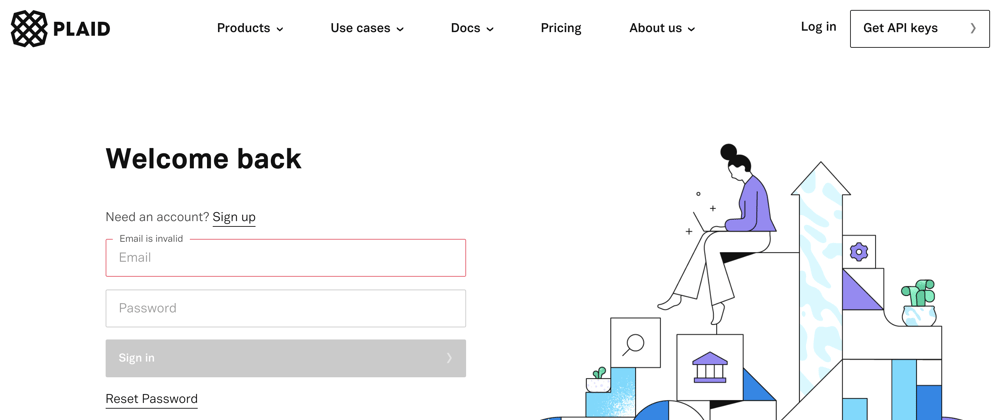
In light of Visa recently acquiring fintech startup Plaid, we're going to hop on the bandwagon and recreate an element of their UI that I enjoy. Here's what we'll be building:
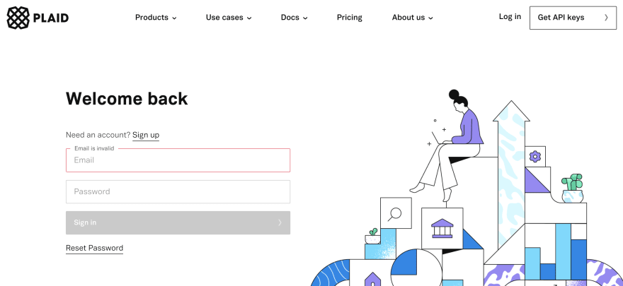
Head to their site to poke around their login page for a minute. Notice the lovely animation baked into their email and password input components? I want that.
Well, actually I want a derivative of that. And I want to share it with you.
Setup
If you're not familiar with React, this post might be a bit beyond you. Follow along and feel free to post a comment if you're lost. We'll need a simple react app to get started.
npx create-react-app plaid-inspired-inputs
Let it build and start up your application. We'll add single dependency - styled components - which has become my default styling library for React apps.
cd plaid-inspired-inputs
yarn add styled-components
yarn start
We're only going to edit the App.js file and a new Input file that we'll create here.
touch Input.js
Now it's time to write some code.
A Generic Input Component
First things first, let's build out our Input component. Here's the skeleton we'll start out with.
import React from 'react'
import styled from 'styled-components'

const InputContainer = styled.div`
  display: flex;
  flex-direction: column;
  margin: 15px 0;
  position: relative;

  & > input {
    border: 1px solid #eee;
    border-radius: 0.25rem;
    background-color: transparent;
    outline: none;
    padding: 12px 3px 12px 15px;
    font-size: 16px;
    transition: all 0.2s ease;
    z-index: 500;
  }
  & > label {
    color: #757575;
    position: absolute;
    top: 15px;
    left: 15px;
    transition: all 0.2s ease;
    z-index: 500;
  }
`

/**
 * A Plaid-inspired custom input component
 *
 * @param {string} value - the value of the controlled input
 * @param {string} type - the type of input we'll deal with
 * @param {string} label - the label used to designate info on how to fill out the input
 * @param {function} onChange - function called when the input value changes
 * @param {function} onFocus - function called when the input is focused
 * @param {function} onBlur - function called when the input loses focus
 * @param {function} setRef - function used to add this input as a ref for a parent component
 */
const Input = ({
  value,
  type,
  label,
  onChange,
  onFocus,
  onBlur,
  setRef,
  ...props
}) => {
  const renderLabel = () => label && <label>{ label }</label>

  return (
    <InputContainer>
      { renderLabel() }
      <input
        value={value}
        type={type}
        onChange={e => onChange(e.target.value)}
        onFocus={onFocus}
        onBlur={onBlur}
        ref={ref => setRef(ref)}
        {...props}
      />
    </InputContainer>
  )
}

Input.defaultProps = {
  type: "text",
  label: "",
  onChange: (text) => { console.error(`Missing onChange prop: ${text}`) },
  onFocus: () => {},
  onBlur: () => {},
  setRef: () => {},
}

export default Input
A few things going on here. Let's break it down in pieces.
Styling
We're encompassing the component in a single styled <div>. This InputContainer element will control the presentation of both the label and the input. We've specified the parent div to have position: relative and the label to have position: absolute. Doing so makes it easy to manipulate the location of label depending on how the user interacts with the input.
We're also not including a placeholder. The label will serve as the placeholder until the user focuses on the input. This won't quite mimic the Plaid inputs, but that's ok. We'll get to that part shortly, anyway.
Also, feel free to play with the colors we're using here, they're not essential.
Component Structure
One core React-centric architectural decision to discuss is letting the parent element control the input's label, value, and type. By doing so, we've made the input more reusable, but still have standardized behavior across our application. The flexibility of this decision will make our lives easier in the long run, though it will require some work up front.
Right now we're extracting the <label> rendering into its own function. At the moment, it might seem silly. However the next section will make this step more apparent.
Behavior
Because we want our parent component to be able to hook into the Input element's internals, we've opted to take in onChange, onFocus, onBlur, and setRef function props. Do with those as you will.
And we're left with an operational, albeit bland and not quite functional, custom input.
Improving Our UX
Try typing into our input. Not very pretty, is it? The label overlays the input text and the user experience is poor, to say the least. Let's fix that.
// ... other code
const Input = ({
  value,
  type,
  label,
  onChange,
  onFocus,
  onBlur,
  setRef,
  ...props
}) => {
  const [focused, setFocused] = React.useState(false)

  const handleOnFocus = () => {
    setFocused(true)
    onFocus()
  }

  const handleOnBlur = () => {
    setFocused(false)
    onBlur()
  }

  const renderLabel = () => label && <label>{ label }</label>

  const isFocused = focused || String(value).length || type === "date"

  return (
    <InputContainer focused={isFocused}>
      { renderLabel() }
      <input
        value={value}
        type={type}
        onChange={e => onChange(e.target.value)}
        onFocus={handleOnFocus}
        onBlur={handleOnBlur}
        ref={ref => setRef(ref)}
        {...props}
      />
    </InputContainer>
  )
}

// ... other code
Finally! React hooks! If you're underwhelmed, that's ok. That's really all there is to hooks. Instead of declaring this.state in a class-based component, we specify our state with React.useState(defaultValue) and destructure our state/stateSetter from the returned array.
The general pattern is const [state, setState] = React.useState(false). Easy enough, right?
If you want to learn more about hooks, check out the docs - they're fantastic.
In our case, we're using a focused flag to determine whether or not the user has clicked on the input. Besides that, the main refactor we've done here is to wrap our onFocus and onBlur with handleOnFocus and handleOnBlur functions. Doing so allows us to call the function props passed to the input while also updating the <label /> and <InputContainer> components when the user focuses on or leaves the input.
Notice how we're passing the <InputContainer> the focused prop? We'll use that to adjust the styles of our label accordingly. This is where styled components shine.
import React from 'react'
import styled from 'styled-components'

const InputContainer = styled.div`
  display: flex;
  flex-direction: column;
  margin: 15px 0;
  position: relative;
  transition; all 0.2s ease;

  & > input {
    border: 1px solid #eee;
    border-radius: 0.25rem;
    background-color: transparent;
    outline: none;
    padding: 12px 3px 12px 15px;
    font-size: 16px;
    transition: all 0.2s ease;
    z-index: 500;
  }
  & > label {
    color: #757575;
    position: absolute;
    top: 15px;
    left: 15px;
    transition: all 0.2s ease;
    z-index: 500;

    ${props => props.focused && `
      font-size: 13px;
      transform: translateY(-23px) translateX(-5px);
      z-index: 501;
      background: white;
      padding: 0 8px;
    `}
  }
`
// ... other code
We're interpolating a function into our style template string that takes in all props supplied to the <InputContainer> element as its argument. Because we're conditionally passing the focused prop depending on whether the user has clicked into the input, we have complete control over the style of the label depending on the user's actions.
So here's a few examples of what we end up with.
And voila! Look what we have here!
That's a nice little animation. Typing into the input element triggers our focused flag and transforms the position of the label. We add a white background and a bit of padding to the left and right of the label so that it appears to break the border of our container element.
If we delete any text we've entered into the input, our label should return to its position as a fake placeholder. The only element that doesn't follow this pattern has prop type="date". Because datepicker inputs have default text, we've auto-specified the isFocused flag as true to accommodate date inputs.
We're creating this simple form with the following code:
import React from "react"
import Input from "./Input"

const SimpleForm = () => {
  const [state, setState] = React.useState({
    email: "",
    password: "",
    username: "",
    birthday: ""
  })

  return (
    <>
      <Input
        label="email"
        type="email"
        value={state.email}
        onChange={val => setState({ ...state, email: val })}
      />
      <Input
        label="password"
        type="password"
        value={state.password}
        onChange={val => setState({ ...state, password: val })}
      />
      <Input
        label="username"
        type="text"
        value={state.username}
        onChange={val => setState({ ...state, username: val })}
      />
      <Input
        label="birthday"
        type="date"
        value={state.birthday}
        onChange={val => setState({ ...state, birthday: val })}
      />
    </>
  )
}

export default SimpleForm
Time to add the finishing touches!
Validation and Error Handling
Head back to our Plaid example. Notice how once the input element is touched and then left, an error message elegantly appears with instructions on how to remedy the issue?
We'll recreate that functionality again using hooks. That's why you're here anyway, right?
Update your <Input /> element like so:
// ... other code

const Input = ({
  value,
  type,
  label,
  onChange,
  onFocus,
  onBlur,
  setRef,
  ...props
}) => {
  const [focused, setFocused] = React.useState(false)
  const [error, setError] = React.useState(null)

  const handleOnFocus = () => {
    setFocused(true)
    onFocus()
  }

  const handleOnBlur = () => {
    setFocused(false)
    onBlur()
  }

  const validateValue = (val) => {
    if (type === "email") {
      // VERY simple email validation
      if (val.indexOf("@") === -1) {
        setError("email is invalid")
      } else {
        setError(null)
      }
    }

    // ... any other validation you could think of
    // ... maybe even pass in an additional validation function as a prop?
  }

  const handleOnChange = (val) => {
    validateValue(val)
    onChange(val)
  }

  const renderLabel = () => {
    if (label) {
      // if we have an error
      if (error) {
        return <label>{ error }</label>
      }

      return <label>{ label }</label>
    }
    return null
  }

  const isFocused = focused || String(value).length || type === "date"

  return (
    <InputContainer focused={isFocused} error={error}>
      { renderLabel() }
      <input
        value={value}
        type={type}
        onChange={e => handleOnChange(e.target.value)}
        onFocus={handleOnFocus}
        onBlur={handleOnBlur}
        ref={ref => setRef(ref)}
        {...props}
      />
    </InputContainer>
  )
}

// ... other code
Now we're getting closer. The main refactor we've done here is to wrap our onChange handler so that we can run an additional validation function on the input's value.
As stated in the comments, feel free to pass in a validation function as an additional prop that can be run along with the type-specific validations.
Doing so allows us to check for improper values and set our error state to be conditionally rendered instead of our label. We're also passing our error to the <InputContainer> element, so that we can change border colors accordingly.
Let's do that.
import React from 'react'
import styled from 'styled-components'

const InputContainer = styled.div`
  display: flex;
  flex-direction: column;
  margin: 15px 0;
  position: relative;
  margin-top: 30px;

  & > input {
    border: 1px solid ${props => props.error ? '#e77674' : '#eee'};
    border-radius: 0.25rem;
    background-color: transparent;
    outline: none;
    padding: 12px 3px 12px 15px;
    font-size: 16px;
    transition: all 0.2s ease;
    z-index: 500;
  }
  & > label {
    color: #757575;
    position: absolute;
    top: 15px;
    left: 15px;
    transition: all 0.2s ease;
    z-index: 500;

    ${props => props.focused && `
      font-size: 13px;
      transform: translateY(-23px) translateX(-5px);
      z-index: 501;
      background: white;
      padding: 0 8px;
    `}
  }
`
And we're left with a much more polished version:
This is not a perfect replica of Plaid's inputs, but it'll do for now. You may have noticed that Plaid's inputs run their validation as soon as the user leaves the input - whether or not the onChange handler has run. There are other improvements that could be added as well, but we'll leave that as an exercise for the reader.
Here's some additional items that most of us had to implement at one point or another. Take a stab at them if you feel up for it:
- How might we pass in an error from parent component to input that depends on multiple inputs?
- Ensure password and confirm password must be the same value
- Ensure password doesn't include username
- Inform users that end date must be after start date
- Password validation for length, valid characters
- Username validation for spaces and improper characters
- Phone number validation
- Non-blank entries


Top comments (2)
Could we use the
:focuspseudo-selector for the input, instead of using a state variable likefocused? If so, how would the code change to achieve the same behavior?can we store target values in two different states for onchange and onblur events?