
Design Brief
Chec Dashboard is a headless eCommerce platform and hosted dashboard that merchants and businesses use to manage their products, orders and customers. The task is to redesign the Products view of the Chec Dashboard.
My Goals
Redesign UI
Improve Accessibility
Add New Features
Design Stack
Pen on paper
InVision Free Hand
Overflow
Adobe XD
Introduction
I was given the opportunity to redesign Chec's eCommerce dashboard's product view. When I had first come across Chec and Commerce.js, I was thrilled to see a platform championing for the next-generation headless CMS and eCommerce. The decoupling of both the front-end presentation layer and back-end data of building an eCommerce website is intuitive, flexible, and robust. As a developer and designer, building an eCommerce platform is a normally a big project undertaking and a two-fold: building the back-end where data is stored and retrieved (products, content, customer reviews, etc.), and the front-facing presentation of both the merchant's dashboard and the actual store-front.
The redesign in this particular task is aimed at the products list view in the merchant dashboard.
Research
Because this was a project that was under some time constraints, I was able to be creative in gathering reliable external usability information. The first place I thought about was Commerce.js's Slack channels. Having access to current users gives an insight to how they are using the platform and their feedback on the product. Additionally, having had a bit of prior experience on other traditional e-commerce CMS myself and asking a few people on theirs, I have an idea of the conventional user flow and the main functionalities.
In most other cases, extensive research is needed for a product design or redesign to be effective. Being able to calculate current users' pain points, needs, and goals can help to nail down the aspects of the redesign to hone my focus in on.
Analysis
Strengths of current product's view dashboard:
Clean aesthetic without a cluttered navigation
The top panel for displaying notices for administrators and users catches the eye
Products list is front and centre in a visible container
Room for Improvements:
Low contrast colours translate to low accessibility
'Add Product' button is not highly visible at first glance
Side dashboard navigation hierarchy is unclear due to grey background on active menu items
Competitive Analysis
I ran a quick competitive analysis on other e-commerce CMS platforms and found some patterns:
White background with high contrast colours translates to higher accessibility
Filtering feature of products are efficient for larger businesses with a high number of products
User Tasks
With a defined user in mind using the products view page, I could identify the key user journeys:
Adding new products to inventory
Adding products in bulk by importing with CSV file
Add categories and tagging products with the categories
Proposed Solutions
Overall visual design update porting over main features and adding additional functionalities.
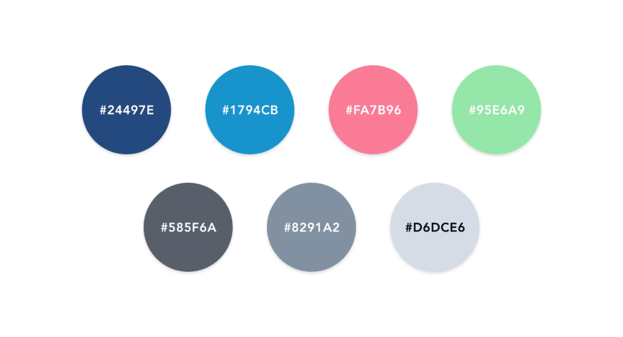
As it was requested to use original colour palette as a foundation, I turned the contrast of three main colours higher. I used a light grey backsplash for the main modal and white for the vertical menu and top navigation bar. This is to aim to correct a higher colour contrast ratio.
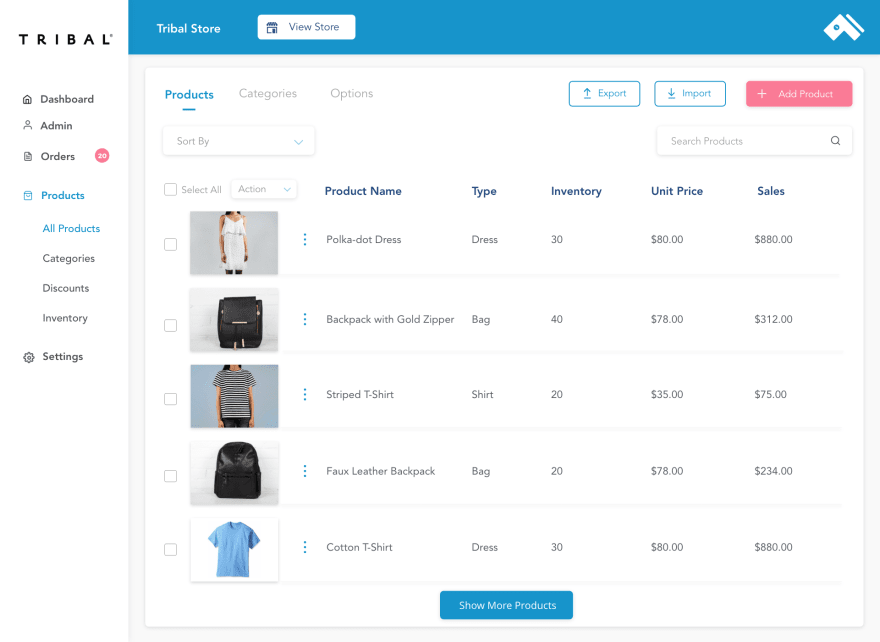
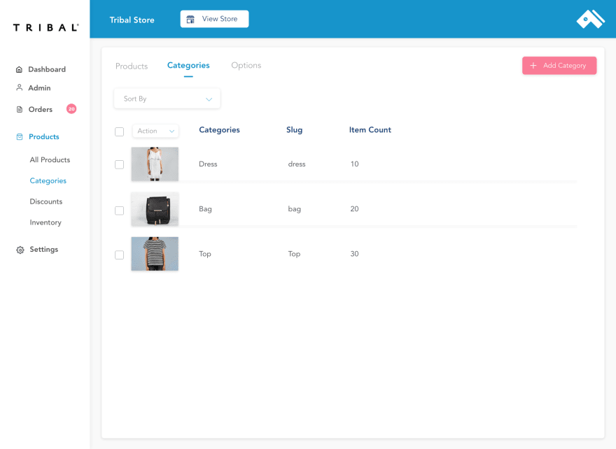
For fluid user flow, I added top-level main navigation items such as Products, Categories, Options on the top left where it is more visible and accessible.
For scalability of platform to target larger businesses, I placed 'Import' and 'Export' feature for adding products in bulk.
'Add Products' button to remain at the top right with higher contrast colour.
'Select All' checkbox and single checkboxes to put bulk action on items.
Wireframing
While this is a redesign, most of main features are being ported over such as the products tab and the editing capabilities of each product. I wanted to keep the lo-fi wireframing step at a minimum and just lay out the main dashboard components of the products view. Once I have the general layout of the dashboard, it was easy enough to shuffle around components in my mock-ups.
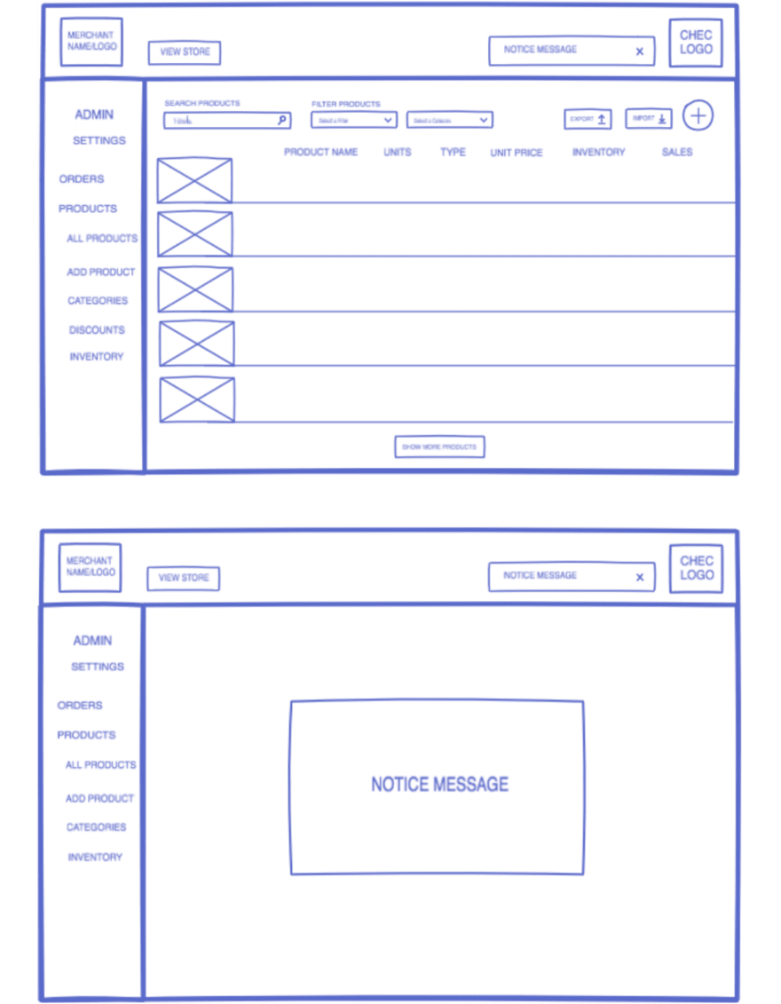
DASBOARD PRODUCTS VIEW AND MODAL POP UP WIREFRAMES
Visual Interface
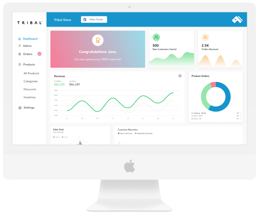
The current interface is cleanly laid out enough to acommodate most of the main features but what it lacked was the white space and light background to make the elements pop out. To begin resolving this, I optimized white space through subtle spacing and adjustments in margins and paddings.
Being able to play with the current colour palette as a foundation was helpful as I quite like the color combinations. The one edit I made was turning the vibrance up on a select few of the main colours.
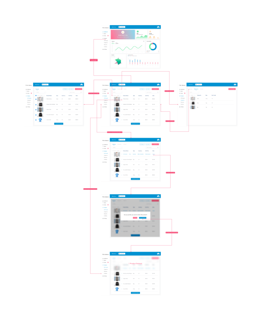
Prototyping
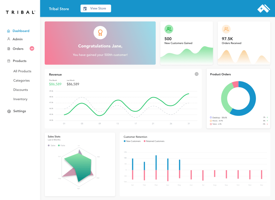
I was excited to pull the new interface together as a prototype as I would be able to see the fluidity with the common user journey. One of the main features of a merchant dashboard is the handling of products, and to be able to go between the main components without much thought is a success in usability.
Top-level navigation items are placed in both the side navigation and top tab menu for accessibility.
Takeaways
Building this case for a redesign of Chec's merchant dashboard was an insightful challenge and a lot of fun. To redesign a product's platform involves some context setting. Given a clear design brief and a bit of research into some user feedback,I was more equipped to focus on the main goals on the Products view page.

Top comments (1)
This is super cool !! You can also create this dashboard wireframe using Mokkup.ai which is a cool tool when it comes to dashboard wireframing. It has lots of templates that you edit and customize according to your needs.