
Updated version of this article is present at: angular-material.dev
Understand Theme of Angular Material and its different Components. 😎
Summary
This is the second part of the series. In part one, we created an Angular Project with Material Modules. We also created a Custom Theme and couple of helper modules (CustomMaterialModule and SharedModule).


In this part, we will understand Material Theming by taking a deep look into Angular Material’s repo.
Let's start...

Understand Material Theming (a deep look into Angular Material’s repo)
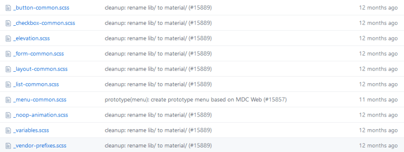
Let’s take a look at related stylesheets (css/scss) on Angular Material’s Github repo. If you open the github repo, you would see below structure:

I will guide you through some important folders, which are directly related to Material Theme. But before that, I would like to remind you that in our application’s styles.scss and theme.scss files, we have these very important lines:
// src/style.scss
// LINE 3
@import '~@angular/material/theming';
// LINE 9
@include mat-core();

// src/theme.scss
// LINE 11
$theming-material-components-theme: mat-light-theme($theming-material-components-primary, $theming-material-components-accent, $theming-material-components-warn);

// src/style.scss
// LINE 20
@include angular-material-theme($theming-material-components-theme);
Just keep in mind above lines, we are going to relate them with some of files from Angular Material repo's src/material folder, you can keep that folder opened up in new tab or window, so that it would be easy for you to understand.
ℹ️ Tip: Look for the 💡, ⛳, ☝️, 👈, 👉 in the article, that will help you relate.
📁 src/material
In this folder, you can see they have made folders for each Material Component and few other (core, testing, schematics, etc.).
📁 src/material/<component-name>
For each component, there is a separate folder. And in each component they have a theme file. Theme file’s naming pattern is : _<component-name>-theme.scss. So, for MatToolbar , it’s _toolbar-theme.scss and full path of the same is: src/material/toolbar/_toolbar-theme.scss. 👉 Now you know, how to find a theme file for any component 👈.
The other way to find components’ themes is through 💡 File Finder. Once you have opened the repo, click on Find File button, which is on the right side of breadcrumbs.


You can simply enter filename in the pattern of: _<component-name>-theme.scss and you will directly see the related file.
ℹ️ Note that, each component has a theme file. We will see later on, how that is included in our application.
📁 src/material/core
This has core library code for other @angular/material components. Other Material Components means, simply the components which you can’t see directly at https://material.angular.io/components/categories, but they are crucial.
Let’s dive in core folder.
📁 src/material/core/_core.scss
Let's (spend couple of minutes to) take a look at file:
To summarize, below is what's happening in this file:
- All of the CDK related styles are 🔁 imported (Lines 1–3)
- Other helper styles are imported (check-boxes, elevation, ripples, typography, etc.) (Lines 6–11)
- A mixin called 💡
mat-coreis created (Lines 14–20). As the comment says, this renders all of the core styles that are not theme-dependent, like ripple effects, CDK behaviors, etc. 👉 Now you know from where are you including mat-core in application’s styles.scss 👈. - A mixin called 💡
mat-core-themeis created (Lines 23–55). As per comments, this renders all of the core styles that depend on the theme, like color combination of ripples, color combination of elevations, etc. But wait 🤔, we didn’t call this in our styles.scss, so where it’s called? Let me reveal the ⛳ suspense later on.
📁 src/material/core/style
The style folder contains some common styling files. File names should give you a basic idea what it does. Going into detail of each file is beyond scope of this article.
📁 src/material/core/theming
This folder contains all the styles related to theming. Let’s go into it.
📁 src/material/core/theming/prebuilt

As you can see, it contains all 💡 prebuilt themes. 👉 Now you know, if you use any of prebuilt theme, from where it’s coming 👈.
📁 src/material/core/theming/_all-theme.scss
If you open the file and see, it has imported 💡 all the Material Component Themes in it, plus 💡 mat-core-theme from src/material/core/_core.scss. And all the mixins are included in a new 💡 mixin called angular-material-theme.
Does angular-material-theme sound familiar 🤔? Yes, you’re right, 👉 we have included it in our styles.scss file👈 . Now everything is becoming more clear, right? (Don't say no...😜)
📁 src/material/core/theming/_palette.scss
As the name suggests, it has all the Material System Colors. But where these colors are used? Next file is the answer to that.
📁 src/material/core/theming/_theming.scss
If you open the file and see, first thing what it does is 💡 @import 'palette'.
And it uses those palette colors in below 💡 five functions:
@function mat-contrast($palette, $hue);

@function mat-palette($base-palette, $default: 500, $lighter: 100, $darker: 700);

@function mat-color($palette, $hue: default, $opacity: null);

@function mat-light-theme($primary, $accent, $warn: mat-palette($mat-red));

@function mat-dark-theme($primary, $accent, $warn: mat-palette($mat-red));
If you are thinking 🤔, are those the same ☝️ functions which we used in our theme.scss file? Then I must say you have a 🧠 strong memory power and you’re ✔️ right! 👉 So now we know, from where our theme functions are coming 👈.
📁 src/material/core/typography

The content and structure is all most similar to src/material/core/theming. It would be now clear to you how it works.
One thing I would like to mention, 💡 a mixin angular-material-typography of src/material/core/typography/_all-typography.scss is the main mixin responsible for typography related stuffs in Material Theme. 👉 And this same mixin is imported in src/material/core/_core.scss 👈.
Great! We are done with inspecting and finding related stylesheets. If you've read upto this, I have 3 claps for you: 👏👏👏
But, you would still have one ❓ question in mind. In our styles.scss file we are only importing one single file @import '~@angular/material/theming'; So, 🤔 how other files are getting loaded?
💡 When Angular Material Team 📦 packages and ⏫ publishes the Angular Material Package (@angular/material), they combine all the theming, typography, styles and core styles into one single file called *_theming.scss*, so that we don’t have to import multiple files.
💡 You can check the same by opening the file. In your project folder open this : **node_modules\@angular\material_theming.scss* . The first comment/line in the file says 👉 : "Import all the theming functionality".*
💡 Pre-built theme files are not included in main *_theming.scss*. The reason behind that is but obvious, if you want to create your custom theme, you wouldn’t want pre-built theme files load into your application. And if you want to include any of pre-built themes, we 🔁 import the respective theme file.

I know 😄 you must be feeling sleepy as it’s still difficult to remember how theming works, as there are lot of things included. I will try to explain again by an info-graphic:

Thank you,
for reading this article. In the next part, we will learn MatToolbar's theme and apply the same to MatSidenav and MatDialog. We will also create a separate theme for MatSnackbar and will use them as notifications.
Next part is also published:
And yes, always believe in your self.


Top comments (0)