
Stepper is a small UI Component but, a most useful component in Application Development to increment or decrement a value. People also call as Counter but, I am calling this has a Stepper because I came from an iOS Development background.
What is a Stepper?
A stepper is a two-buttons used to increase or decrease an incremental value. By default, one button of a stepper displays a plus symbol, and the other displays a minus symbol. These symbols can be replaced with custom images if desired.
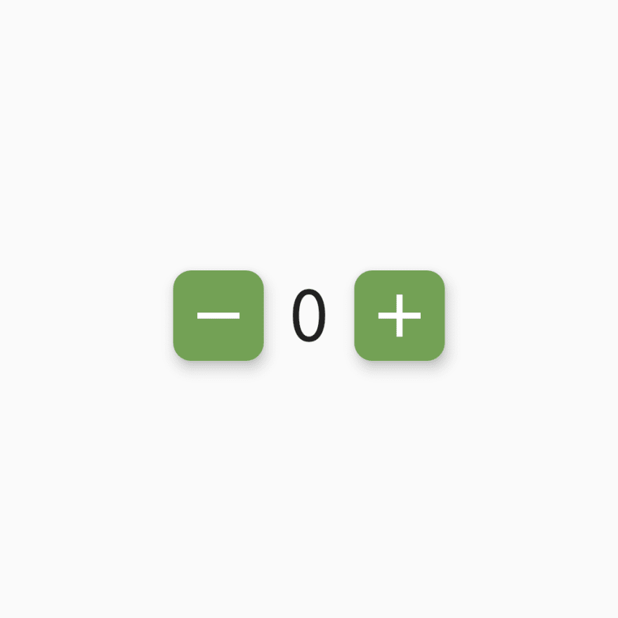
Let's Build a Carousels like this:
This is actually what we going to make by the end of this article. Load up your energy and let's get started.
RoundedIconButton
class RoundedIconButton extends StatelessWidget {
  RoundedIconButton({@required this.icon, @required this.onPress, @required this.iconSize});

  final IconData icon;
  final Function onPress;
  final double iconSize;

  @override
  Widget build(BuildContext context) {
    return RawMaterialButton(
      constraints: BoxConstraints.tightFor(width: iconSize, height: iconSize),
      elevation: 6.0,
      onPressed: onPress,
      shape: RoundedRectangleBorder(borderRadius: BorderRadius.circular(iconSize*0.2)),
      fillColor: Color(0xFF65A34A),
      child: Icon(
        icon,
        color: Colors.white,
        size: iconSize * 0.8,
      ),
    );
  }
}
Create a StatelessWidget class and name it as RoundedIconButton
Declare the following properties:
  final IconData icon;
  final Function onPress;
  final double iconSize;
-
iconis anIconDatadatatype because we can't pass a string foricon name. -
onPressproperty helps to write the functionality of the button. -
iconSizeis for making the button more dynamic.
We are returning a RawMaterialButton with common properties you see above like constraints, elevation and child etc..
Custom Stepper
Create a StatelessWidget name it as CustomStepper, we need a StatelessWidget because we often change properties of the Class i.e, incrementing or decrementing a value.
// ignore: must_be_immutable
class CustomStepper extends StatefulWidget {
  CustomStepper({
    @required this.lowerLimit,
    @required this.upperLimit,
    @required this.stepValue,
    @required this.iconSize,
    @required this.value,
  });

  final int lowerLimit;
  final int upperLimit;
  final int stepValue;
  final double iconSize;
  int value;

  @override
  _CustomStepperState createState() => _CustomStepperState();
}

class _CustomStepperState extends State<CustomStepper> {

  @override
  Widget build(BuildContext context) {
    return Row(
      mainAxisAlignment: MainAxisAlignment.center,
      children: [
        RoundedIconButton(
          icon: Icons.remove,
          iconSize: widget.iconSize,
          onPress: () {
            setState(() {
              widget.value =
                  widget.value == widget.lowerLimit ? widget.lowerLimit : widget.value -= widget.stepValue;
            });
          },
        ),
        Container(
          width: widget.iconSize,
          child: Text(
            '${widget.value}',
            style: TextStyle(
              fontSize: widget.iconSize * 0.8,
            ),
            textAlign: TextAlign.center,
          ),
        ),
        RoundedIconButton(
          icon: Icons.add,
          iconSize: widget.iconSize,
          onPress: () {
            setState(() {
              widget.value =
                  widget.value == widget.upperLimit ? widget.upperLimit : widget.value += widget.stepValue;
            });
          },
        ),
      ],
    );
  }
}
Declare the following properties:
lowerLimitproperty is where you can update the lower limit of the Stepper.upperLimitproperty is where you can update the upper limit of the Stepper.stepValueproperty is where you can update each step value of the Stepper.iconSizeproperty which will manage the whole structure of the Stepper.valueproperty will be updated each time afterRoundedIconButtonis Clicked.
Follow the steps to create a CustomStepper:
- Create a
RowwithMainAxisAlignmenttocenter - Add two
RoundedIconButton's with passingadd,removeicons, and functionalities respectively. -
Functionalities:
- Increase the
valuebystepValuewhenaddButtonClicked. - Decrease the
valuebystepValuewhenremoveButtonClicked. -
Ternary Operatoris the best one to use in this case.
- Increase the
- Give a Text label to the
valueproperty and place between the icons.
Here you see the actual CustomStepper.
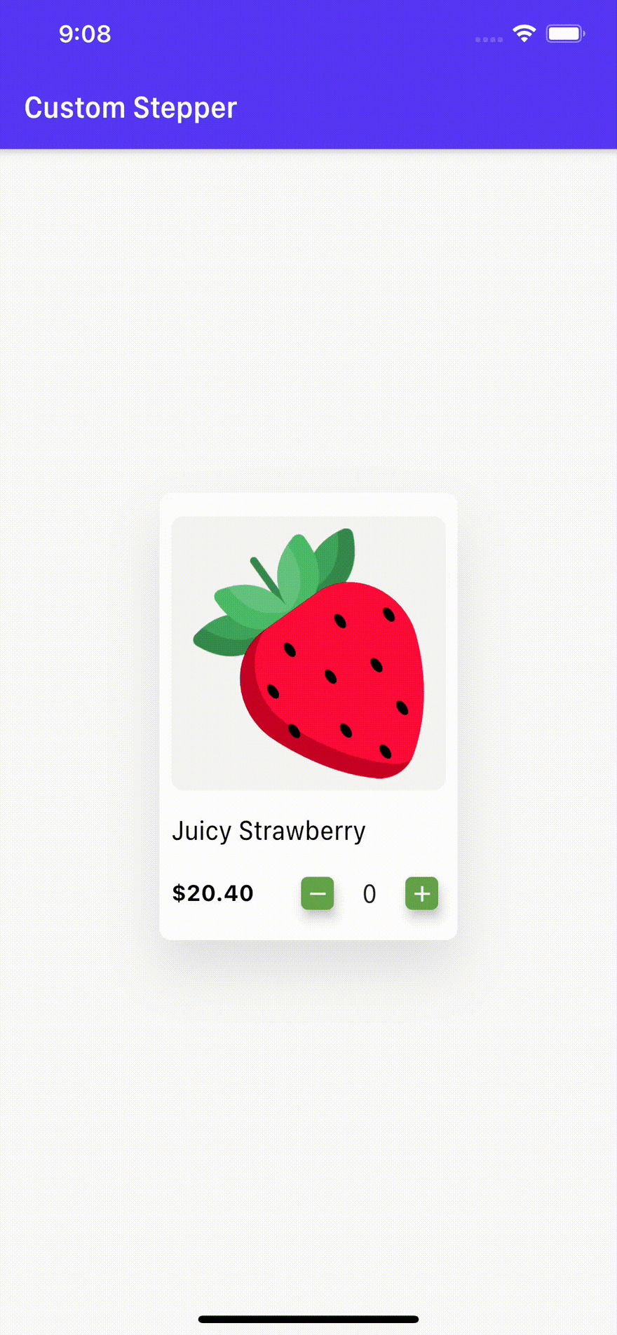
UseCase Example
class StepperScreen extends StatelessWidget {
  @override
  Widget build(BuildContext context) {
    return Scaffold(
      appBar: AppBar(
      backgroundColor: kPrimaryColor,
      title: Text("Custom Stepper"),
      centerTitle: false,
      ),
      body: SafeArea(
        child: Center(
          child: Container(
            height: 300,
                width: 200,
                decoration: BoxDecoration(
                  color: Colors.white,
                  borderRadius: BorderRadius.circular(8.0),
                  boxShadow: [
                    BoxShadow(
                      color: kShadowColor,
                      offset: Offset(0, 20),
                      blurRadius: 30.0),
                  ]
            ),
            child: Column(
              mainAxisAlignment: MainAxisAlignment.center,
              crossAxisAlignment: CrossAxisAlignment.start,
            children: [
              Padding(
                padding: const EdgeInsets.all(8.0),
                child: Container(
                  decoration: BoxDecoration(
                    color: Colors.black.withOpacity(0.04),
                    borderRadius: BorderRadius.circular(8.0),
                  ),
                  child: Padding(
                    padding: const EdgeInsets.all(8.0),
                    child: Image.asset('assets/images/fruit.png',fit: BoxFit.fitWidth,),
                  ),
                ),
              ),
              Padding(
                padding: const EdgeInsets.only(top: 8.0,left: 8.0),
                child: Text('Juicy Strawberry',style: TextStyle(
                  color: Colors.black,
                  fontSize: 18.0,
                ),),
              ),
              Padding(
                padding: const EdgeInsets.only(top: 8.0,left: 8.0),
                child: Row(
                  children: [
                   Text('\$20.40',style: TextStyle(
                     color: Colors.black,
                     fontSize: 15.0,
                     fontWeight: FontWeight.bold,
                   ),),
                Spacer(),
                CustomStepper()
                  ],
                ),
              ),

            ],
        ),
          )),
      ),
    );
  }
}
I used a simple example of a Grocery Cart where you can add the quantity of the Item through CustomStepper.
Conclusion
Stepper helps to increase and decrease the value easily. Use stepper for small values, for example, How many hour's you sleep per day?. On the other hand, it doesn’t make sense to use a stepper to How many miles you travel per day?.
If you like to improve your App Development Skills, even more in Flutter and SwiftUI. Feel free to dm me on Instagram or tweet to me on Twitter if you have any additional tips or feedback.
Thanks for reading!

Top comments (3)
A silly question to ask, if I used it on a listview builder, then how am i going to retrieve the value on the custom stepper?
Use State Management.
really appreciable....thanks!