Sequence diagrams that are understandable to everyone in your team
⚡ Tl;dr
- Even though sequence diagrams are suited to visualizing low-level technical details, they are often used to communicate high-level flows with product and business stakeholders.
- At IcePanel we’re focused on making sequence diagrams easily understandable to your technical and non-technical team members. This article goes through some of the design decisions we made when creating the flows feature.
🚀 Let’s kick-off
UML sequence diagrams are a popular tool for software engineers to describe the flow of messages in a software system. They’re great for showing interactions between different services or classes and the order in which they are executed. It paints a great picture of the dependencies involved in a particular process flow.
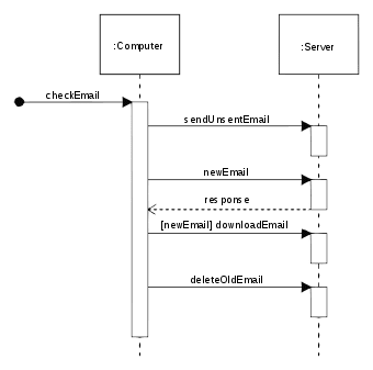
Even though sequence diagrams are better suited for visualizing complex low-level technical details, they are also used to communicate flows to higher-level people such as product and business stakeholders. As you can imagine, this can overwhelm anyone who does not deal with low-level code daily. Even the simple UML sequence diagram below could cause non-technical people to glaze over and not fully understand what they read.
IcePanel helps bridge the communication gap between product and engineering, so we felt there must be a friendly way to visualize sequence diagrams in a way that appeals to everyone on your team.
Let’s dive into how we approached this.
🖼️ Overlaying sequences on existing diagrams
Our initial consideration was the process of presenting diagrams and sequences to your team to tell a specific story. The cognitive load caused by completely switching layout and visual styling mid-presentation between regular and sequence diagrams can be distracting, especially for those unfamiliar with the UML sequence diagram notation. It requires your audience to re-read the layout of your objects and connections, which takes attention away from your ability to tell your story effectively.
We chose to overlay sequences of messages onto your existing diagrams and let you seamlessly transition into a flow during a presentation or conversation without any distractions. This also reduces maintenance as you don’t need to create separate diagrams for each sequence you need to show.
🔎 Automatic zooming that keeps the focus
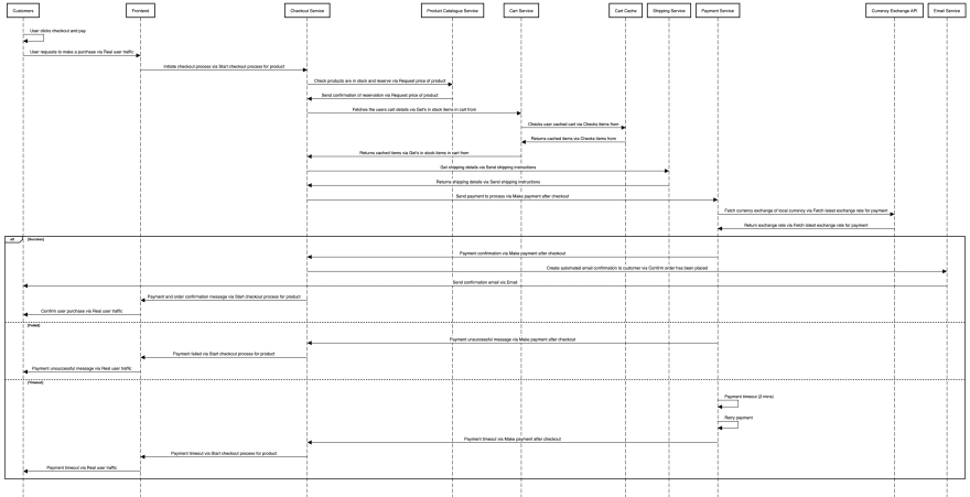
Sequence diagrams can quickly become very high or wide, requiring scrolling to consume at a readable size. This makes it difficult to navigate your audience through the elements of your flow, especially if you keep having to scroll up and down to show different areas. For example, the sequence diagram below is unreadable when embedded into a word document.
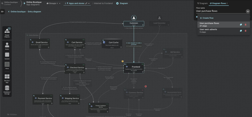
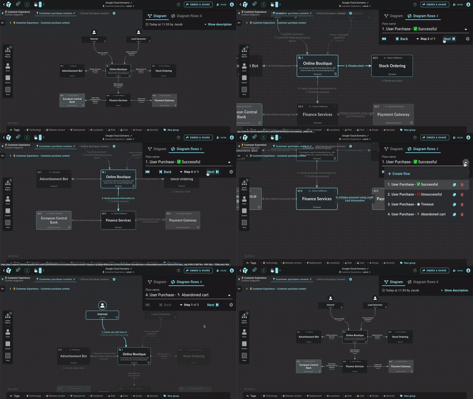
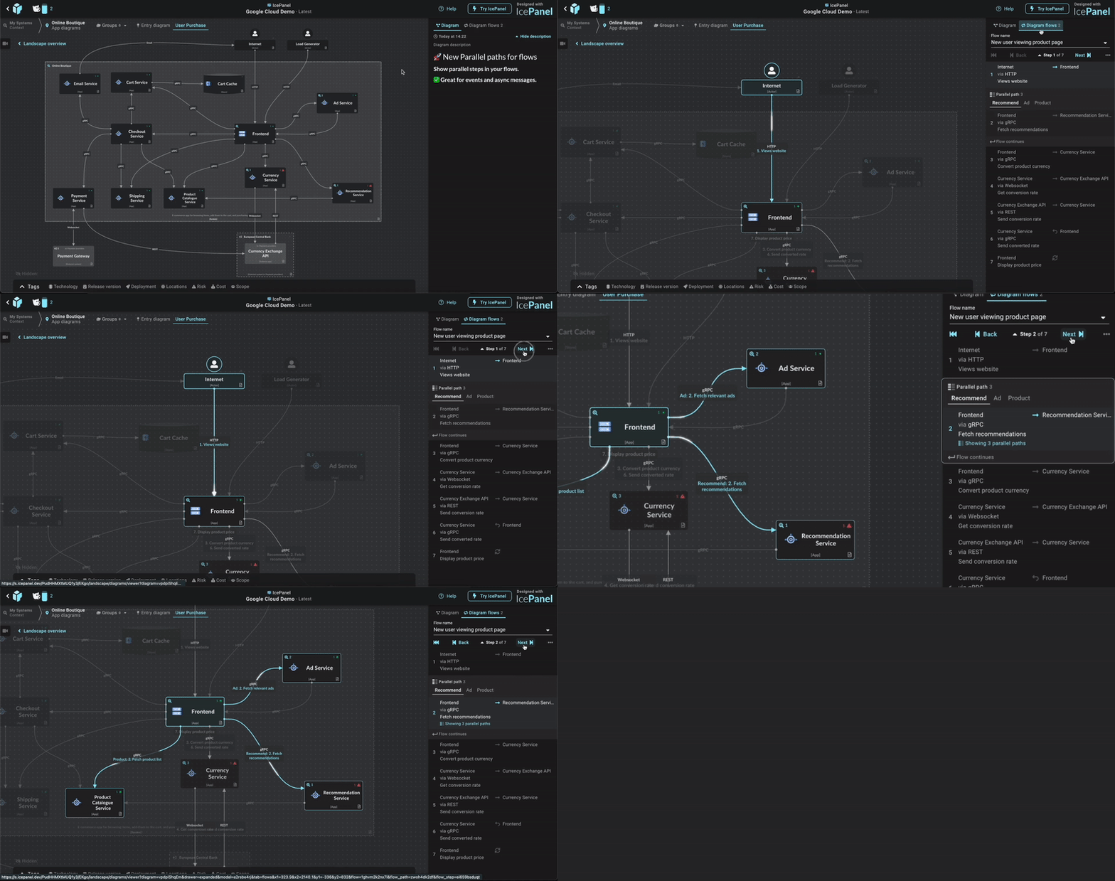
Being an interactive tool, we have luxuries that are impossible for static printed or image-based sequence diagrams exports. IcePanel shows you a list of steps so you can quickly flip through them one by one, automatically re-centring and zooming the camera to bring the important elements into focus for easy readability. It even applies a slight opacity to objects that are not used in the currently focused step and a more aggressive opacity to objects and connections that are not part of the flow at all. This helps break down the complexity and make it more digestible for your audience.
👉 Showing the direction of travel
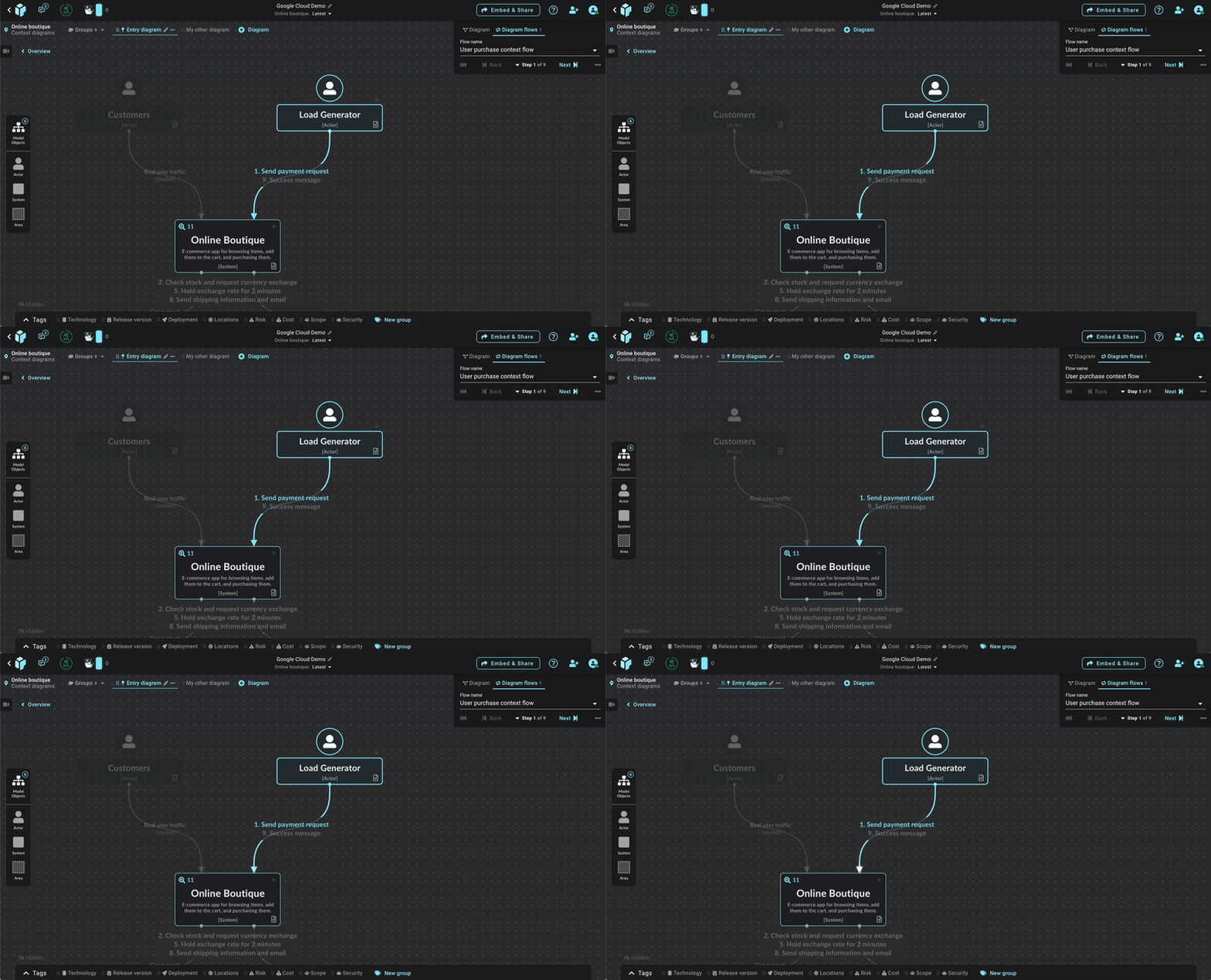
It can also be difficult to see the direction of travel for connections in traditional sequence diagrams, especially if the arrowheads are small or the lines are drawn very wide. To help here, we added an animated pulsating line to communicate the direction of travel and bring focus to the current connection. Product and business people love this as it adds a cool visual element which helps them understand the flow.
🔄 Alternate and parallel flow paths
Showing concurrent and alternate paths can be a challenging concept to show non-technical audiences and requires some basic understanding of the UML notation. It can also be difficult to see where the second or third concurrent request happens with many other steps listed in between.
Pulsating multiple connections at once easily communicates the concurrent nature of these requests in a way that’s much more obvious to everyone. A simple grouping of steps with a tab for switching between alternate flow paths allows you to easily communicate how thee paths run independently and focuses the conversation on the currently selected path.
💨 Rapid creation of flow sequences
We believe that creating and editing sequence diagrams should be insanely fast and easy, especially to help keep up with the rate of change. Product and business people often have great insights into high-level non-technical flows but may not feel comfortable creating or editing sequence diagrams, especially if generated from a markup language. We want to make it easy and quick for everyone to make changes when needed.
IcePanel already has context from the diagram about the objects being drawn and the direction of connections, so it can make helpful assumptions for you. Selecting a connection on the diagram and clicking “add step” will automatically infer the origin, receiver and connection for the flow step, leaving you to just fill in the description.
🏁 To wrap up
We understand there are cases where a UML sequence diagram is the best tool for the job, especially when the audience is only engineers or it includes low-level implementation details. There may also be advanced UML notations you need to use that aren’t supported in IcePanel, where another tool would be better suited.
IcePanel does allow flow export as code for rendering in tools like PlantUML or SequenceDiagrams.net for those that prefer visualizing in a traditional UML sequence diagrams format.
We’ve spent a lot of time making it seamless to tell both high-level and technical stories in IcePanel in a way that’s digestible and engaging to all your team. I hope you’ve enjoyed the insight into our design decisions for flows.
Stay chill 🧊



Top comments (0)