
A few months ago, Honeycomb released our SLO — Service Level Objective — feature to the world. We’ve written before about how to use it and some of the use scenarios. Today, I’d like to say a little more about how the feature has evolved, and what we did in the process of creating it. (Some of these notes are based on my talk, “Pitfalls in Measuring SLOs;” you can find the slides to that talk here, or view the video on our Honeycomb Talks page).
Honeycomb approaches SLOs a little differently than some of the market does, and it’s interesting to step back and see how we made our decisions.
If you aren’t familiar with our SLO feature, I’d encourage you to check out the SLO webcast and our other documentation. The shortest summary, though, is that an SLO is a way of expressing how reliable a service is. An SLO comes in two parts: a metric (or indicator) that can measure the quality of a service, and an expectation of how often the service meets that metric.
When Liz Fong-Jones joined Honeycomb, she came carrying the banner of SLOs. She’d had a lot of experience with them as an SRE at Google, and wanted us to support SLOs, too. Honeycomb had an interesting secret weapon, though: the fact that Honeycomb stores rich, wide events [REF] means that we can do things with SLOs that otherwise aren’t possible.
The core concept of SLOs is outlined in the Google SRE book and workbook, and in Alex Hidalgo’s upcoming Implementing Service Level Objectives book. In the process of implementing SLOs, though, we found that there were a number of issues that aren’t well-articulated in the Google texts; I’d like to spend a little time analyzing what we learned.
I’ve put this post together because it might be fun to take a look behind the scenes — at what it takes to roll out this feature; at some of the dead ends and mistakes we made; and how we managed to spend $10,000 of AWS on one particularly embarrassing day.
As background, I’m trained as a human-computer interaction researcher. That means I design against user needs, and build based on challenges that users are encountering. My toolbox includes a lot of prototyping, interviewing, and collecting early internal feedback. Fortunately, Honeycomb has a large and supportive user community — the “Pollinators” — who love to help each other, and give vocal and frequent feedback.
Expressing SLOs
In Honeycomb, you can express static triggers pretty easily: simply set an aggregate operation (like COUNT or AVERAGE) and a filter. The whole experience re-uses our familiar query builder.
We tried to go down the same path with SLOs. Unfortunately, it required an extra filter and — when we rolled it out with paper prototypes — more settings and screens than we really wanted.

We decided to reduce our goals, at least in the short term. Users would create SLOs far fewer times than they would view and monitor their SLOs; our effort should be spent on the monitoring experience. Many of our users who were starting out with SLOs would be more advanced users; because SLOs are aimed at enterprise users, we could help ensure our customer success team was ready to help users create them.
In the end, we realized, an SLO was just three things: an SLI (“Service Level Indicator”), a time period, and a percentage. "Was the SLI fulfilled 99% of the time over the last 28 days?" An SLI, in turn, is a function that returns TRUE, FALSE, or N/A for every event. This turns out to be very easy to express in Honeycomb Derived Columns. Indeed, it meant we could even create an SLI Cookbook that helped express some common patterns.
We might revisit this decision at some point in the future — it would be nice to make the experience friendlier as we’re beginning to learn more about how users want to use them. But it was also useful to realize that we could allow that piece of the experience to be less well-designed.
Tracking SLOs
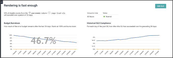
Our goal in putting together the main SLO display was to let users see where the burndown was happening, explain why it was happening, and remediate any problems they detected.
This screenshot gives a sense of the SLO screen. At the top-left, the “remaining budget” shows how the current SLO has been burned down over 30 days. Note that the current budget has 46.7% remaining. We can also see that the budget has been gradually burning slowly and steadily.
The top-right view shows our overall compliance: for each day of the last 30, what did the previous 30 look like? We’re gradually getting better.
Contrast this view: we’ve burned almost three times our budget (-176% means we burned the first 100%, and then another 1.76 of it).

A lot of that was due to a crash a few weeks ago — but, to be honest, our steady state of burning was probably lower than it wanted to be. Indeed, we’ve never exceeded our goal of 99.5% at any time in the last 30 days.
Explaining the Burn
The top parts of the screen are familiar and occur in many tools. The bottom part of the chart is, to me, more interesting, as they take advantage of the unique aspects that Honeycomb has to offer. Honeycomb is all about the high-cardinality, high-dimensional data. We love it when users send us rich, complex events: it lets us give them tools to provide rich comparisons between events.
The chart on this page shows a heatmap. Like other Honeycomb heatmaps, it shows the number of events with various durations (Y axis) by time (X Axis). This time, though, it adds yellow events that failed the SLI. This image shows that the yellow failed events are largely ones that are a little slower than we might expect; but a few are being processed quickly and failing.

Contrast this image, which shows that most of the failed events happened in a single burst of time. (The time axis on the bottom chart looks only at one day, and is currently set on one of the big crash days).

Last, we can use Honeycomb’s BubbleUp capability to contrast events that succeeded to those that failed — across every dimension that is in the dataset! For example, in this chart, we see (in the top left) that failing events had status codes of 400 and 500, while succeeding events had status codes of 200.

We can also see — zooming into the field app.user.email in the second row — that this incident of burn is actually due only to one person — encountering a small number of errors.
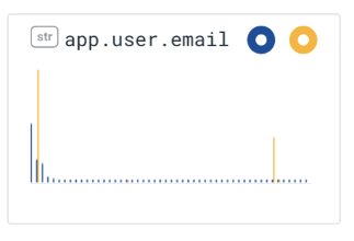

This sort of rich explanation also lets us discover how to respond to the incident. For example, seeing this error, we know several things: we can reach out to the relevant customer to find out what the impact on them was; meanwhile, we can send the issue to the UX team to try to figure out what sequence of actions got to this error.
User Responses to SLOs
From the earlier versions of SLOs, we got useful and enthusiastic responses to the early betas. One user who had set up their SLO system, for example, wrote: “The Bubble Up in the SLO page is really powerful at highlighting what is contributing the most to missing our SLIs, it has definitely confirmed our assumptions.”
Another found SLOs were good to show that their engineering effort was going in the right direction: ““The historical SLO chart also confirms a fix for a performance issue we did that greatly contributed to the SLO compliance by showing a nice upward trend line. :)”
Unfortunately, after that first burst of ebullience, enthusiasm began to wane a little. A third customer finally gave us the necessary insight: “I’d love to drive alerts off our SLOs. Right now we don’t have anything to draw us in and have some alerts on the average error rate .... It would be great to get a better sense of when the budget is going down and define alerts that way.”
Designing an Alert System
We had hoped to put off alerts until after SLOs were finished. It had become clear to us — from our experience internally as well as our user feedback — that alerts were a fundamental part of the SLO experience. Fortunately, it wasn’t hard to design an alerting system that would warn you when your SLO was going to fail in several hours, or when your budget had burned out. We could extrapolate from the last few hours what the next few would look like; after some experimentation, we settled on a 1:4 ratio of baseline to prediction: that is, a one-hour baseline would be used to predict four hours from now; a six hour baseline would be used to predict the next day.
We built our first alert system, wired it up to check on status every minute ... and promptly arranged a $10,000 day of AWS spend on data retrieval. (Before this, our most expensive query had cleared $0.25; this was a new and surprising cost).

Tony Hoare is known to have said that “premature optimization is the root of all evil;” it turns out that some optimization, however, can come too late. In our case, running a one-minute resolution query across sixty days of data, every minute, was asking a lot of both our query system and our storage.
We paused alerts; and rapidly implemented a caching system.
Caching is always an interesting challenge, but perhaps the most dramatic issue we ran into is that Honeycomb is designed as a best-effort querying system which is ok with occasional incorrect answers. (It’s even one of our company values: “Fast and close to right is better than perfect!”). Unfortunately, when you cache a close-to-right value, that means that you keep an incorrect value in your cache for an extended period; occasional incorrect values had an outsize effect on SLO quality. Some investigation showed that our database was able to identify queries that were approximations, and that few retries would usually produce a correct value; we ended up ensuring that we simply didn’t cache approximations.
(We had other challenges with caching and quirks of the database, but I think those are less relevant from a design perspective.)
Handling Flappy Alerts
One of our key design goals was to reduce the number of alerts produced by noisy systems. Within a few days of release, though, a customer started complaining that their alert was turning just as noisy.
We realized they’d been unlucky: their system happened to be such that their burndown was being estimated at just about four hours. A bad event would pop in — and it would drop to 3:55. A good event would show up, and they’d bump up to 4:05. This flapping would turn on and off the alerts, frustrating and annoying users.
Fortunately, the fix was easy once we’d figured out the problem: we added a small buffer, and the problems went away.
Learning from Experience
Last, I’d like to reflect just a little on what we’ve learned from the SLO experience, and some best practices for handling SLOs.
- Volume is important. A very small number of events really shouldn’t be enough to exhaust budget: if two or three failures can do it, then most likely, a standard alert would be the right use case. The SLO should tolerate at least in the dozens of failed events a day. Doing the math backward, an SLO of 99.9% needs a minimum level of traffic of a few tens of thousands of events a day to be meaningful.
- Test pathways, not users: It’s tempting to write an SLO per customer, to find out whether any customer is having a bad experience. That seems not to be as productive a path: first, it reduces volume (because each customer now needs those tens of thousands of events); second, if a single customer is having a problem, does that imply something about the system, or the customer? Instead, writing SLOs on paths through the system and on user scenarios seems like a better way to identify commonalities.
- Iterating is important: We learned rapidly that some of our internal SLOs were often off by a bit: they tested the wrong things, or had the wrong intuition for what it meant for something to be broken. For example, “status code >= 400” gets user errors (400s) as well as failures in our own system (500s). Iterating on them helped us figure out what we wanted.
- Cultural change around SLOs can be slow. Alerts on numbers in the system are familiar; SLOs are new and may seem a little unpredictable. Internally, our teams had been slow to adopt SLOs; after an incident hit that the SLOs caught long before alarms, engineers started watching SLOs more carefully.
Conclusion
SLOs are an observability feature for characterizing what went wrong, how badly it went wrong, and how to prioritize repair. The pathway to implementing SLOs, however, was not as straightforward as we’d hoped. My hope by putting this post together is to help future implementors make decisions for their paths — and to help users know a little more about what’s going on behind the scenes.
Want to know more about what Honeycomb can do for your business? Check out our short demo!

Top comments (0)