inline and block are the fundamentals of how things are laid out on a page. In this article, we will see how inline, block, and inline-block behaves in normal flow.
In normal flow, inline elements display in the inline direction, that is in the direction words are displayed in a sentence according to the Writing Mode of the document. Block elements display one after the other, as paragraphs do in the Writing Mode of that document. In English therefore, inline elements display one after the other, starting on the left, and block elements start at the top and move down the page.
We will take English as the writing mode in this article.
Block
A block element will take up the horizontal space of its container.
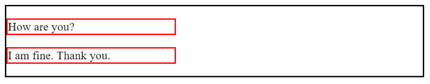
<div>
  <p>
    How are you?
  </p>
</div>
div {
  border: 2px solid #000;
}

p {
  border: 2px solid red;
}
div and p by default are block elements, notice that the content inside p is not much, but it takes up the full width of its parent div.

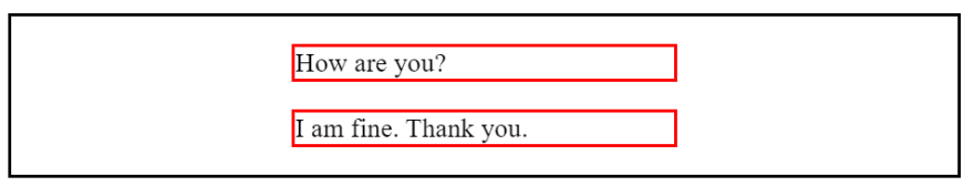
We can set width of an block element, but it will still consumes the horizontal space.
p {
  width: 40%;
}
It looks like there is room for two p to fit on a same line, but because they are block elements, they consume all horizontal space.
Because now there is some space assigned to p is left, we can set left and right margin to auto to center the p horizontally.
p {
  width: 40%;
  margin-left: auto;
  margin-right: auto;
}
p are now centered.
Margin collapse
In normal flow, vertical margin between two adjacent block elements will collapse. The bigger number of margin wins.
<div class="container">
  <p>hi</p>
  <p>hello</p>
</div>
p:nth-child(1) {
  margin-bottom: 60px;
}

p:nth-child(2) {
  margin-top: 80px;
}
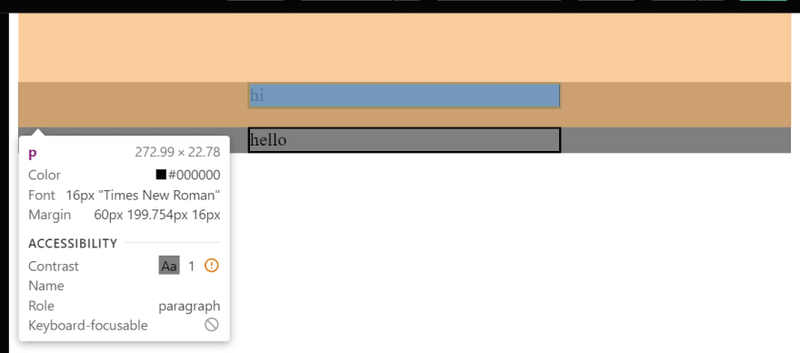
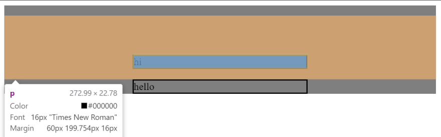
First p has 60px margin bottom.
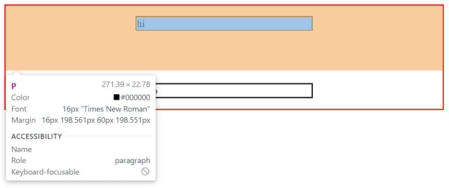
Second p has 80px margin top. 80px is greater than 60px, so the margin between two p is 80px.

When a child element touches its parent top or bottom, the top or bottom margin also collapses. For example:
.container {
  background: hsl(0 0% 0% / .5);
}

p:nth-child(1) {
  margin-top: 60px;
}

p:nth-child(2) {
  margin-bottom: 60px;
}
The parent element .container is the gray area and it doesn't have any padding or border.
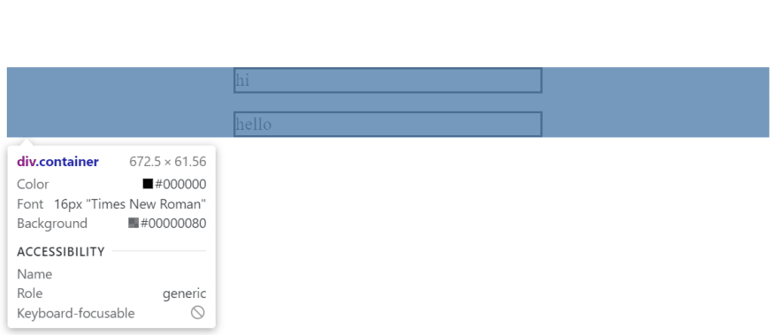
First p has 60px margin top, we would expect it to create a distance between it and its parent container. But because its box model touches the top of its parent, margin collapse.
Similar thing happens to second p margin bottom.

Adding padding or border on parent element to create some space is a way to handle this issue.
.container {
  padding-top: 16px;
}
There is some space between .container and first p. Their box models no longer overlaps. So margin top of the first p can create distance between p and the .container.
Inline
An inline element does not start on a new line and only takes up as much width as necessary.
em by default is an inline element.
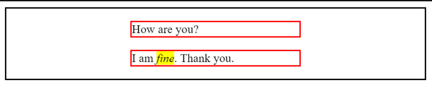
<p>
  I am <em>fine</em>. Thank you.
</p>
em {
  width: 200px;
  height: 200px;
  background: yellow;
}
Setting width or height on an inline element doesn't have any effect.
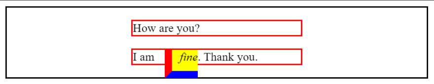
Setting vertical padding, margin, or border won't affect the layout. Actually, setting vertical margin on an inline element doesn't have any effect.
em {
  background: yellow;
  padding-left: 10px;
  margin-left: 10px;
  border-left: 10px solid red;

  padding-bottom: 10px;
  margin-bottom: 10px;
  border-bottom: 10px solid blue;
}
Notice that the box of em can stick out bottom of its container.
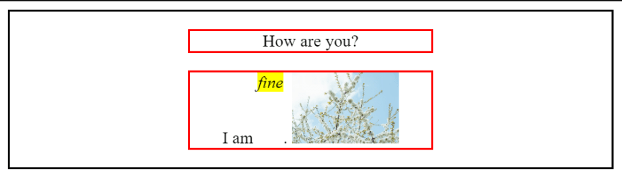
We can set text-align on parent element to align inline element in horizontal space. img by default is an inline element.
<p>
  I am <em>fine</em>. Thank you.

  <img src="https://images.pexels.com/photos/11789773/pexels-photo-11789773.jpeg?auto=compress&cs=tinysrgb&w=600&lazy=load" alt="" width="100">
</p>
p {
  text-align: center;
}
Content inside p is centered horizontally.

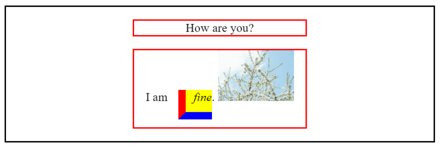
Notice that the text are aligned vertically to the bottom of the img. Each line of text form a line box, we can use vertical-align to control vertical position of an inline elements within that line box.
em {
  vertical-align: top;
}
Because img is larger, a larger line box is generated, therefore we can use vertical-align on em to change its vertical position within that line box.
We can use vertical-align: bottom; to get rid of a small extra space created by img at the bottom.
img {
  vertical-align: bottom;
}
The small space at the bottom of img is removed.

Because img is special, people usually would set it to display: block with width: 100% or max-width: 100% and put it inside a wrapper element like div, so img won't create a gap at the bottom, and can grow and shrink according to the size of its container.
img {
  max-width: 100%;
  display: block;
}
The difference between max-width: 100%; and width: 100%; is that setting max-width: 100%; on img only allows it to grow as much as its original size. Setting width: 100%; allows img to grow as much as its container size. When we resize a img more than its original size, it gets blurry.
Inline-block
Inline-block is inline outside and block inside. Inline outside means that it can be aligned horizontally by its parent with text-align and can align itself vertically with vertical-align like an inline element. Block inside means that its box model is respected as a block element, which means that setting padding, border, margin on it will affect the layout.
Before setting display: inline-block; on em.

After setting display: inline-block; on em.
There are two types of inline element, Replaced elements and non-replaced elements. Inline-block elements and img are replaced elements. Generally, we only need to know that there are different kinds of inline elements and know what is happening when setting properties does't work.
Wrap up
In this article, we look at a few examples of how inline element and block element behave in normal flow. We learn that some properties work differently on them. I hope this could help you distinguish a problem when setting a property on an element doesn't work.

Top comments (0)