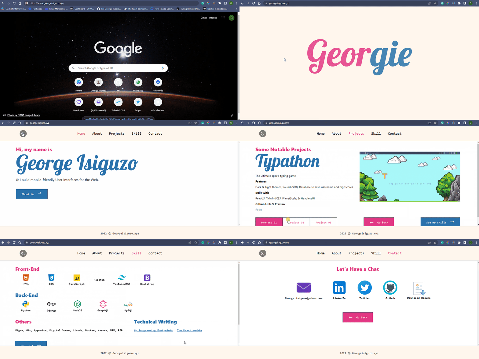
I built it with ReactJS, TailwindCSS and HeadlessUI.
See link to portfolio here: https://www.georgeisiguzo.xyz/
Just in case you want to create something similar, I want to share how I added 3 key features to the portfolio.
The Key Features
- Pre-Loading Screen
- Transition
- Light/Dark Theme
Now let's begin.
If you're using TailwindCSS, what I'm about to show will be very applicable to you and if you aren't, I wonder why? 😁
Pre-Loading Screen
See the pre-loading screen below:
Now before I show you how to add one to your portfolio or any other app, what's the essence of a preloader on your app?
Preloaders, particularly animated ones, look nice and provide a solid first impression - bootcamp.uxdesign.cc.
Not my words! Lol... But several notable tech portfolios do have them for example - brittanychiang
How to create a pre-loader in a ReactJS app:
We will use functional components and React hooks for all examples in this article:
This is the code to create a pre-loader:
import React, { useEffect, useState } from "react"; // #1

function App() {
  const [isLoading, setIsLoading] = useState(true); // #2

// #3
  useEffect(() => {
    const timer = setTimeout(() => {
      setIsLoading(false);
    }, 5000);

    return () => {
      clearTimeout(timer);
    };
  }, []);

  return (
    <div className="app">
      {!isLoading && ( // # 4
        <div className="flex flex-col h-screen">
          {// put your main page content here}
        </div>
        )
      }
      {isLoading && ( // # 5
        <div className="flex flex-col h-screen">
          {// put your preloader content here}
        </div>
        )
      }
    </div>
  )

}

export default App;
Explanation:
- First we import React,
useState, anduseEffecthooks. - Next we create a true/false (boolean) variable called
isLoadingwhose value will determine what will show on the page. The initial value forisLoadingistrue. - We use the
useEffecthook to change the value ofisLoadingafter 5 secs usingsetTimeout() - We use conditional rendering for #4 and #5 to determine how to show our preloader and the main content
Try it out.
Complete the code snippet with your desired content.
Transition
See how one section of my portfolio transitions to another below:
Why add a transition between pages/sections?
Page transitions are animated transitions between pages that give websites that extra touch that distinguishes them as top-notch and worthy of a good browse. So, when applied correctly, it can give a sense of liveliness and help significantly with navigation - orpetron.com
Yeah, page transitions make websites cool 😎
Now how can you add page transitions to your app?
While there are other libraries you can use (and you can also use pure CSS), CSS is hard for me so I use HeadlessUI for transitions.
Before using the code below, you will first need to install HeadlessUI using npm like this:
npm install @headlessui/react
Now, the code:
import { Transition } from "@headlessui/react"; // #1

...
<Transition // #2
    show={true} // place a boolean variable here to determine when to show this component
    enter="transition ease-in-out duration-700 transform"
    enterFrom="translate-x-full"
    enterTo="translate-x-0"
    leave="transition ease-in-out duration-500 transform"
    leaveFrom="translate-x-0"
    leaveTo="translate-x-full"
    >
        {// place component content here}
</Transition>
Explanation:
- First we import
Transitionfrom HeadlessUI - Next we can use
Transitionanywhere in our app - Take note of the values of each property (prop) of
Transitionespeciallyshow. -
showdetermine when the component insideTransitionwill enter and when it will leave the user's screen. - Other props like
enter,leave,enterToetc determine the transition behavior of the component. How it will enter and leave the screen.
See HeadlessUI doc here to know how to tweak each prop.
Let's use Transition to render our preloader and main content like so:
import React, { useEffect, useState } from "react"; // #1

function App() {
  const [isLoading, setIsLoading] = useState(true); // #2

// #3
  useEffect(() => {
    const timer = setTimeout(() => {
      setIsLoading(false);
    }, 5000);

    return () => {
      clearTimeout(timer);
    };
  }, []);

  return (
    <div className="app">
      <Transition
          show={!isLoading}
          enter="transition ease-in-out duration-700 transform"
          enterFrom="translate-x-full"
          enterTo="translate-x-0"
          leave="transition ease-in-out duration-500 transform"
          leaveFrom="translate-x-0"
          leaveTo="translate-x-full"
        >
          <div className="flex flex-col h-screen">
            {// put your main page content here}
          </div>
      </Transition>
      <Transition
          show={isLoading}
          enter="transition ease-in-out duration-700 transform"
          enterFrom="translate-x-full"
          enterTo="translate-x-0"
          leave="transition ease-in-out duration-500 transform"
          leaveFrom="translate-x-0"
          leaveTo="translate-x-full"
        >
          <div className="flex flex-col h-screen">
            {// put your preloader content here}
          </div>
      </Transition>
    </div>
  )

}

export default App;
Explanation:
- We used
Transitiontwice, one for the main content and the other for the preloader. - We passed
isLoading(a boolean) as the value for theshowprop. - For main content, the
showprop value is!isLoading. We use!beforeisLoadingmeaning the opposite or inverse of the current value ofisLoading.!also means not (i.e !isLoading means not isLoading) - For the preloader, the
showprop value isisLoading.
That's just it.
Light/Dark Theme
Finally, changing themes from light to dark and vice versa.
Why does your app need this feature?
Let me answer without reference to an external source for once 😅
Put simply:
As a web app user, I have a preference. At night, I prefer all my apps to be on dark mode. Sometimes during the day, I place all apps on dark mode, especially my Twitter app. I believe every other user also has a preference so giving users the ability to set your app theme the way they like is a big win for User Experience (UX) - TheReactNewbie
I hope you agree with me 😉
Now for the how?
How can you add a switch between light and dark mode in your React App?
TailwindCSS makes this very easy.
Fortunately for me and for you, I have already written a step-by-step guide on how to do this so
Head over to the article here and enjoy!.
Okay. That's it for now.
I hope you found this article helpful.
I welcome feedback and constructive criticisms of my portfolio. Thank you as you do
Here's a link to the portfolio again:


Top comments (4)
Wonderful 😍
Thanks Atul 😊
One thing to add would be to transition to the side pointed by an arrow instead of forwards and back having the same animation
Thanks David. That's a good one!
I'll make the correction 👍