Story by Eric Daily
When you have so many people using your app, it can be pretty tough to make a good first impression. But thanks to the Mere Exposure Effect, you can rest assured that they’ll love your design.
Just give it time…
This post is part of a 9-part series on UX psychology. The next post in the series will be coming soon.
What is the Mere Exposure Effect?
The Mere Exposure Effect dictates that people learn to prefer otherwise neutral stimuli simply because they’ve been exposed to them more frequently. Put simply, people like things they’re familiar with–whether that’s people, objects, symbols, brands, or apps.
So What?
Many of the previous psychological principles have been pretty easy to apply to UX–but this one feels more like something you’d hear about from Chad in Marketing. Does it really make a big difference in the wild world of UX?
Researchers have been asking the same questions.
A Berlin Institute of Technology study examined how the user’s perception of “good UX” changes over time. Each subject was asked to evaluate 102 interfaces. The following two images, 1a and 1b, were repeated 30 times each throughout the set.
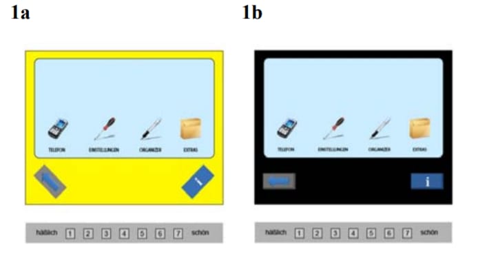
The researchers hypothesized that the Mere Exposure Effect would kick in. These were the results.

While users grew to love the high-aesthetic interface, they grew to hate the low-aesthetic one. Why? Is the Mere Exposure Effect selective?
The answer is simpler than it seems: there’s a sneaky exception to the rule. The stimulus has to start out as neutral or good. If people don’t have any strong opinions about the design, they’ll grow to like it. However, no amount of exposure can fix 1a.
That’s a nice rule to remember in your own UI endeavors: mere exposure makes good designs better, but it makes bad designs worse. Keep longevity in mind and your design will be indestructible.
Familiar Buttons
What if I told you that familiar buttons are more clickable?
It should come as no surprise that the Mere Exposure Effect lends itself well to marketing and UI design. However, you may be surprised to learn that the rule comes in handy when building UI elements. If all your buttons have similar text and design, they’ll slowly grow on your users–so keep your buttons consistent.
That’s also one of the big reasons why a consistent call to action is so important: it sticks with your user. Think about Spotify. Throughout the UI, the call to action is to upgrade to Spotify premium.
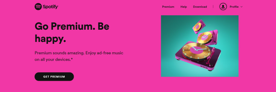
As the user sees more buttons and ads, the message starts to sink in. Consistent copy makes them click.
Memorable Marketing
Not a designer? That’s okay. The mere exposure effect is useful for marketers, too.
Have you ever tried ad retargeting? Congratulations! You’ve used the mere exposure effect. By targeting ads at people who have already visited your website, you’re repeatedly exposing them to your brand. Over time, the visitor grows more familiar with your brand and, possibly, becomes a customer.
Once you take a look at the statistics, the results speak for themselves. While most ads have a click-through rate of 0.07%, retargeted ads top out at 0.7%. Plus, retargeted visitors are 70% more likely to convert into customers.
Why? Psychology.
Of course, there are many factors at play, but one is clearly the mere exposure effect. Visitors who are frequently exposed to your brand after leaving your website will learn to love your products or services.
Non-Annoying Notifications
Ads are pricy. How can your app live in your user’s head without paying rent?
Notifications are a great starting point. If you subtly remind your user that your app exists, they will be more likely to use it.
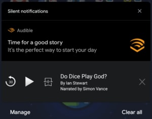
Audible is great at notifications. It notifies you of new sales and interesting titles without spamming you. Plus, when you’re listening to an audiobook, the app sends you a notification to pause, play, and skip.
Since these notifications are so subtle and strategic, users are more likely to click on them. Thus, they are exposed to the app more frequently.
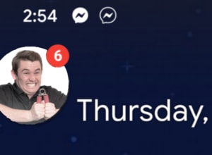
Another great example is Facebook Messenger. Of course, it notifies you whenever someone sends a message–but that’s not what sets it apart. When you receive a notification on android, a chat head pops up. Now, the user has two separate notifications to worry about, so they are more likely to click one and expose themselves to the app.
However, not every app can get away with notifications. If you notice your user too frequently, they’ll get annoyed. But this problem is easy to fix: just do a little more planning. Instead of spamming your users, research them. Then, use that newfound information to send strategic notifications at specific times.
Mere exposure isn’t hard if you plan ahead. Simply considering the lifetime of the user will put your UX miles ahead of the competition and get you more bang for your buck. To chat with one of our expert designers about UX longevity, reach out online or call us at 602.638.2839.

Top comments (0)