Story by Reed Steiner.
Psychology can make your UX design better–or it can trick the user. Designers call these tricks “dark patterns,” and recognizing them is crucial for human-centered UX. Avoid dark patterns at all costs.
This post is the final part of a 9-part series on UX psychology. Read the first article on Social Proof.
What Are Dark Patterns?
Dark patterns are bits of deceptive UX that pressure, trick, or mislead users into doing things they don’t want to do. Sometimes, dark patterns abuse the principles of UX Psychology that we’ve talked about in this series. Other times, the designer simply build a UX so broken that users are forced to follow their every whim.
So What?
Dark patterns are pretty evil. Whether you design UX, work on a team that designs UX, or just use apps and websites, it’s your duty to fight back. This guide will help you recognize the most common dark patterns and call them out.
Wait–What About The Big 12?
There are a lot of dark patterns–and just as many ways to categorize them.
Most of the UX industry refers to what I call the “Big 12,” which are the items listed on the Dark Patterns website (if you haven’t visited that website, check it out).

While I absolutely applaud Brignull for initiating the whole movement and Darlo for keeping the website together (check out their mission here–it’s genuinely awesome), their categories could be better. For instance, “hidden costs” and “sneak into basket” are very similar–why aren’t they grouped together? And fake countdown timers are pretty malicious–which category do they fit into? While the big 12 are perfect for education, they aren’t very comprehensive.
The Scientific Dark Pattern Taxonomy
Brignull and Darlo have done absolutely amazing work, but their categories need an update.
In this article, I’ve used the categories listed in the academic paper Dark Patterns at Scale: Findings from a Crawl of 11K Shopping Websites. As the title of the paper suggests, researchers crawled 53,000 pages on 11,000 shopping websites. Then, they used this data to identify fifteen distinct types of dark patterns, which were organized into seven categories.
I will be using a modified version of the “Princeton List” because it prioritizes dark patterns that are empirically more common. However, I’ll also discuss a few more dark patterns that are extremely dangerous, but hard to measure on a large scale.
Sneaking
Sneaking occurs when a website adds extra costs and fees without telling the user. Usually, the website withholds these additional costs until the last possible second, in the hopes that the user won’t notice.
Dark Pattern #1: Basket Sneaking

1 in every 1,570 eCommerce websites (estimations based on the number of offending websites out of the 11,000-website sample in Dark Patterns at Scale, rounded to the nearest ten.)
Have you ever found items in your basket that you didn’t put there? That’s basket sneaking.
Unethical eCommerce websites will add extra items to your cart–even if you didn’t want them in the first place. For example, when I added a laptop to my basket on Laptop Outlet, it also added a mouse and one year of security software.

Unless the user steps in to remove these extra products, they’ll spend more than they bargained for. Basket sneaking is illegal in the UK and certain EU countries, but not in the US.
Dark Pattern #2: Hidden Costs

1 in every 2,200 eCommerce websites
While some websites trick users to buy items they don’t want, others will simply charge the user undisclosed fees.
Hidden costs have been around for as long as paid services, but they’re especially deceptive online. On the internet, many websites can keep these fees hidden until the last possible second and slap on an ambiguous label.

Fees aren’t always bad, but they become a bigger problem when they’re disclosed too late.
Dark Pattern #3: Hidden Subscription

1 in every 850 eCommerce websites
Have you ever been charged for a subscription you didn’t know about? That’s pretty problematic, right?
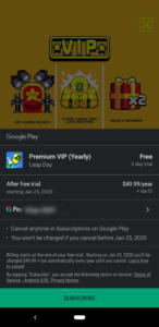
Many apps–especially mobile games–will rope you in with a “free” label before hitting you upside the head with a hidden subscription. While Google play does disclose this information, it’s not always enough to stop young kids from spending the big bucks on a parent’s account.
But hidden subscriptions hardly stop there. More devious websites will disguise a subscription as a one-time purchase. That way, the shopper doesn’t even realize that they’ve subscribed until it’s too late.
Fake Urgency
Urgency isn’t inherently bad, but it can be extremely misleading when abused. It becomes a problem when websites create false urgency to trick people.
Dark Pattern #4: Fake Countdown Timer

1 in every 80 eCommerce websites
Some online purchases require countdown timers. Movie theaters can only reserve your seats for so long, so they add a countdown timer.
But in most cases, such as the one below, countdown timers only add urgency to a sale.
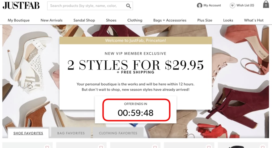
However, that “1 in 80” statistic does not describe all websites with countdown timers. That statistic exclusively describes eCommerce websites with fake countdown timers. That means that a whopping 1.2% of eCommerce websites either reset their timers or continue the sale after it hits zero.
That number is even more shocking when you remove websites without countdown timers. Out of 393 websites with countdown timers, 140 were fake–that’s almost 40%!
Countdown timers can be stressful, but fake countdown timers are downright deceptive.
Dark Pattern #5: Sales With Ambiguous Deadlines
1 in every 130 eCommerce websites
If your offer is only available for a limited time, tell the user when it ends. Don’t list a sale without a deadline, as Samsung does.

Sales with ambiguous deadlines are problematic because they create an entirely false sense of urgency. However, that doesn’t mean you need to cut out all limited-time offers. Newegg removes the dark pattern by telling you exactly when the sale is going to end.

Remember: there’s a fine line between clever UX and dark patterns, so be careful.
Misdirection
Misdirection is one of the worst dark patterns. It occurs whenever websites intentionally sway a user toward a certain choice.
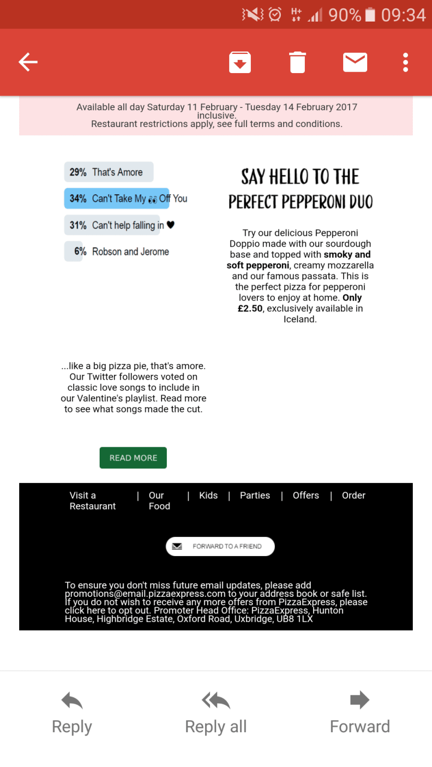
Dark Pattern #6: Confirmshaming

1 in every 70 eCommerce websites
Confirmshaming shames users into confirming, hence the name. It uses tricky, emotional language to make the user feel bad about not making a choice.

Confirmshaming is most common in email lists and popup notifications. However, it is by no means limited to these sources. Even Neil Patel’s website uses confirmshaming to make users feel bad.

Of course, confirmshaming improves the website’s click-through ratio. However, it also reduces the value of each click. If people only clicked a link because they felt bad, they won’t convert as easily.
Since confirmshaming makes the user do something they wouldn’t normally do, it’s a form of abusive UX.
Dark Pattern #7: Visual Interference

1 in every 460 eCommerce websites
A good designer will make sure important elements stand out. A malicious designer will make important, but non-preferable elements harder to see.
“Visual interference” describes the use of visuals to trick the user. This category is very broad, but very common outside of eCommerce websites.
Emails use visual interference all the time. Instead of putting the unsubscribe link somewhere visible, they hide it away in the hopes that the user won’t see it.
Of course, visual interference is hardly limited to emails. The dark pattern lives on in any design that tricks or manipulates users with visuals.
Dark Pattern #8: Trick Questions
1 in every 1,200 eCommerce websites
Even forms aren’t safe from dark patterns. In fact, they’re especially vulnerable to manipulative design. This example from the Dark Patterns website is a classic.

Checking one box opts out of the newsletter while checking the other opts in. Unless the user reads carefully, they may check the wrong box. The user doesn’t want emails, but they may get them because of the way the text is written.
Dark Pattern #9: Pressured Selling

1 in every 180 eCommerce websites
Is pressured selling a dark pattern? That’s debatable.
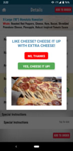
On one hand, it can add genuine value to a customer’s experience. The Domino’s Pizza App gives the user an option to add extra cheese–that feature could be very useful.
However, the paper’s taxonomy defined pressured selling as “asymmetric” (pushing something pricy the user wouldn’t have purchased otherwise) and “partially covert.” In the context of the study’s sample, these criticisms make sense. However, I’m not sure if the same can be said for every single instance of pressured selling. This one is pretty nuanced, so it comes down to the case. However, I will admit that in the context of most eCommerce websites, it’s pretty overboard.
Fake Social Proof
Social proof isn’t bad on its own–Spotify uses it to help you find music, Youtube uses it to rank videos, and countless other apps and websites use it to help the user. However, social proof becomes a problem when companies lie.
Dark Pattern #10: Fake Activity

1 in every 550 eCommerce websites
Are there really “three people viewing this item” right now?
Social proof can be very powerful, but when companies don’t have the numbers to pull it off, they fake it. Instead of letting that “0” work against them, they generate numbers. In fact, it’s so easy and common that you can find simple instructions like these pretty much anywhere.

And the worst part is that these numbers could be much higher (I only counted instances of social proof that were verifiably fake instead of all social proof). While 20 of the websites in the sample used a number generator, many of them kept that information on the server-side.
Dark Pattern #11: Testimonials Of Uncertain Origin

1 in every 920 eCommerce websites
Testimonials and reviews are wonderful–if they’re real.
A surprisingly high number of testimonials are completely fake–the researchers searched several testimonials and found exact matches with different customer names on several sites.
But this research barely scratches the surface when you include Amazon. Reviews are so important on Amazon that most companies will spend as much as possible to get good ones. Even verified purchasers aren’t reliable when companies pay people to buy and review their items.
A great tool for combating fake Amazon reviews is ReviewMeta. It analyzes the reviews and generates detailed reports, then gives you an adjusted rating. I ran a report (shown below) to demonstrate what the chrome extension can do.

Of course, this program only works for amazon reviews–it doesn’t even begin to cover testimonials.
If you ever need to make a decision based on a testimonial, google it first to make sure it’s real.
False Scarcity
Scarcity, like social proof and urgency, isn’t always bad. However, it becomes a problem when websites lie about how scarce an item really is.
Dark Pattern #12: Low-Stock Messages

1 in every 20 eCommerce websites
Sometimes, companies run low on an item–that’s just how business works. But it’s a bit suspicious when their entire inventory is almost entirely gone–especially if it isn’t the holidays.

This message, for instance, appeared on most products at the time in which the paper was written (they’ve since toned it down a bit).
However, it’s hard to draw the line between a deceptive message and a genuine one. Maybe the company really does have low stock, or maybe they’re lying to drive sales. It’s impossible to tell, which is why so many websites were flagged by the research team.
Dark Pattern #13: Deceptive High-Demand Messages

1 in every 290 eCommerce websites
High-Demand messages function in the same way, but they’re a bit more manipulative. “Low stock” indicates that items are so popular, the company is running low. “High-demand” means the same thing, but it’s even more ambiguous.
Obstruction
Obstruction occurs whenever the UX prevents a user from completing an action. Instead of misrepresenting option A (misdirection) or forcing option A upon the user (forced action), an obstructive UX makes option B nearly impossible.
Dark Pattern #14: Roach Motels

1 in every 350 eCommerce websites
The researchers called these dark patterns “Hard to Cancel,” but let’s face it: Brignull hit the nail on the head with “Roach Motel.”
A roach motel is a situation that’s easy to get into, but very hard to get out of–just like a real roach trap. Usually, a company will make account deletion so difficult that most users will give up.
Amazon is notorious for this dark pattern. Deleting an Amazon account is so difficult that it’s nearly impossible without an internet guide.
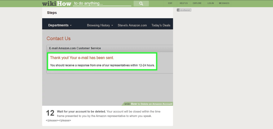
This dark pattern restricts the user by making cancellation nearly impossible.
Forced Action
Forced action is a more extreme version of misdirection. Instead of misrepresenting an option, it forces the user to choose it.
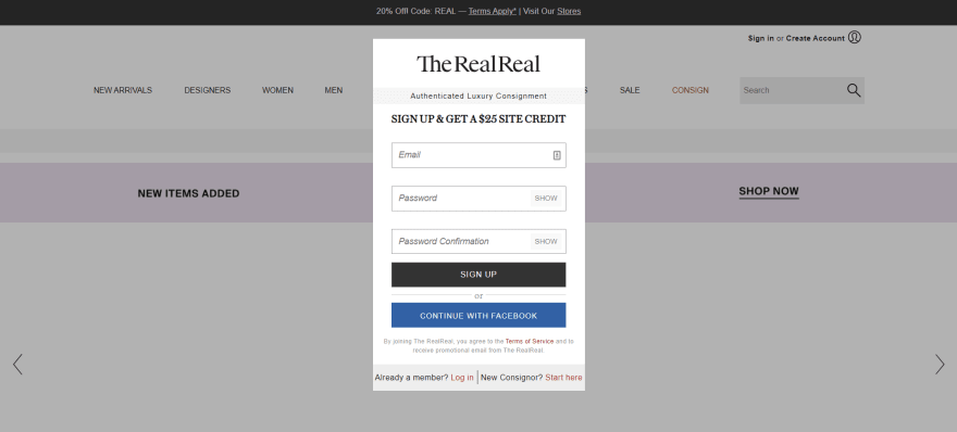
Dark Pattern #15: Forced Enrollment
1 in every 1,830 eCommerce websites
While some websites make canceling your account very difficult, others prevent you from using the website without making an account.
TheRealReal, for instance, won’t even let you browse the website’s catalog without an account.
However, most instances are more subtle. Many websites will require the user to opt in to an email list before accessing the website’s basic functionality. Since this strategy uses pressures the user to act against their own best interests, it counts as a dark pattern.
Other Dark Patterns
The Princeton study is phenomenal, but it’s not perfect. Most importantly, it only analyzes shopping websites, which biases the results a bit. Sure, eCommerce websites are the biggest offenders, but they aren’t the only ones. Wherever there’s UX, there will be dark patterns.
The following four dark patterns did not appear in the Princeton study for a few reasons. Some, like Bait and Switch are most common in apps. Others, like LinkedIn-ing, are very common on social media, but uncommon in eCommerce. Though none are as common as misdirection and false scarcity, they are still important to address.
Dark Pattern #16: Bait And Switch

Wouldn’t it be awful if pressing the “X” button on a window forced you to install software? That’s what happened in 2016, when this pop-up appeared on windows computers everywhere.
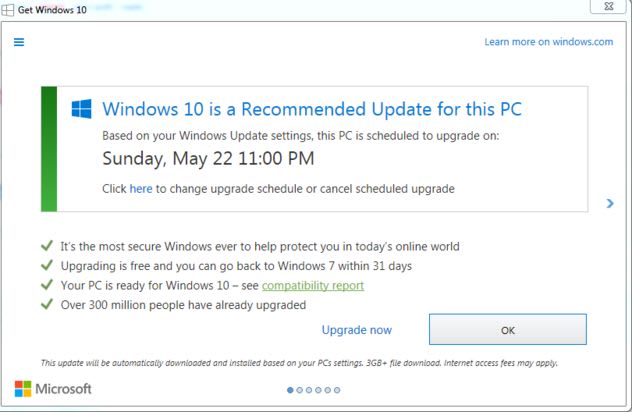
Normally clicking “X” closes the window, but in this case, it updated your computer to Windows 10.
Patterns like this one are called “Bait and Switch.” In every case of Bait and Switch, the user clicks a button expecting one thing, but gets an undesirable result. In the case of Windows 10, the user expected to close the window, but received an update.
Bait and Switch can also include advertisements disguised as UI elements (though Brignull gives disguised ads their own category). The user expects to click a button but receives an ad or virus instead. Illegal streaming services, like PutLocker, are full of these ads.

Bait and Switch dark patterns did not show up in the study because they are not very common on eCommerce websites. However, mobile game advertisements are full of them. The ad will show the user an image or video of the game interface, implying that the ad includes a free demo. But when the user tries to play the game, they tap the ad.
These ads are a clear example of Bait and Switch because the user does not intend to click the ad. While uncommon in eCommerce websites, Bait and Switch dark patterns can be very dangerous–especially if they’re riddled with malware.
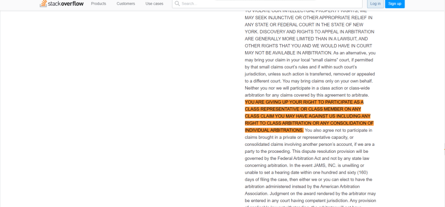
Dark Pattern #17: Privacy Zuckering

This is another dark pattern from Brignull’s list.
Privacy Zuckering, named after Mark Zuckerberg, occurs whenever a website tricks you to share information. In most cases, the user has to agree to abusive terms of service.
Don’t think Zuckering is a problem? Stack Overflow makes you surrender certain legal rights, but nothing in its UX indicates that such a significant agreement has taken place.
An easy way to avoid abusive terms of service is with Terms of Service; Didn’t Read. Of course, it doesn’t do anything to stop the sale of private data or cross-site tracking, but it flags important parts of the Terms of Service agreement so you know what you’re getting into.

If you want to prevent your data from being brokered, opt-out of as many lists as possible. Opting out of a few lists won’t solve everything, but it’s better than nothing.
Dark Pattern #18: LinkedIn-Ing

Brignull calls it “Friend Spam,” but I prefer “LinkedIn-ing.” After all, LinkedIn is the king of LinkedIn-ing.
When you create a new account, LinkedIn asks you to add your contacts. You, naturally, assume that the contacts will connect you to your friends on the network, but in reality, LinkedIn would use these contacts to spam your friends.
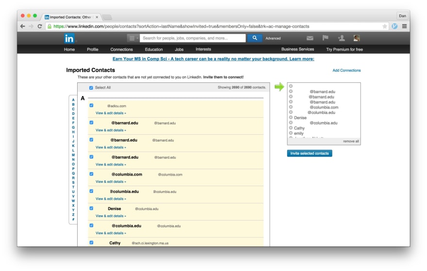
Spam is bad enough, but the deception makes it worse. The app misleads users into spamming their friends, which is clearly a dark pattern.
What Can I Do About Dark Patterns?
As a rule, dark patterns abuse the user–what can we do about them?
Take action by pressuring companies to stop using dark patterns. How? Use twitter. The Dark Patterns website includes these instructions:
Retweet, quote and favourite other people’s tweets about Dark Patterns.
@mention the offending brands and tell them what you think about their practices.
When you see a Dark Pattern, take screenshots and tweet it.If you’ve got an example that doesn’t fit into a tweet, you can use a platform like Medium or Imgur, then tweet it.
Mention @darkpatterns or use the hashtag #darkpattern.
A simple tweet is enough to put pressure on devious companies. Let’s fight for ethical UX, one tweet at a time.
If you want to learn more about our human-centric UX design, reach out to us online or call us at 602.638.2839.

Top comments (2)
Nice read
Thank you, Matei! Check out our blog for more UX related posts.