
Painting has been around for thousands of years. During this time these painters have learned one or two things about design. Important things. The great news is that many of these fundamentals can be utilised when designing for the web. I have spent many years getting oil paint on every surface in my house. To save you time scrubbing your furniture, clothes and child with turps, I've put some of these fundamentals into a handy list for you.
Focal Points
You generally have focal points in paintings, photography and websites. These are areas that draw your attention. You don't want all of the elements competing for the viewers attention.
From the focal point you have to lead them by the hand to other parts of the painting. This is true with websites. You generally have a hero banner with something you want your users to do ( a call to action). These should be your focal points. Your call to action is usually the second focal point, after their attention is grabbed by an image or illustration. Sendinblue has a great video as their focal point. You look at the video first, then you are drawn to their call to action button.

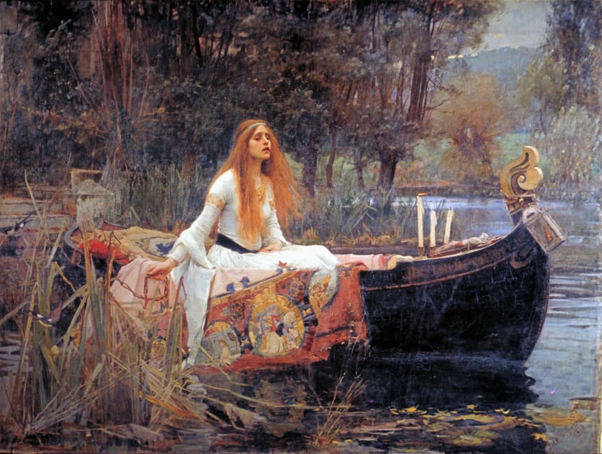
Here is a great Waterhouse painting that has an incredibly strong focal point.
So how do we design a focal point? What makes something stand out? Usually, it is a change in a property of the colour.
The first way is a change in value, this is the easiest way to make something catch the viewers attention. I have made an image and split it in two. Each side has a small square with the same colour in the centre. As you can see, the one on the right draws your attention more. This is because the difference in value between the square and the background is greater than the other half.

The other way to make something stand out is to have a low saturated colour next to a saturated one. Which yellow square stands out more?

The one on the right. This is because the difference in saturation is greater.
Interesting Shapes
To keep an image exciting and interesting when painting or designing, it is vital that you have a variation of shapes. Stapleton Kearns calls ignoring this principle 'Potation' - where everything looks like potatoes ( or similar in shape ). If your site is just made up of only squares, then it can get visually boring for the user. Mix it up by overlapping elements, this also introduces depth.
This image is from the Dutch master Dirk Van Assaerts, which is actually a fictional persona made by Stapleton to highlight dumb design ideas.
On MCT Web I have used overlapping shapes to try and keep the user interested.

Space is important
Space creates interest. For an area to stand out, you need to have other areas that have less in them. This Rockwell painting has loads of negative space. Negative space is the space between things. The white in the shirt and chair split up the background and the focal points. These areas help to frame shapes and draw the eye.
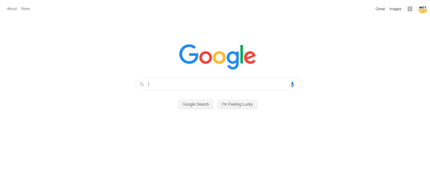
Space is equally important in web design. Take a look at all this space on google.com. It makes it obvious to the user what they should do.
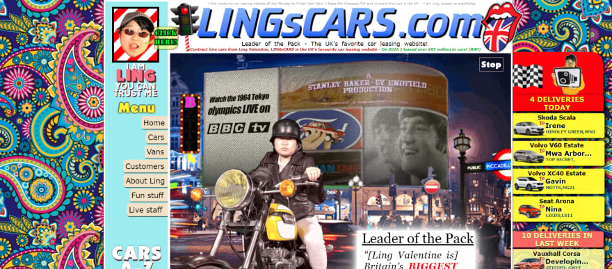
Then take a look at the famous LingsCars. It's not quite so obvious what you should do. It also emulates having a stroke, so there's that.
Let me know if you find this sort of post interesting, because there are many more principles that can be translated over and I would be happy to write about them.
You can get in touch with me via my website MCT Web

Top comments (2)
If you’re searching for trusted commercial painters in London, I’d definitely recommend taking a look at Adam’s Painting & Decorating. I recently came across their services while researching professional decorators for commercial spaces, and their work stands out for quality and reliability.
What impressed me most is their experience with different types of commercial properties, from offices and retail units to larger business premises. The finish is clean, professional, and long-lasting - exactly what you want in a commercial environment where first impressions matter. The team at Adam’s Painting & Decorating seem to understand how important timing is for businesses. They work efficiently, keep disruption to a minimum, and maintain a tidy workspace throughout the job. It’s reassuring to know you’re dealing with commercial painters in London who take both quality and professionalism seriously.
If you’re planning a refurbishment or need ongoing maintenance painting, their commercial services are worth considering.
When it comes to transforming your home or workspace, hiring Professional Painting & Decorating Contractors in London can make all the difference. At Fine Finish Decorative, we take pride in delivering top-quality craftsmanship, attention to detail, and a finish that truly stands out.
Our team of skilled painters and decorators are known for their reliability, creativity, and professionalism. Whether you’re refreshing a single room or giving your entire property a new look, we tailor our services to meet your exact needs. As one of the most trusted Professional Painting & Decorating Contractors in London, we handle everything - from surface preparation and painting to wallpaper hanging, spray finishes, and bespoke decorative work.
we believe every project deserves precision and care. We use high-quality materials and the latest techniques to ensure a long-lasting, beautiful result. Our clients appreciate our commitment to meeting deadlines and maintaining a tidy workspace, making renovations stress-free from start to finish.
Choosing experienced Professional Painting & Decorating Contractors in London means your property gets the expert touch it deserves. Whether it’s a modern apartment, a traditional home, or a commercial building, we bring your vision to life with colour, texture, and style.
If you’re ready to elevate your interiors, get in touch with Fine Finish Decorative today. Let our expertise and passion for design transform your space into something truly exceptional. Quality, care, and a flawless finish - that’s what we stand for.