
What is CSS Grid?
Grid is a layout module in CSS that utilizes columns and rows to create responsive web design layouts.
When using Flexbox, you would create a parent container in HTML and in CSS set the display property on the element to flex or inline-flex.
<div id="flex-container">
  <div>Flex Item 1</div>
  <div>Flex Item 2</div>
  <div>Flex Item 3</div>
  <div>Flex Item 4</div>
</div>
It is the same using Grid, with the display property of grid or inline-grid.
-
gridwill display the container as a block-level element -
inline-gridwill display the container as an inline-level element
Follow along on CodePen:
Grid lines divide up the grid into columns and rows.

As you can see starting from the left, the vertical and horizontal grid lines start at 1. This is the numerical index you can use to determine the positions of grid items.

You can also get the opposite end of the grid using a negative numerical index.

A Grid Cell is a single unit that is defined where the grid row & column intersect.
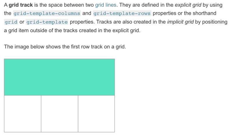
A Grid Track is the space between two adjacent grid lines, so essentially the columns and rows.
This is how it is explained on MDN:
A Gutter can be used to separate Grid Tracks, which will separate cells from each other. It is set using the gap property, which I will get into below with Explicit Grids.
Explicit Grid, fr & repeat
An Explicit Grid is just a Grid layout that is explicitly defined with the exact number of rows and columns.
You would declare these properties in the Grid Container.
grid-template-columns
In order to specify the number of columns you want, use grid-template-columns.
grid-template-columns: auto auto auto denotes three equally-sized columns spanning the width of the container.
grid-template-rows
In order to specify the number of rows you want, use grid-template-columns.
grid-template-rows: 50px 50px 50px denotes three rows with each of their heights.
gap
The gap property is used to set a gutter between grid cells.
Now that you know what each of these properties do, you can use a variety of values within them, but I will stick with either px or fr.
fr
The flexible unit fr was introduced by Grid. It represents a fraction of the available space in the grid container.
If you had three columns each with a size of 1fr, they would be equally sized within the grid container.
repeat
The repeat function is used so that you don't have to repeat yourself when defining columns or rows. It takes an argument of how many columns you would like to explicitly define, and the size of those columns.
grid-template-columns: repeat(3, 1fr)
Implicit Grid
An Implicit Grid is a layout that is used when you have more grid items than there are explicitly defined tracks.
For example, if you had explicitly defined four columns and two rows, but had more items than what could fit in the container, an implicit Grid is created using the rules you defined with the other columns and rows.
If you don't know how many items your grid will have, the whole layout could just be an Implicit Grid.
To define the sizes of Implicitly created columns and rows, you can use grid-auto-rows and grid-auto-columns with the same values from earlier.
Although the sizing in grid-auto-columns will not work if there isn't an implicit fourth column.
You can create an implicit fourth column using grid-column. grid-column is short for grid-column-start & grid-column-end.
You have to use the value of the grid lines to denote where you want the columns to start and where you want them to end. To do this, we'll use the shorthand:
grid-column: 4 / 6grid-column: starting-grid-line / ending-grid-line
The forward slash is necessary with the shorthand.

Top comments (0)