Hey everyone! It's my first post 🎉 I've been a "lurker" for years, following and bookmarking amazing devs and their articles. I figured it was time 😀
I’ve been trying to improve my CSS for the longest time, and I was fortunate enough to find Frontendmentor.io as the perfect platform to do so. It has lots of projects in different skill levels that you can practice with and add to your portfolio. If you are trying to get out of the tutorial loop, I highly recommend to check it out. Here’s how I worked out one of the major issues I ran into with the latest project I worked on.
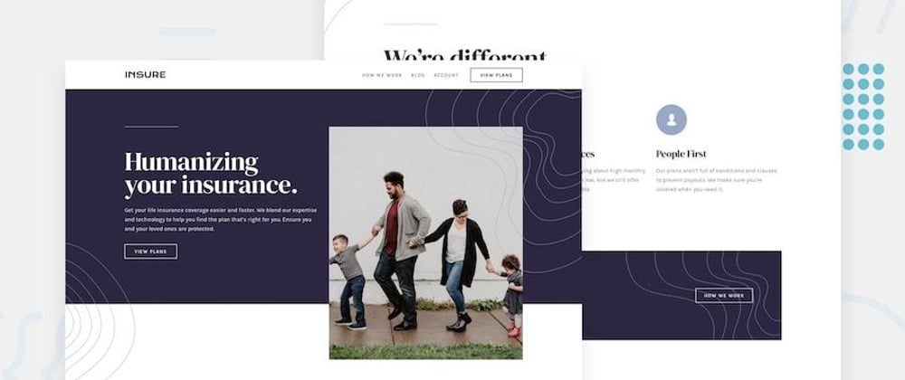
Live: https://insure-landing-page.emestabillo.now.sh/
Github: https://github.com/emestabillo/insure-landing-page
Frontendmentor submission page: https://www.frontendmentor.io/solutions/insure-landing-page-GaMK1QZAW
Planning
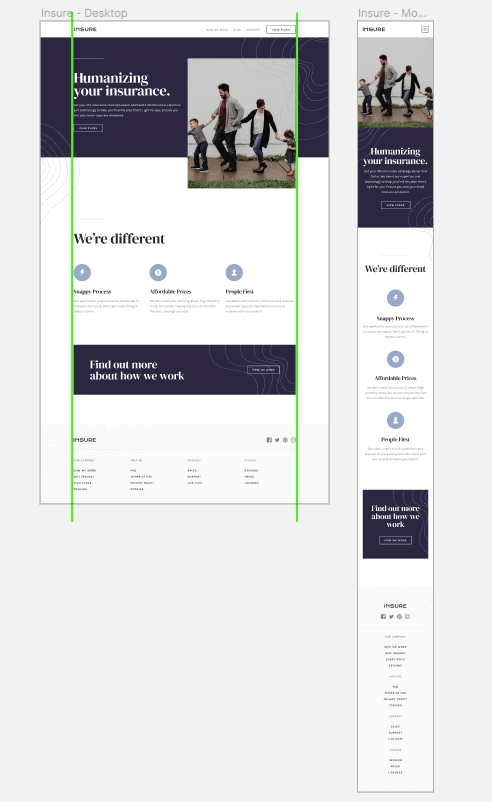
I compared the differences between the layouts and note that there’s a left and right margin going through the entire page. The hero and the footer containers however, spans the entire screen width with their contents inside these margins, so I can’t just place the whole page in one wrapper. The hero also has that photo that overflows vertically on desktop view.
The problem
My go-to solution for these kinds of layout is to place all the contents inside a container class:
.container {
   width: 90% //prevents it from touching the left and right gutter
   max-width: 110rem //keeps it fluid
   margin: 0 auto //horizontal centering
}
I tried this out initially and though it did work, it gave me another issue with the mobile layout.

The wavy background patterns also look a little odd floating around as is instead of touching the edges of the browser.
My first instinct is to ditch the container solution for the header and apply appropriate paddings. While it’s a completely valid approach, I think it would result to more media queries for larger screens, since I’m always lining it up with the rest of the page. I’d like to try to be consistent with the margins, so I had to think of another route. How do I customize the container div without affecting its use on the rest of the page?
Solution
The answer came to me while eating adobo (a popular Filipino dish). I’m using SCSS for this project, so why not take advantage of NESTING. The container is nested under .hero, so I targeted that specific container only and for smaller screens, set it at full width:
.hero {
  //styles here
  .container {
   @media screen and (max-width: 767px) {
      width: 100%;
    }
  }
}

Pretty neat!


Top comments (2)
Pretty nice! You could, however, use a mixin (basically a function but for returning css markup) if you want to reuse this code with out code dupe with the following:
The code would then generate the following css:
Great tip! 👍🏼 I did use mixins for the breakpoints, but this was one-off just for that instance so I felt it was fine doing it the long way. The mixin will be handy for maintenance though 🙂