Have you ever encountered a website with a beautiful scrollbar and thought to yourself “wow, I wish I could create something like that.” Me too! And after a little investigation, I figured out that creating a custom scroll bar for your blog or personal portfolio doesn’t take a ton of CSS.
Today we’ll build a gradient progress bar that fades in from zero opacity to full opacity as you scroll. This tutorial only requires foundational HTML, CSS, and JavaScript knowledge and won’t make use of any JavaScript frameworks or libraries. You can find the full code on CodePen!
HTML.
First let’s create our document structure. Inside of the HTML CodePen editor let’s add two elements: our progress bar and our progress container.
The progress bar will indicate how far down the page the user has scrolled. The progress bar container will span the entire height of the page and contain the progress bar.
Let’s also add a page header with the text “Welcome” and some lorem ipsem paragraphs. I added seven of these paragraphs but for the brevity of this post will only include one.
<h1>Welcome.</h1>
<p>
  Lorem ipsum dolor, sit amet consectetur adipisicing elit. Aspernatur
  provident eveniet veritatis ipsa id consectetur ab tenetur dolores eaque.
  Temporibus laboriosam cum corporis amet doloremque animi aut ipsa ea a?
</p>
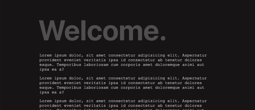
Here’s what our web page currently looks like.
CSS.
Now we’re ready to add our styles. First let’s add some basic page styling to make our site look a little nicer.
body {
  background: #171414;
  font-family: "Courier New", Courier, monospace;
  color: #ffffff;
  padding: 15% 15% 5%;
}

p {
  font-size: 1.8rem;
}

p:first-of-type {
  margin-top: 100px;
}

h1 {
  font-size: 200px;
  position: absolute;
  top: -5%;
  left: 15%;
  opacity: 25%;
  font-family: -apple-system, BlinkMacSystemFont, "Segoe UI", Roboto, Oxygen,
    Ubuntu, Cantarell, "Open Sans", "Helvetica Neue", sans-serif;
}
Next let’s hide the default browser scroll bar. We can use the webkit vendor prefix to hide the scroll bar in Chrome and Safari.
::-webkit-scrollbar {
  width: 0;
  background: transparent;
}
We’ll need to make special considerations for Firefox as it’s not a webkit browser and won’t respond to the webkit vendor prefix (like Chrome and Safari).
html {
  scrollbar-width: none;
}
Now we’re ready to style our custom scroll bar. First let’s set up our scroll bar container. We want our scroll bar container to be fixed to the right side of the viewport so we’ll use position fixed with top and right values set to 0. We’ll give the scroll container a width of ten pixels and a very light grey background.
#progressBarContainer {
  position: fixed;
  top: 0;
  right: 0;
  width: 10px;
  height: 100%;
  background: rgba(255, 255, 255, 0.05);
}
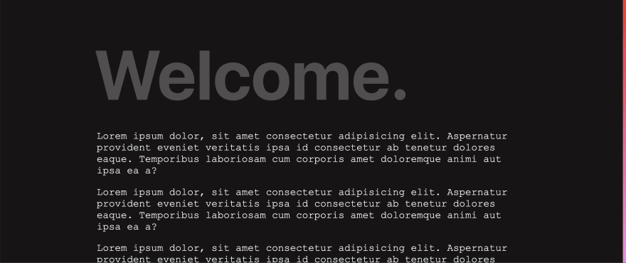
You should now see the scroll container appearing on the right side of the viewport.
Our progress bar will also be fixed to the right side of the viewport and have a width of ten pixels, however, we’ll give it a linear gradient from red to violet in order to make it stand out.
#progressBar {
  position: fixed;
  top: 0;
  right: 0;
  width: 10px;
  background: linear-gradient(to top, violet, red);
  height: 100%;
  opacity: 100%;
}
We want to dynamically update the height and opacity of our progress bar on scroll so let’s set height and opacity to zero.
#progressBar {
  position: fixed;
  top: 0;
  right: 0;
  width: 10px;
  background: linear-gradient(to top, violet, red);
  height: 0;
  opacity: 0;
}
JavaScript.
To update the height and opacity of our progress bar we’ll need to write a few lines of JavaScript. Let’s first grab our progress bar DOM node.
const progressBar = document.querySelector("#progressBar");
We’ll also need to calculate the total height of our web page. We can calculate the total height by subtracting the window inner height from the entire document body scroll height.
let totalPageHeight = document.body.scrollHeight - window.innerHeight;
Next, let’s add an event listener to the window. When we scroll we want to calculate the new progress height. We can calculate this by first dividing the window’s page Y offset by the total page height to get a decimal fraction. To use this value in our CSS code we must multiply this fraction by 100 (to get a percentage).
Lastly, we can set the progress bar’s height and opacity to the new progress height.
Unfamiliar with the ${} syntax? It’s called a template string or template literal and it allows you to combine evaluated expressions (the values between the ${}) with plain strings.
window.onscroll = () => {
  let newProgressHeight = (window.pageYOffset / totalPageHeight) * 100;
  progressBar.style.height = `${newProgressHeight}%`;
  progressBar.style.opacity = `${newProgressHeight}%`;
};
Conclusion.
And that’s it! You now have a beautiful custom scroll bar in just a few lines of CSS.


Top comments (13)
This is really cool and shows how simple it can be to do seemingly complicated things, there are a couple of gotcha's I can think of though 😊
smallchanging height causes a repaint.Resize
I added a debounce because recalculating on every frame of a resize sounds chunky 😅
Interactivity
I think this is expected behaviour from the user, I don't know if this is the best way to do it though.
Transform
I think this one is just my personal taste as opposed to something anyone else would care about 😁
I hope you don't mind my comment, I just found the project really interesting so had a little look.
Yes, this is one of the things missing here! Thanks for sharing 😁
I'd love to give positive feedback because I do like simple solutions and when we can make things pretty, but honestly all you've done is made a terrible alternative for something you had to go out of your way to remove!
We have all these tools to style the scrollbar now to look great (which you've used to hide them) - let's use those instead of promoting anti-patterns that reduce accessibility, and make it more difficult for users to navigate. Let's not abuse scrollbar styling, forcing browser vendors to reduce the control we have so we don't ruin UX.
If you need a custom scrollbar for legacy browsers then I totally understand you need to replace it, maybe with a bit more thought than this simple implementation though. For modern browsers this isn't necessary, embrace browser scrollbar styling!
Scrollbars and scrolling are two things I refuse to touch. I utterly hate it when my scrolling is hijacked and it changes how scrolling behaves (like slower or with bounce). And I like the functionality of the scrollbar, use it often on my phone to quickly scroll up and down. I just tap and drag.
I mean scroll-jacking is absolutely horrible, it drives me a bit nuts how all of these websites that win awwwards and such all ruin the experience by removing native scrolling. People ignore how much of a basic accessibility problem it is too, a slight difference in scroll behaviour can make people feel uncomfortable and even motion sick using your website.
Scrollbars I will touch if what's needed is a custom scrollbar in legacy browsers, but only in the form of a well-regarded library with a lot of history that prioritises accessibility. I still don't like it as it's so unnecessary but at least I know it's not harming people in the process.
Congratulations, you just spent a couple of hours to make your scrollbar not accessible.
It's so great to see the power of HTML, CSS and JS - the barebones of anything we do on the web! Using these basic languages, we can create so much and need no fancy libraries or intense knowledge.
I really liked the scroll bar implementation here but I think a horizontal bar to the top makes more sense because to the right (usually) we have the browser default scroll bar. Rest assured, the tutorial is really useful and easy to digest! 🔥
Can we stop referring to this as a scrollbar? It's a progress bar mapped to scrolling. I like it. I've seen horizontal ones but this makes my head hurt a little less as it is in the direction of scroll. It's great, really. But it isn't a scrollbar.
This is awesome, I have custom made scrollbars but with css only. I definitely try using javascript. Great tutorial Emma :)
I'm excited to try this!
Thanks for share your thoughts and code!
I have changed code a bit to make reading progress bar of your code: codepen.io/th3mon/pen/xxVXqJe
That's so cool!
Never made a custom scrollbar but must definitely give it a try!
This is nice to avoid scrollbar plugins.