I’ve been thinking quite a bit about how developers go about choosing and learning charting libraries. I feel d3.js is arguably the most influential tool among developer community for creating interactive data visualisations. My interest in d3 started when i visited the state of javascript website earlier this year (Jan 2020). I fell in love with the way charts were developed on the site as they explained things that are really hard to explain with words or just looking at the raw data.
I have gone through sample chapter from Fullstack d3 book by Amelia Wattenberger and built my first chart :)
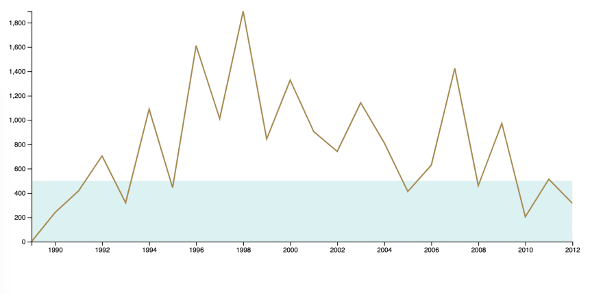
I am a big fan of cricket and Sachin. I wanted to visualise how he performed from his debut to retirement every year. You can find the data i used to create a chart here. Sachin data by year - github gist.
Final output looks like below
Let's see the steps to get there.
Step - 1
Download latest d3 library file and place it in a folder where index.html is created.
<!DOCTYPE html>
<html lang="en">
    <head>
        <title>My Timeline</title>
    </head>
    <body>
        <div id="wrapper"></div>

        <script src="./d3.v5.js"></script>
        <script src="./chart.js"></script>
    </body>
</html>
Step - 2
Use node live-server or python SimpleHTTPServer to start a dev server in current folder.
live-server // starts the webserver on port 8080
python -m SimpleHTTPServer // start the webserver on port 8000
Step - 3
Let's make use of d3 internal functions to generate a line chart. I will explain the meaning of each line with in the js file.
async function drawLineChart() {

    // 1. Read the data from json
    const dataset = await d3.json("./sachin-by-year.json")

    // 2. Verify if your data is retrieved correctly.
    console.log("what is dataset ", dataset)

    /* 3. Define x and y axis accessor methods
       (x-axis -> Year, y-axis -> runs). Accessor methods
       helps to fetch the to be plotted info from the datapoint.
       Say the datapoint represent an object e.g dataset[0]
       from dataset.
    */
    const yAccessor = d => parseInt(d.runs)
    const dateParser = d3.timeParse("%Y")
    const xAccessor = d => dateParser(parseInt(d.year))

    /*
      4. Define chart dimensions (external border, #wrapper)
         and bounds (internal border, covers axes labels or info
         on the chart). In general the dimensions depend on the
         amount of space we get on the page for the chart.
    */
    let dimensions = {
        width: window.innerWidth * 0.6,
        height: 400,
        margin: {
            top: 15,
            right: 15,
            bottom: 40,
            left: 60,
        },
    }
    dimensions.boundedWidth = dimensions.width -
        dimensions.margin.left -
        dimensions.margin.right
    dimensions.boundedHeight = dimensions.height -
        dimensions.margin.top -
        dimensions.margin.bottom


    /*
       5. Select an external wrapper (for the chart).
       d3's d3-selection module helps in querying
       and manipulating the DOM. (If you are familiar with
       JQuery module methods, this module doco is easy
       to understand).
    */
    const wrapper = d3.select("#wrapper")
        .append("svg")
        .attr("width", dimensions.width)
        .attr("height", dimensions.height)

    /*
      Note: This explanation is copied from book. FYI

      The <g> SVG element is not visible on its own, but
      is used to group other elements. Think of it as the
      <div> of SVG — a wrapper for other elements. We can
      draw our chart inside of a <g> element and shift it
      all at once using the CSS transform property.
    */
    const bounds = wrapper.append("g")
        .style("transform", `translate(${
        dimensions.margin.left
      }px, ${
        dimensions.margin.top
      }px)`)

    // 6. Define scales (x and y scales)
    const yScale = d3.scaleLinear()
        .domain(d3.extent(dataset, yAccessor))
        .range([dimensions.boundedHeight, 0])

    /*
       I want to understand the years when sachin
       Scored just 500 runs in a year. (Area with light
       blue colour in the graph depicts that)
    */
    const runsLessThan500InAYear = yScale(500)
    const runsLessThan500 = bounds.append("rect")
        .attr("x", 0)
        .attr("width", dimensions.boundedWidth)
        .attr("y", runsLessThan500InAYear)
        .attr("height", dimensions.boundedHeight
            - runsLessThan500InAYear)
        .attr("fill", "#e0f3f3")

    // x axis defines years from 1989 to 2012
    /*
      Note: I thought of using x axis labels as scaleLinear()
      but the problem with that was labels were treated as numbers
      and the display was like 1,998, 1,999 etc which is wrong.
      Hence i used date parser to show the labels like years.May be
      there is a better way to do this.
    */
    const xScale = d3.scaleTime()
        .domain(d3.extent(dataset, xAccessor))
        .range([0, dimensions.boundedWidth])

    // 7. Map data points now
    const lineGenerator = d3.line()
        .x(d => xScale(xAccessor(d)))
        .y(d => yScale(yAccessor(d)))

    /*
       Use 'attr' or 'style' methods to add css

       Note: As this is a simple example, CSS and JS are
       mixed.
    */
    const line = bounds.append("path")
        .attr("d", lineGenerator(dataset))
        .attr("fill", "none")
        .attr("stroke", "#af9358")
        .attr("stroke-width", 2)

    // 8. Draw bounds (x and y both axes)
    const yAxisGenerator = d3.axisLeft()
        .scale(yScale)

    const yAxis = bounds.append("g")
        .call(yAxisGenerator)

    const xAxisGenerator = d3.axisBottom()
        .scale(xScale)

    /*
     d3 don't know where to place the axis
     line and hence the transform property required to
     place it where we want. In this case we displace it
     along y axis by boundedHeight.
    */
    const xAxis = bounds.append("g")
        .call(xAxisGenerator)
        .style("transform", `translateY(${
        dimensions.boundedHeight
      }px)`)

}
drawLineChart()
Conclusion
I don't have enough dev experience with d3 to compare it with charting libraries out there and provide merits. My next step is to get my hands dirty with d3 library by reading Amelia Wattenberger's book :P. I will share the code snippets as and when i learn a concept in the book through dev.to articles :).
I will appreciate the constructive feedback about the article. Please share your experience with d3 and any good books to learn the subject.
Thank you :)

Top comments (0)