Sorry if you're expecting something more, well, techie from me, with tales of heroic coding derring-do and the slaying of fearsome bugs. Today I'm just going to tell you how to better configure your most used tool - your web browser.
Like most devs I luuurve my browser tabs and open them all the time. What I'm not so good at is closing them, and so they build up and build up and build up, just one long line of them. It's not long before they're so narrow that I can see maybe a few characters of their title, not enough to really know what it is, and not much longer before they're so narrow that I'm lucky to be able to see much of the page's icon and no text at all. I lose tabs all the time, and because it takes so long to find the one I'm looking for I often just open another tab, search for whatever it was I wanted - and now I've got even more of the blasted things open, with duplicate content!
But I have found a solution!
Recent builds of Chrome have an experimental "tab groups" feature. In summary, it lets you go from this:
to this:
which immediately makes things easier to navigate. Just have a group per project that you're working on, or a group per subject. And then you can do this:
Collapsing and expanding tab groups makes it very easy to find what you're looking for.
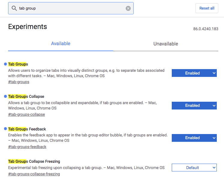
To enable it, go to chrome://flags, search for "tab groups", and turn it on. You may have to reboot Chrome for the changes to take effect.


Top comments (0)