Hello there! After another long break, TestMace is finally coming out of the shadows to tell you the news about our project.
In case you've forgotten or haven't read the article, TestMace is an IDE for API design. The main purpose of our tool is to cover all possible API interaction cases, such as creating requests, combining them in scenarios (without any code), API description (instead of using swagger and other similar tools), writing tests (no code as well), and so on. The files are wrapped in projects and have a human-readable format. This allows to store projects in version control systems and then use your favorite tools and approaches. This is how it is in a few words. The work to be done is enormous, and at the moment we're still in the beginning of our way. TestMace is ready to help you solve real problems though. Its features allow it to join the lines of the most popular competitors. Since the previous article we've got so many things to tell you, thus we'll divide this information into 2 parts. Let's go.
Beta testing has finished. 💫
As you might have already noticed, the last release hasn't been labeled as a beta one, meaning we have introduced a stable release of our product. From one version to another together with our users we've been doing our best to make our product as much reliable as possible. Currently TestMace is a tried and tested solution, which can be safely used for solving everyday tasks.
New Interface 👻
At the early stages of development, we focused on implementing as many features as possible, paying less attention to interface design. As a result, some users complained of the interface being nonintuitive, while others claimed it to be quite messy (colors, indentations, extra components). After our product hunt release, we were also informed about some UI and UX shortcomings. That's why we've decided to radically redesign the existing interface and focus on beautiful features implementation. And you can already check out our work.
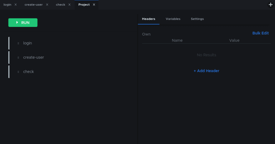
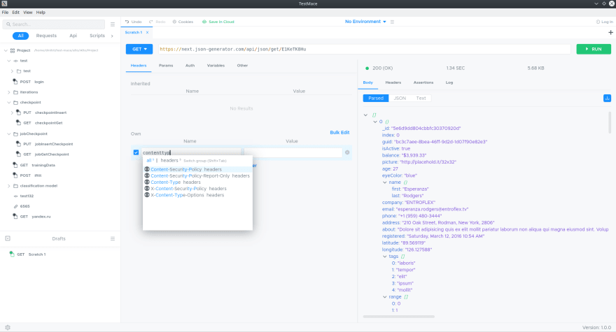
The first thing you're going to notice after running TestMace is its new interface. The changes are quite significant: the standard theme has been improved, and each control has been redesigned. However, if you take a closer look at the interface, you'll see that the structure of interface blocks is the same, so you won't have to get used to it again. The only exception is Folder and Project nodes tabs (that look the same anyway): in order to achieve more compact design, the tab panel is divided into 2 parts: in the left part there is a list of children, while in the right part - the node's settings. You can see the new interface in the picture below:
We've added prompts everywhere else and made the interface much friendlier. Otherwise everything is quite the same, so the migration process shouldn't be painful at all.
Light Theme 🔆
Dark application theme is definitely the latest trend. On the one hand, a dark theme interface looks stylish, on the other hand, in the everyday routine it is easier to work with (both views are subjective though). After all, no doubt the dark theme is a number-one solution for our IDE developers. That's why it's quite obvious, the dark theme was implemented first.
However, we've been getting so many requests for a light theme version recently that we couldn't resist. Now you have a light theme option in the stable 1.0.0 release. Here's how it looks like:
Paid Subscriptions 💵
One of the main features to present is a paid version of our app. We're certain, paid subscriptions would help us make our product more stable and powerful. Still we intend to keep our prices reasonable so that anyone could afford it. We'll be continuously improving the free version of TestMace without limitations on use cases.
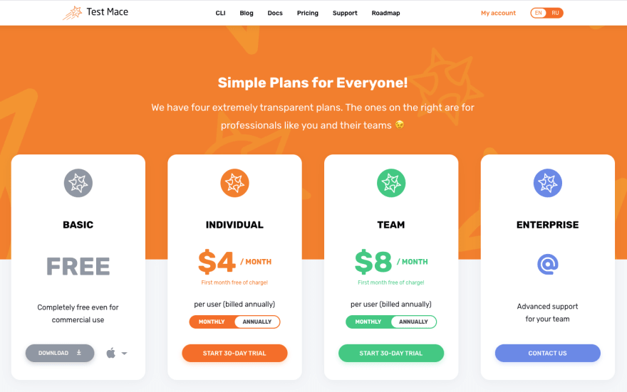
If you visit our site, you'll see 4 plans: basic, individual, team, and enterprise.
The first plan is a plain free version, that you've used before. The Enterprise plan is for teams and organizations wanting to get a customized solution. The Individual plan allows individual users to get access to TestMace's advanced features. The Professional plan deserves special attention though.
It's quite simple. Apart from users, you've got teams in the system. Teams are like organizations in Github, for example. You buy a subscription for the whole team. The price depends on the number of users and the chosen period (a month or a year). As compared to the Individual plan, you've got a cloud synchronization feature inside the team. There are no other differences.
There is a dashboard (http://dashboard.testmace.com), that you can use to manage your projects and subscriptions.
The most important, paid version users will get as a bonus:
- Cloud synchronization (for 1 user or for a team depending on the plan chosen);
- Light theme;
- Extended assertions set;
- Advanced autocomplete for variables and functions.
There are a few new node types that will also be available in the paid version:
- gRPC;
- Websocket.
Isn't it cool? Moreover, we offer a trial period for you to try all these wonderful features. It has some differences in comparison with other products' trial periods, such as:
- The trial period is not for the whole application, but for each feature separately. For instance, you don't need gRPC, and its trial doesn't start, until you decide to try it. It allows you to fully appreciate all features and stay tuned with the pro-features updates.
- The trial period is divided into 3 parts: 15 days for unlogged users, 15 days for authorized users and 30 days for paid subscription users. You can get a 60-days trial in total. This is an opportunity to try our features even without logging in our application.
Cloud Synchronization ☁️
In TestMace teamwork has always been a top priority to us. This is not only a convenient format for storing your projects in version control systems but also a cli for running them in CI/CD and a scenarios sharing ability. Cloud synchronization is one more step towards easier teamwork with API. As stated above, cloud synchronization is a paid feature. However, we've kept it free for individual users.
To be able to use this feature, you'll need to do the following:
- Log in the control panel
- Create a team
- Create a project for this team
Now you're going to need to log in the app and choose the project you've just created. Please note that synchronization process is not performed on the fly. To save the changes, click the Sync button on the top of the toolbar:
You also can migrate existing projects to the cloud. Just click the Save in the cloud button and chose the team which you can save this project for.
Launching the Product on ProductHunt 🚀
Launching a product on Product Hunt is a key milestone for every startup. This site is like a springboard, that can provide a big number of users, useful contacts, and therefore understanding of your future plans. Getting ready for launch is a time-consuming process: you need to find a hunter and influencers, think about getting more users on the launch day (ask regular users for support in particular), create promo materials, etc. Each case is unique.
We started with reading articles about other people's experiences, but they very often contradict each other. This official Product Hunt team post was one of the main sources for us.
As a result, we focused on:
- Making a nice profile: find the right tags, name, and description and create an attractive animated logo.
- Writing the first comment from developers, where we introduced our team and stated our goals and plans.
- Creating makers' accounts and providing some information about them.
- Introducing a special offer - LTD Professional version license for 5 people.
- Creating a promo-video. This is a very important step, since having an appealing but limited special offer you will always find someone who'd buy your product before actually trying it. Those people will be caught by your promo materials: a video, product description, and landing page.
- Creating a roadmap and placing it on the product's site.
- Using the Product Hunt Ship service to pre-launch our product. When you create a page on this site, your product appears on the main Product Hunt page from time to time, and you can get new followers. The fact is that you get people who are interested in your product and have a PH account. On the launch day you can use Ship's built-in services to do a mass mailing to ask your followers to support the project. Just don't use the word "Upvote"! Every single user should decide whether they like it or not on their own.
- Creating a landing page: we put there a banner with our special offer info and the 'Featured on ProductHunt' button.
We started preparations one and a half month before the launch. We didn't look for a hunter, we decided to do it ourselves. On the launch day we got unexpected news: a few days prior to that a random hunter had published our project! The publication was too raw, it got a very small number of feedbacks and likes and was almost left unnoticed. We immediately contacted the PH support to publish our product again. The PH team approved our request and after a while we were given permission to make a publication the next day, having the previous page deleted.
As a result, we had: one sleepless night, 300+ upvotes, our product on the main page for 1 day, LTD licenses sold, a lot of useful feedback, and several hundreds of new users. Our product wasn't in the first 5 places in the end, but for most of the day we were on the 1st place.
Conclusion ⚡
In this article we've covered some important details of TestMace, which are not directly connected with its features, but make things easier. In addition to that, we've covered such important steps for our project as paid subscriptions introducing, first stable version release, and launching the product on Product Hunt.
In the next article we're going to shed light on new nodes and improvements. Stay tuned!


Top comments (0)