Hi guys,
It's late here and I'm lazy to write anything here.
I just pushed my new open source project live and I just finished making it compatible on mobile. It is meant to be used on desktop so I didn't have mobile in mind. So the UX on mobile is crap.
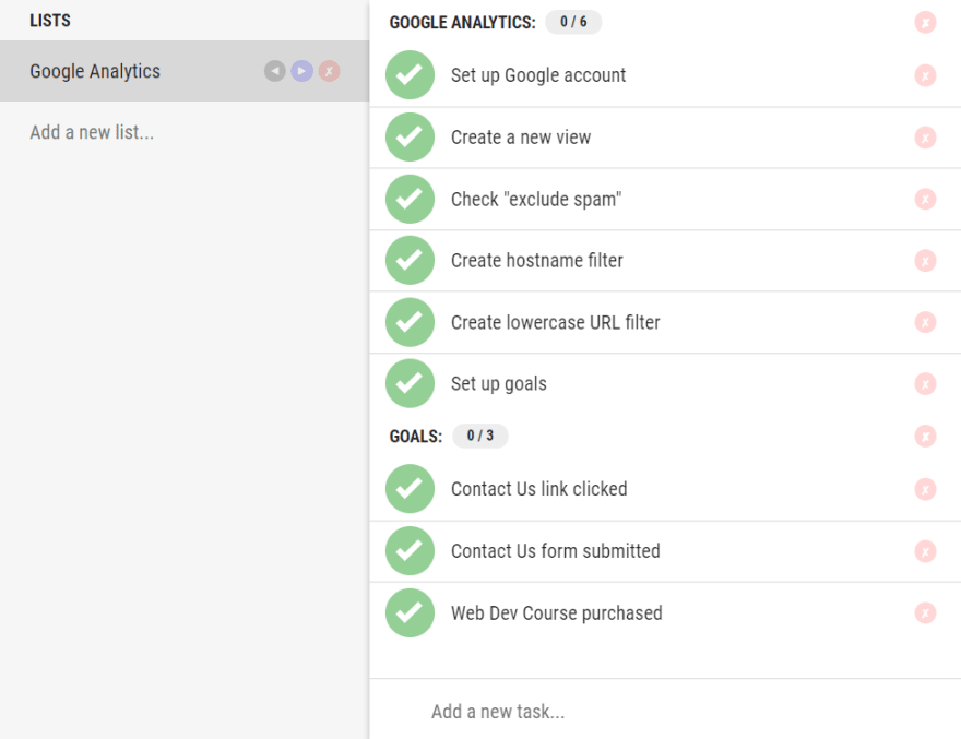
You can create new sections by typing ":" at the end of the task's name. For example "Goals:" will create a new section as seen on the image below.
I'm open to any suggestions, feel free to post issues on Github.
Link to web app: https://checklist.messedcode.com
 david-szabo97
/
open-checklist
Simple checklist (todo list) built upon Preact + Redux
Open Checklist
CLI Commands
# install dependencies
npm install

# serve with hot reload at localhost:8080
npm run dev

# build for production with minification
npm run build

# test the production build locally
npm run serve

# run tests with jest and preact-render-spy
npm run test
For detailed explanation on how things work, checkout the CLI Readme.


Top comments (1)
Hey! I've noticed that in this post you use "guys" as a reference to the entire community, which is not made up of only guys but a variety of community members.
I'm running an experiment and hope you'll participate. Would you consider changing "guys" to a more inclusive term? If you're open to that, please let me know when you've changed it and I'll delete this comment.
For more information and some alternate suggestions, see dev.to/seankilleen/a-quick-experim....
Thanks for considering!