In this post we will learn about CSS grids and how you can make your own website with grids. So, let's get started.
Introduction
In CSS there are several layouts present that are used to build a good and responsive design.
We have flex, multi-column layout, positioned layout, and many more but making a complex responsive design with these layouts can be very frustrating sometimes and that's where the grid layout comes into play.
Let's start by making a 2d layout so we can see how powerful the grid is.
1. Create the project:
Since we will be using react for this project so let's start by creating the project.
If you have npm or yarn installed then you can install like this
npx create-react-app my-app
cd my-app
npm start
or if you are following me then let's make a new code sandbox from here codesandbox.io
After creating the react app let's add our beloved styled-component so we can start making our design.

For react app
yarn add styled-components
2. Edit the App.js:
Edit the App.js and let's create a basic HTML structure.
Let's import all the required packages and make a styled-component Container.
This Container will be the parent of all the components.
import "./styles.css";
import styled from "styled-components";
const  App = () => {
  return (
    <Container>
    </Container>
  );
}
export default App;
Now add the display property of Container as grid.
const Container = styled.div`
  display: grid;
  height: 100vh;
  color: white;
`;
Since we will be creating a 2d layout we can add grid related properties like grid-template-rows and grid-template-columns which will tell us how our grid is divided into parts.
grid-template-rows: 0.2fr 1fr 0.5fr 0.5fr;
grid-template-areas:
    "nav nav nav nav"
    "sidebar main main main"
    "sidebar content content content"
    "sidebar footer footer footer";
text-align: center;
grid-gap: 0.25rem;
Here you might have come across a new property grid-template-areas. The grid-template-areas CSS property specifies named grid areas, establishing the cells in the grid and assigning them names.
Here's an interactive example from MDN if you want to play with grid-template-areas property.
grid-template-areas.html
Now let's quickly make the other components and style them.
The grid-template-areas we created in the container component we will pass them to their components.
 <NavBar>NavBar</NavBar>
 <Main>Main</Main>
 <SideBar>SideBar</SideBar>
 <ContentBox>
     <Content1>Content1</Content1>
     <Content2>Content2</Content2>
     <Content3>Content3</Content3>
 </ContentBox>
 <Footer>Footer</Footer>
const NavBar = styled.nav`
  background: #3a3a55;
  grid-area: nav;
  padding: 0.25rem;
`;
const Main = styled.main`
  background: #1f2128;
  color: white;
  grid-area: main;
  padding: 0.25rem;
`;
const SideBar = styled.div`
  background: #9aaab7;
  grid-area: sidebar;
  padding: 0.25rem;
`;

const ContentBox = styled.div`
  display: flex;
  gap: 0.25rem;
  padding: 0.25rem;
  align-items: center;
  grid-area: content;
  justify-content: center;
`;
const Content1 = styled.div`
  background: #a6b8b9;
  padding: 0.25rem;
  width: 100%;
  height: 100%;
`;
const Content2 = styled(Content1)``;
const Content3 = styled(Content1)``;
const Footer = styled.footer`
  background: #ff9637;
  grid-area: footer;
  padding: 0.25rem;
`;
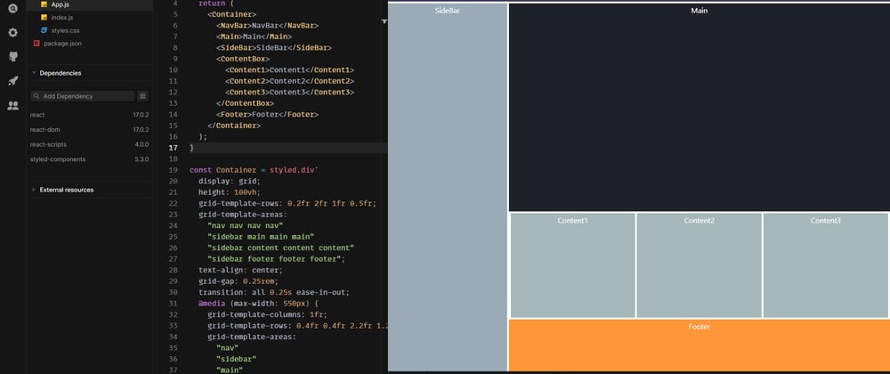
After all this our app started taking shape and now we can see the whole layout.

Well we created what we aimed for a simple yet powerful design.
Hope you learned something from this and if you have any queries feel free to comment.
But wait where is the responsiveness.
Here
3. Add media queries for responsiveness:
Edit your container element and content box for responsive mobile design.
const Container = styled.div`
  display: grid;
  height: 100vh;
  grid-template-rows: 0.2fr 1fr 0.5fr 0.5fr;
  grid-template-areas:
    "nav nav nav nav"
    "sidebar main main main"
    "sidebar content content content"
    "sidebar footer footer footer";
  text-align: center;
  grid-gap: 0.25rem;
  transition: all 0.25s ease-in-out;
  @media (max-width: 550px) {
    grid-template-columns: 1fr;
    grid-template-rows: 0.4fr 0.4fr 2.2fr 1.2fr 1fr;
    grid-template-areas:
      "nav"
      "sidebar"
      "main"
      "content"
      "footer";
  }
  color: white;
`;
const ContentBox = styled.div`
  display: flex;
  gap: 0.25rem;
  padding: 0.25rem;
  align-items: center;
  grid-area: content;
  justify-content: center;
  @media (max-width: 550px) {
    flex-direction: column;
  }
`;
Final App.
The End


Top comments (0)