Hello guys, this blog post is a part of a video series we have started to upload on YouTube.
Flutter News App (Frontend to Backend)
Here is the video:
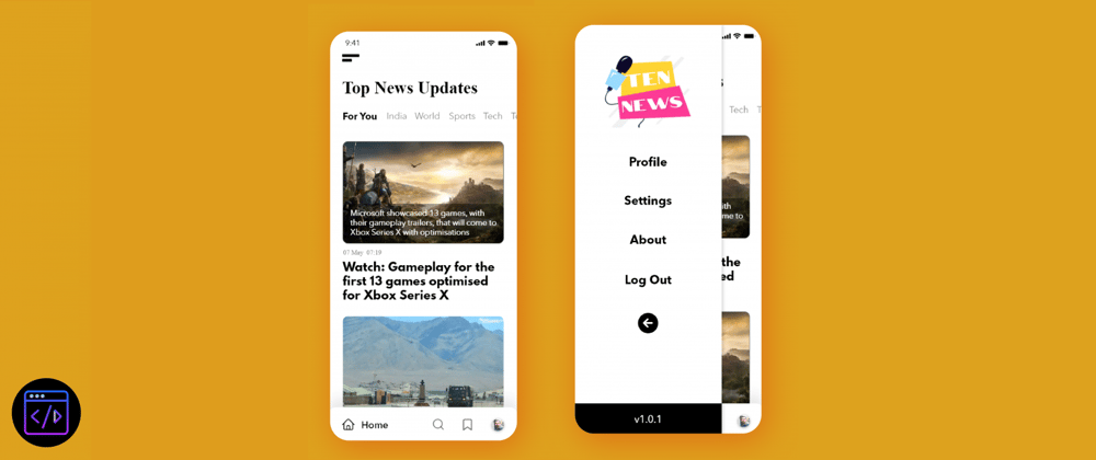
In this video, we will have a look at how to create a Drawer with a Custom Icon in Flutter.
So before we customize the icon, lets just build the default Drawer.
Now in our Scafdfold(), there is a parameter named as drawer:
Let's pass the Drawer() widget to this parameter.
drawer: Drawer(
          child: Column(
            children: <Widget>[
              SizedBox(
                height: 30,
              ),
              DrawerHeader(
                child: Container(
                    height: 142,
                    width: MediaQuery.of(context).size.width,
                    child: Image.asset(
                      "assets/images/ten_news.png",
                    )),
                decoration: BoxDecoration(
                  color: Colors.transparent,
                ),
              ),
              SizedBox(
                height: 20,
              ),
              GestureDetector(
                onTap: () {
                  setState(() {
                    currentIndex = 3;
                  });
                  Navigator.of(context).pop();
                },
                child: Text(
                  'Profile',
                  style: TextStyle(
                    fontFamily: 'Avenir',
                    fontSize: 24,
                    fontWeight: FontWeight.w700,
                  ),
                  textAlign: TextAlign.center,
                ),
              ),
              SizedBox(
                height: 45,
              ),
              GestureDetector(
                onTap: () {},
                child: Text(
                  'Settings',
                  style: TextStyle(
                    fontFamily: 'Avenir',
                    fontSize: 24,
                    fontWeight: FontWeight.w700,
                  ),
                  textAlign: TextAlign.center,
                ),
              ),
              SizedBox(
                height: 45,
              ),
              Text(
                'About',
                style: TextStyle(
                  fontFamily: 'Avenir',
                  fontSize: 24,
                  fontWeight: FontWeight.w700,
                ),
                textAlign: TextAlign.center,
              ),
              SizedBox(
                height: 45,
              ),
              Text(
                'Log Out',
                style: TextStyle(
                  fontFamily: 'Avenir',
                  fontSize: 24,
                  fontWeight: FontWeight.w700,
                ),
                textAlign: TextAlign.center,
              ),
              SizedBox(
                height: 45,
              ),
              Expanded(
                  child: Align(
                alignment: Alignment.bottomCenter,
                child: Container(
                  height: 65,
                  width: MediaQuery.of(context).size.width,
                  color: Colors.black,
                  child: Center(
                    child: Text(
                      'v1.0.1',
                      style: TextStyle(
                        fontFamily: 'Avenir',
                        fontSize: 20,
                        color: const Color(0xffffffff),
                      ),
                      textAlign: TextAlign.center,
                    ),
                  ),
                ),
              ))
            ],
          ),
        ),
Now above, inside the Drawer() widget, in the child parameter, we have a passed a Column()
This is just used for the sake of inserting multiple widgets in my drawer.
There is also a widget named, DrawerHeader.
This widget is used for displaying any content on top of the whole drawer. This widget comes with a default divider. We have passed our app logo to it.
Now where is the drawer?
In order to see the drawer, we need to also pass the AppBar() to our Home Page's Scaffold().
Scaffold(
   appBar: AppBar()
);
After building the current project we can see the default hamburger Icon in our AppBar. Pressing on it our drawer opens.

How to Exit the Drawer On Press of a Button?
I order to close the drawer manually i.e on the press of a button, we only need to return the Navigator.of(context).pop() to exit the Drawer.
So let's also add a button on our Drawer.
Material(
                borderRadius: BorderRadius.circular(500),
                child: InkWell(
                  borderRadius: BorderRadius.circular(500),
                  splashColor: Colors.black45,
                  onTap: () {
                    Navigator.of(context).pop();
                  },
                  child: CircleAvatar(
                    radius: 20,
                    backgroundColor: Colors.black,
                    child: Icon(Icons.arrow_back, color: Colors.white),
                  ),
                ),
              ),
Now on pressing the button the drawer closes.
How to change the default Hamburger Icon?
This question had arrived in my mind on the first day I had learned to build a Drawer in Flutter.
Now in order to have a custom Icon, lets remove the default one first.
 AppBar(
        automaticallyImplyLeading: false,
),
automaticallyImplyLeading set to false would just remove the default icon.
Now let's pass out Icon to either leading: or title: parameter.
appBar: AppBar(
        automaticallyImplyLeading: false,
        title: Padding(
          padding: EdgeInsets.symmetric(horizontal: 25),
          child: Builder(
            builder: (context) => IconButton(
              icon: SvgPicture.asset(
                "assets/icons/drawer.svg",
                height: 15,
                width: 34,
              ),
              onPressed: () => Scaffold.of(context).openDrawer(),
            ),
          ),
        ),
        backgroundColor: Colors.white,
        elevation: 0,
        centerTitle: false,
        titleSpacing: 0,
      ),
Now in the above code, there are a few importing things:
-
Builder(): We use a Builder class to pass the context of the Scaffold widget to a particular widget. More Info: https://stackoverflow.com/a/52123080/6484719 -
Scaffold.of(context).openDrawer(): This is why used the builder widget, to get the current context of the scaffold and then open the drawer.
Finally, our output:
👨💻Source Code: https://github.com/Code-Decoders/ten_news_yt/tree/Part-2--Drawer
ten_news
A new Flutter project.
Getting Started
This project is a starting point for a Flutter application.
A few resources to get you started if this is your first Flutter project:
For help getting started with Flutter, view our online documentation, which offers tutorials, samples, guidance on mobile development, and a full API reference.
💐Join Our Slack Group: https://bit.ly/JoinSlackCD
✌Subscribe to CodeDecoders: http://bit.ly/CodeDecoders
💮Design Link: https://xd.adobe.com/view/99205dd3-7fe4-44bb-9edd-dd2a75290cbf-cc73/screen/90d0c71c-26b7-44d1-b29d-6578cbd87884
🤝Developed by
Maadhav Sharma:
🌐 https://maadhav.github.io/
🐤 https://twitter.com/maadhav_sharma
📘 https://www.facebook.com/maadhav2001
📷 https://www.instagram.com/maadhav_sharma/
Kunal Jain:
📷 https://www.instagram.com/jainkunal528


Top comments (0)