
By Dave Strydom
Last year I teased an upgrade to editing with inputs in CloudCannon's Visual Editor. And here it is! We’re giving you the option to free editors from the sidebar, so your content team can focus more on the page itself.
Content editors can now access a draggable Editor Panel directly next to their styled content on the page, freeing up screen space and streamlining the editing workflow.
We’re always looking for new and helpful ways to improve the content editing experience. We also want to continue giving developers as many options as possible, in order to create the best CMS interface for non-technical users. Every client is different, after all, and the more flexibility we can build into our tools, the more options you’ll have to create a customized editing interface, and the more control you’ll have over how your sites can be edited.
If you choose to include our open-source tool Bookshop, or Live Editing via React or Svelte (or even vanilla JavaScript!), you’ll discover the most complete and customizable editing experience you’ll be able to build anywhere. Bookshop, you may recall, is a component browser and playground, which brings component-driven development to static site generators with benefits like SSG templating language support, isolated component structure, fast build times, and easy configuration and integration. You can check out the Bookshop readme in its GitHub repository, as well as our guide for incorporating Visual Data Bindings with Bookshop — and if you hit a problem or have an idea on how to improve Bookshop, feel free to open an issue and we’ll be there to help.
Editing with inputs
CloudCannon builds a CMS for your site by reading your custom configuration. You can alter or customize your editing experience by adjusting your input configuration, allowing content editors to edit your content in the ideal format — your format.
We’ve recently simplified our configuration by creating a consolidated inputs key, allowing for more streamlined input workflows.
However, CloudCannon is more than just a series of inputs.
You can group inputs into Structures which can be used as page-building components. Editors can create new pages using your components, customizing their content with your configured inputs. It’s a great way to empower your editors to make changes or even build pages using the component library you’ve lovingly crafted for your site.
This is, we think, the ideal relationship between web dev and content teams, where design and development can give editors both freedom and suitable constraints.
In the data editor it all looks like this:
The trouble is — or can be, for some editors — that it still feels like you’re filling out a form to submit for a drawing. You fill out a long list of inputs, and visualizing them all together as a page requires some imagination. Only when you submit your form can you see what you’ve made. We think this can be better.
Working with content in Editor Panels
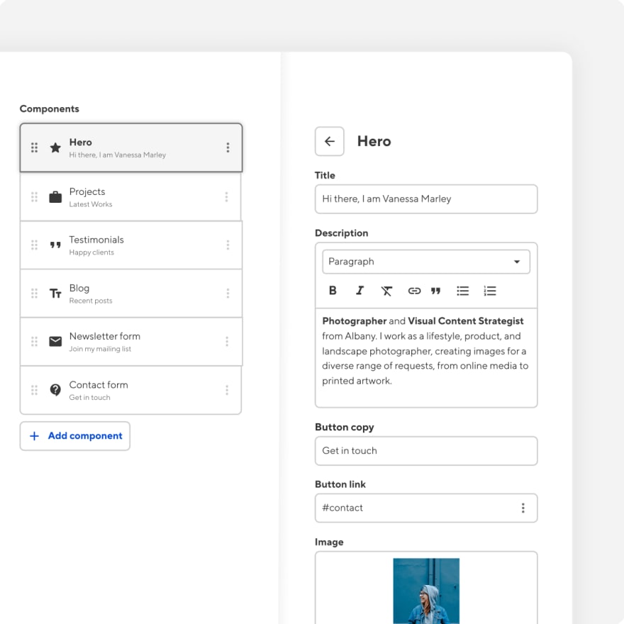
Enter a new way to visually organise your editable front matter content — inputs on the page. We’ve extended our Visual Editor to encompass data, allowing editors to configure any content defined by inputs — right on the page at full width!
In the Visual Editor, you’ll be able to configure a group of inputs into a component for editing on the same panel. You can configure the editing options for front matter, grouping it in the way that best suits you, or your editors’ needs.

Depending on their needs, or the size of their windows and screens, editors can grab the drag handle and move the panel around, or use the resize handle to change its size.
We’ve created a lot of options here — and they all allow you to craft the best on-the-page editing experience for your sites, and for your users.
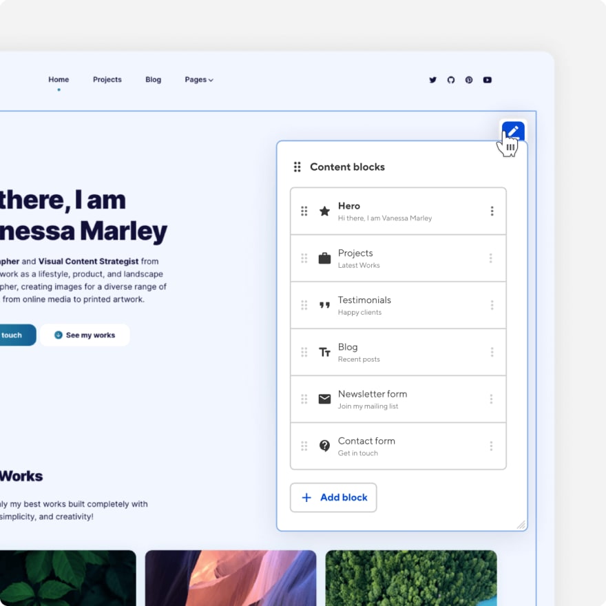
Working with your components visually
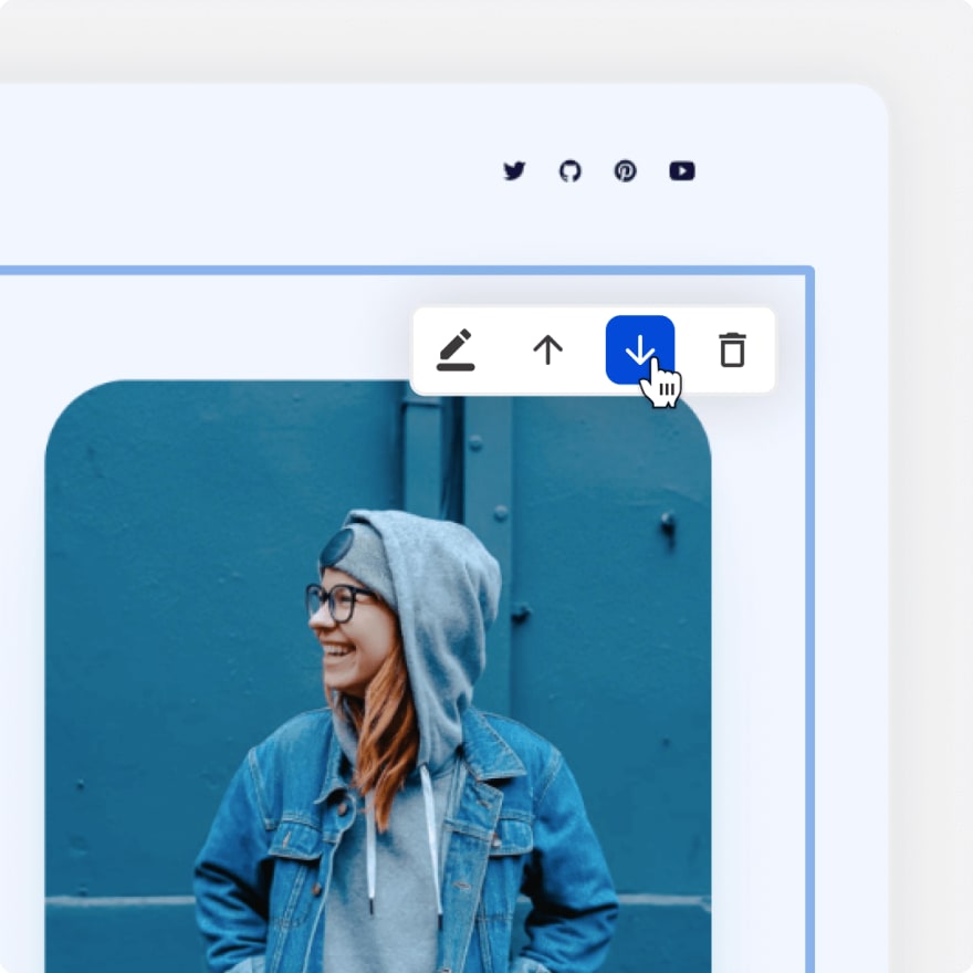
Along with the Editor Panel, we’ve added a controls menu in the top right corner of components. The menu will help you access the panel, as well as move or delete a component. Simply click through to the component you want to access and you’ll find the menu in the top right.

The new controls also include a ‘plus’ button on the edges of your components that allows editors to clone them, or even add new components from your library. This means you’ll always be able to give editors the freedom to choose from your customized components when they need to expand the content of a page.
Edit with ease
At CloudCannon we’re on a mission to give you the best tools to build your ideal editing experience, without enforcing a single vision of what that looks like for you. Our recently released features — Bookshop, UI improvements, consolidated inputs, and now freeing the Editor Panel — all allow you to build an amazing on-the-page editing experience. The part we’re proudest of, however, is that everything here is optional: with CloudCannon, developers will always be free to customize the editing tools their clients will use, without getting locked into a given feature set for every single client site.
With CloudCannon you can consistently empower your clients to edit and build pages, no matter their technical knowledge. We know just how precious your design and development time is, so we’re always working on lowering the barriers between content editors and the changes they want to make. That way your time can be spent on work that matters to you.

Top comments (0)