
This post is part of a series about everything I have learned about design systems and I’ll write it from a designer’s point of view. This is the second part, you can find the introduction part here
Customizing design tokens
After getting a new design system, you might need to customize all the design tokens to match your product’s. Check if your design system takes full advantage of the Figma Tokens plugin, which will allow you to change the style of the entire design system in a few minutes. For this post, I’ll be working with this open-source design system file I found in the Figma community. This one doesn’t support Figma tokens so this post won’t cover it.
This file ships with design tokens and a few essential components. You can take a look around by navigating the pages found in your left panel.

Fonts

Once duplicated the file, on the right side, you will see all the local styles available. We want to edit the text styles.

Hover over one of the styles, eg. H1 and you will see a controls icon button, click it and a window for editing will appear.
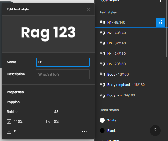
There you can change the name of the text style, you can add a description to help designers in your team understand what this text style is used for, and can change the font family and other text properties. For this example, I will change the font family from Poppins to Chivo, and I’ll repeat the same steps for all text styles so the font family used across the design system is Chivo.
When changing the font family you might find that some font-weight styles from the current font are not found in the font you are trying to use, so instead, you can use a font-weight close to that one. In this case, Chivo doesn’t have a medium font weight so I used bold, in fact for H1 through H5 my font-weight is set to bold.
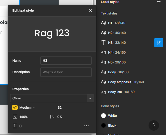
After changing the font family and weight in all text styles, this how the typography preview look.

Colors

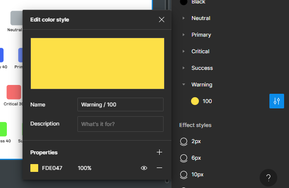
Our example design system ships with five types of colors, the default black and white, neutrals, primaries, critical, and success. I want to add more colors and edit the current color values and their names.
Adding new colors
On the left panel, there is a category for color styles, I am going to hover over the title ‘Color Styles’ and use the plus button to add more colors.

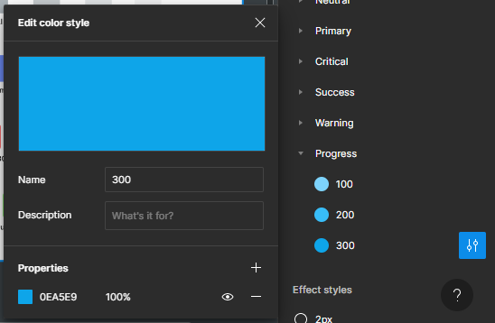
The new colors I am going to add are yellow color for warning and blue color for progress. I like using the colors created by TailwindCSS, so I’ll visit the link attached and copy the yellow and sky colors from values 500 - 300. I want to only have three colors for each group except neutrals, so my scale will be from 100 to 300.

Editing existing colors
For editing existing color styles, I want to delete all the criticals, success, and primary colors from values 70 - 5, and then rename them and change their values. After deleting the values I don’t need and renaming them, here is what I have:

For my primary colors, I am going to use Tailwind Fuchsia, values 500 - 300. For errors, I’ll use Tailwind Red from 500 - 300. And for Success, I’ll also use Tailwind Green, values 500 - 300’. This is what my color styles look like:

I also renamed the neutrals:

I also edited the colors documentation and now it looks like this:

Components
The example design system ships with a couple of essential components. You might need to add your own components or edit the existing ones.
Editing existing components
Let’s start by fixing the button component. When I edited the color styles, by deleting some values I broke the styling of the buttons, they are now not using the color styles defined.

I’ll fix this by selecting the frame containing all buttons and going to the selection colors section in the right panel where I’ll click and change the values to use my color styles.

After editing here is what I have

To edit the contents of a component, you can edit the master component at the top of the variants. Example here is the master component of the input component:

You can choose to edit this by adding an icon before the hint text or adding an icon after the label text and your changes will be reflected across all variants. And you can even make new variants that use or don’t use your new elements.
Adding new components
To add new components, create a new page, give it a name related to your component and start creating.
Publishing Changes
With the free plan, you can only publish your styles, like text, color, or effects. With a team or professional plan, you can publish your components. Whenever you publish new changes, files that use your design system will get a notification that there are some new changes needed to be reviewed and applied.
Here is the version I have been working on in this article, you can duplicate the file and explore it.

Top comments (1)
Design systems? HugeIcons 9 style swaps keep stroke/grid perfect match. Those 4k free ones actually hold up in production