
Styled Components are a way of styling your React components using CSS and the advantages offered by ES6, they are best explained by the official docs:
Utilising tagged template literals (a recent addition to JavaScript) and the power of CSS, styled-components allows you to write actual CSS code to style your components. It also removes the mapping between components and styles – using components as a low-level styling construct could not be easier!
Here's what we'll cover today:
What are styled components?
Here's an example of a styled component:
import styled from "styled-components"

// Creates a StyledButton component of a button with the given style
const StyledButton = styled.button`
  background-color: #710504;
  color: #FFC700;
  border: 2px solid #6A686A;

  &:hover {
    cursor: pointer;
    color: white;
  }
`

// StyledButton can now be used like any other component
const Button = ({ children, onClick }) => {
  return (
    <StyledButton onClick={onClick}>
      {children}
    </StyledButton>
  )
}
As you can see, they are React components like the one's you've known until now. They are created by calling styled and invoking a method with the name of the HTML tag you wish to use while passing it its styles. Here's a full list of the available tags).
styled.buttonis just a shortcut forstyled('button'), this is an ES6 feature called tagged templates 😄
One of the best things about styled components is the fact that you can adapt your styles based on your component's props, for example:
// https://www.styled-components.com/docs/basics#adapting-based-on-props

const StyledButton = styled.button`
  background: ${props => props.primary ? "palevioletred" : "white"};
  color: ${props => props.primary ? "white" : "palevioletred"};
`;

render(
  <div>
    <Button>Normal</Button>
    <Button primary>Primary</Button>
  </div>
);
Advantages
Reusable components
Styled components allow us to create components that are extremely easy to reuse as they directly contain their style values.
So the following JSX:
<h1 className="title">Christopher Kade</h1>
Can be translated in the following component:
const Title = styled.h1`
  color: white;
  font-size: 3rem;
`
And can be used like so:
<Title>Christopher Kade</Title>
Which removes the need for a mapping between components and their respective CSS and making style an integral part of each component.
Scoped styles
CSS is global by nature, David Khourshid puts it really well:
You ever stop and think about why CSS has a global scope? Maybe we want to use consistent typography, colors, sizing, spacing, layout, transitions, etc. and have our websites & apps feel like one cohesive unit?
And yet its very nature is something that is often disliked by many people, as changing a value somewhere can "break" something elsewhere. That's where CSS scoping comes into play.
CSS scoping allows us to avoid these issues by limiting the impact of CSS to its component, and styled components are no exception.
Scoped styles make maintenance painless, where you won't have to hunt across multiple files for that one piece of CSS that's messing up your view.
Easily create dynamic CSS
I already mentioned how styled components allow you to use a component's props to dynamically set style values.
For example, I'm currently working on a side project where I'm building a component library based on World of Warcraft's UI, I have a ProgressBar component with a default size and a percent of completion that can be changed with a prop, like so:
<ProgressBar text="Loading..." percent={25} width={500} />
I would then set the bar's size and advancement in styled components like so:
// Set the bar's width based on the width prop
const Wrapper = styled.div`
  width: ${props => props.width}px;
  // ...
`

// Set the bar's advancement based on the percent prop
const Bar = styled.div`
  width: ${props => props.percent}%;
  // ...
`

const Label = styled.span`
  // ...
`

const ProgressBar = ({ width, text, percent }) => {
  return (
    <Wrapper width={width}>
      <Label>
        {text}
      </Label>
      <Bar percent={percent} />
    </Wrapper>
  )
}
Support for server-side rendering
SSR is widely used, especially thanks to tools such as Next, Gatsby or Nuxt so the styled components team made sure to support this feature with a concept called stylesheet rehydration.
The basic idea is that everytime you render your app on the server, you can create a ServerStyleSheet and add a provider to your React tree, that accepts styles via a context API.
This doesn't interfere with global styles, such as keyframes or createGlobalStyle and allows you to use styled-components with React DOM's various SSR APIs.
More information on the official docs.
Performance improvements
Styled components keep track of which components are rendered on a given page and inject their styles and nothing else. This means your user loads the least amount of styles necessary for a given component.
Other advantages
Other advantages include native mobile support and unit/snapshot testing tools but I believe these three might be the most essential to keep in mind.
Disadvantages
Learning curve
Styled components take some time to get used to, their syntax and the new way of thinking they introduce will require some patience but the payoff is worth it in my opinion.
A smaller community
At the time of writing this article, the styled components repository has 23k ⭐on Github. Despite that, getting fast support may be tough some times. Although I haven't truly encountered situations where I could not find any solutions to a given problem.
Longevity
Just like any tool in the JS ecosystem, styled components may disappear one day, which would involve refactoring your code base. So it's important to keep that in mind before committing to it in production.
A concrete exercise
Note: In order to do this exercise, you will need a good grasp of both CSS and React (if you have trouble using
flexbox, feel free to check out my article covering all the basics you'll need).
Alright, let's get our hands dirty.
Open up codesandbox, select the create-react-app starter and import the styled-components dependency.
We'll create a very simple layout displaying a navbar and cards, each step of the exercise will be composed of a component to create (with its associated styled components). Try to code them from scratch and once you are done (or end up stuck), feel free to check out the code snippets.
The resulting code can be found here.
1. The Navbar component
This component will simply contain 3 links on its right and be displayed at the top of our view.
Start by creating a Navbar.js file under /src/components/.
Import both react and styled from React and styled-components respectively. Finally, create and export a Navbar component that doesn't return anything yet.
// Navbar.js

import React from "react";
import styled from "styled-components";

const Navbar = () => {
  return (

  );
};

export default Navbar;
We now want to create a Wrapper styled component that will wrap around our links. Make sure to set its styles, including flexbox in order to align your items at the end of the container.
Finally, make sure that your Navbar component returns the Wrapper.
// Navbar.js

import React from "react";
import styled from "styled-components";

const Wrapper = styled.div`
  display: flex;
  justify-content: flex-end;
  align-items: center;
  background-color: #424651;
  height: 3rem;
`;

const Navbar = () => {
  return (
    <Wrapper>
    </Wrapper>
  );
};

export default Navbar;
Next up, we want to create a styled component that will take care of displaying our links. Create NavbarItem using the a tag, don't forget to set its :hover style !
// Navbar.js

// ...

const NavbarItem = styled.a`
  font-size: 1rem;
  margin-right: 1rem;
  color: white;

  &:hover {
    opacity: 0.5;
    cursor: pointer;
  }
`;

const Navbar = () => {
  return (
    <Wrapper>
      <NavbarItem>Home</NavbarItem>
      <NavbarItem>About</NavbarItem>
      <NavbarItem>Contact</NavbarItem>
    </Wrapper>
  );
};

//...
Alright ! You've created the Navbar component from scratch, the thought process behind styled components may seem a bit hard to grasp at first, but it'll get more and more intuitive after each step.
Let's now create our card-related elements 😃
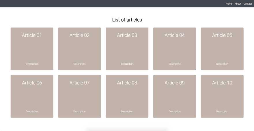
2. The CardList component
Let's create a CardList component that will contain our cards.
CardList will take the form of a simple Wrapper component and will .map through a list of data (you may use a .json file containing an array of blog posts for example) and render each card.
Start by creating the CardList component returning a Wrapper styled component, don't forget to use flexbox to have a nice layout.
// CardList.js
import React from "react";
import styled from "styled-components";

import data from "../data";

const Wrapper = styled.div`
  display: flex;
  flex-wrap: wrap;
  justify-content: center;
`;

const CardList = () => {
  return (
    <Wrapper>
    </Wrapper>
  );
};

export default CardList;
We'll come back to this component once our Card component is done.
3. The Card component
The Card component will receive props in the form of its title and description and will be composed of 3 styled components: Title, Description and a Wrapper.
Go ahead and create it, giving it any style you want. I personally made sure to use flexbox for my wrapper in order to display each card's content as a column. 🤷♂️
// Card.js
import React from "react";
import styled from "styled-components";

const Wrapper = styled.div`
  display: flex;
  flex-direction: column;
  justify-content: space-between;
  width: 250px;
  height: 250px;
  background-color: #c4b2a9;
  border-radius: 4px;
  padding: 1rem;
  margin: 1rem;

  &:hover {
    opacity: 0.5;
    cursor: pointer;
  }
`;

const Title = styled.h1`
  font-size: 2rem;
  font-weight: 300;
  margin: 1rem;
  color: white;
`;

const Description = styled.p`
  color: white;
`;

const Card = ({ title, description }) => {
  return (
    <Wrapper>
      <Title>{title}</Title>
      <Description>{description}</Description>
    </Wrapper>
  );
};

export default Card;
Let's now go back to CardList and make sure to render our newly created component through a .map of our data.
// CardList.js

// ...

// data is simply an imported .json file containing an "articles" array
const CardList = () => {
  return (
    <>
      <Wrapper>
        {data.articles.map(article => (
          <Card title={article.title} description={article.description} />
        ))}
      </Wrapper>
    </>
  );
};
// ...
Bonus: using styled-component's dynamic styling
To go a bit further, let's create a Title styled component that will be used in both our Card and CardList components. For example, we could display the article's title in the former and "List of articles" in the latter using the same component !
But there's a twist: it should be displayed in white in our cards and black in our card list.
Hint: use props to conditionally set our color in the Title styled component !
  // Title.js
  import React from "react";
  import styled from "styled-components";

  const Title = styled.h1`
    font-size: 2rem;
    font-weight: 300;
    margin: 1rem;
    color: ${props => (props.main ? "black" : "white")};
  `;

  export default Title;
  // CardList.js

  // ...
  const CardList = () => {
    return (
      <>
        <Title main>List of articles</Title>
        <Wrapper>
          {data.articles.map(article => (
            <Card title={article.title} description={article.description} />
          ))}
        </Wrapper>
      </>
    );
  };

  // ...
Congratulations, you've created a layout using styled components ! 🎉
Good documentation
If you want to learn how styled components work under the hood, you should definitely check out this article by Eugene Gluhotorenko: link.
This great introductory article by Robin Wieruch: link.
But of course, nothing beats the official documentation: link.
Wrapping up
I've been increasingly using styled components in my React projects and have found them super intuitive and elegant. I hope this article will push some of you to start using them 😄
This article was first published on christopherkade.com, if you enjoyed it or have any questions make sure to follow me on Twitter @christo_kade to get a heads up on any other article I'll post in the future. ❤️


Top comments (16)
Thanks christopher for the post.
but do you think that one of disadvantages of styled components is inspecting the styles in browsers dev tools, i find it difficult to follow up, what do you think?
BTW i'm new to styles components
This is a common problem with styled components so thank you for bringing it up.
A solution would be to use the plugin mentioned here: styled-components.com/docs/tooling
It will display named classes instead of the randomly generated ones, so
<button class="asdf123" />would be<button class="Button-asdf123 asdf123" />! 😄the real problem is you need to eject create-react-app for it 😁
That's definitely a problem, it seems like the babel macro feature would allow us to use it without ejecting our app: styled-components.com/docs/tooling...
🤯🤩
Although I see some advantages of Styled Components but I don't see them important enough. I am still not convinced. At the moment, it looks like Styled Components are for those who don't understand CSS properly or like to use latest fashionable technologies just for the sake of it.
How does it show a lack of understanding CSS?
The CSS attributes used are the exact same & it is eventually transpiled to actual CSS
I was referring to yours these sentences "CSS is global by nature." and "And yet its very nature is something that is often disliked by many people, as changing a value somewhere can "break" something elsewhere. That's where CSS scoping comes into play.".
I have been working with CSS for almost 11 years now and I don't have the issues you mentioned. If you define a style for an element, it will be of course global. If you use classes, it will be specific. In fact CSS' global nature is it's one of the powerful feature as it help developers from writing duplicate styles. If we understand, the specificity and cascading nature of CSS, these issues never comes. I blame the frameworks such as Bootstrap for this that it made people not to learn basic rules of CSS.
Hey I just started experimenting with styled components. Would you know why I see duplicate classes with same rules. So when rendering 3 button styled components it generates 3 class unique hash with the same css rules
Thanks for the article.
I work with styled-components since 2+ years.
IMO it's the best way to handle styling in react with a good SOC.
You can associate it with react-responsive to build your responsive app. really awesome with the ability of using props value in styled-components
really nice post. using styled for a few months now.
btw
ProgressBarhave a native html element.developer.mozilla.org/en-US/docs/W...Hey, thank you so much, I'm glad you found it nice 😄
Thanks for the info, I'll be sure to update it !
I see the main advantage of styled components being the fact that they are autoprefixed. When you apply a style like display: flex inline this doesn't get autoprefixed and breaks on different browsers.
Thank you for the good article. If you don't mind, can I translate it into Korean because I want to share this with the people I study with?
Hey, no worries, go ahead ! Thanks for sharing it 😄
Great post!