
Written by Paweł Karniej✏️
Intro
“I have an idea for an app I want to build” — this is a common sentence for programmers. I myself said that more than 10 times. How to turn that idea into a reality? There’s a long list of things to do, but in the beginning of development, it’s a good idea to start with an MVP.
As a React Native developer, there’s no better choice for creating an app than using the technology itself. I have very little design skills, so I would rather invest my time into programming the idea at first in order to test if it makes any sense.
So, I am a programmer with no design skills, and I want to build a decent-looking MVP as quickly as possible. The best way to achieve this is to use some kind of component library. There are a few component libraries to choose from, but in this article, I’ll describe how to build a simple app with the react-native-paper library.
Definitions necessary for the rest of the article:
Paper is a collection of customizable and production-ready components for React Native, following Google’s Material Design guidelines.
Material Design is a design language that Google developed in 2014. Expanding on the “card” motifs that debuted in Google Now, Material Design uses more grid-based layouts, responsive animations and transitions, padding, and depth effects such as lighting and shadows.
react-native-paper helps a lot with building a very nice UI with the implementation of widely used design principles developed by Google. By providing a set of great customizable components with good theming support, we can build an MVP in little to no time.
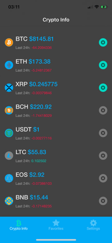
In order to show some of its capabilities, I’ve created a simple application called “Crypto Info.” Note that I am using Expo in this tutorial, and the whole application code is available here on GitHub.

Installation and setup
As always, we begin with installing the library by our package manager of choice (I use Yarn here): yarn add react-native-paper.
If your app was made by a react-native CLI, you also need to add SVG icons to the project:
yarn add react-native-vector-icons
react-native link react-native-vector-icons
If you’re building your MVP with Expo ( like I do in this example ), you can omit this step.
Now, add the Babel plugin to your babel.config.js file for production environment, so it should look something like this:
module.exports = {
  presets: ['module:metro-react-native-babel-preset'],
  env: {
    production: {
      plugins: ['react-native-paper/babel'],
    },
  },
};
Most of the time, we won’t use every component from the library we’re importing. Adding this plugin helps us reduce the react-native-paper package size in the bundled production app since it only bundles with components we actually use.
Usage
In order to start using the package, we have to do some minimal setup first.
In the App.js file:
import { AppLoading } from 'expo'
import { Platform, StatusBar, StyleSheet, View } from 'react-native'
import { Ionicons } from '@expo/vector-icons'
import { DefaultTheme, DarkTheme, Provider as PaperProvider } from 'react-native-paper'
import { StoreProvider, Store } from './Store'

const styles = StyleSheet.create({
  container: {
    flex: 1,
  },
})

function App() {
  return (
    <View style={styles.container}>
      {Platform.OS === 'ios' && <StatusBar barStyle="default" />}
      <StoreProvider>
        <Store.Consumer>
          { (value) => {
            const { isDarkModeOn } = value[0]
            return (
              <PaperProvider theme={isDarkModeOn ? DarkTheme : DefaultTheme}>
                <AppNavigator theme={isDarkModeOn ? 'dark' : 'light'} />
              </PaperProvider>
            )
          }}
        </Store.Consumer>
      </StoreProvider>
    </View>
  )
}
I am using context instead of redux for state management inside this app for easier setup. Inside a Store.Consumer component, I render the app based on context value.
The value of isDarkModeOn is a boolean determining the current state of the theme being used. This setup is necessary if you want to dynamically change the color theme later on. You can also use it with Redux — the setup is very similar.
Then, inside the renderProps, I return a PaperProvider wrapper for the whole application, whose child is the AppNavigator component.
The AppNavigator component theme is also dynamically changed by the same context value, but the default theme used in a navigation library like react-navigation is its own theme, not the paper theme. This is why, later on, we’ll have to do a bit more setup in order to make use of DefaultTheme and DarkTheme colors inside our navigation components.
The PaperProvider wrapper receives a single theme prop based on context value — it’s either DefaultTheme or DarkTheme. To get things set up more quickly, I use the built-in DefaultTheme and DarkTheme in this tutorial. The themes can be customized or completely overridden.
After this setup, we can start building our app and make use of all react-native-paper features.
Building the Crypto Info app
For the purpose of this article, I’ve built a simple app I’ve called Crypto Info, which consists of three screens. It connects to the CoinGecko API in order to get the list and all the necessary information about cryptocurrency data.
HomeScreen displays a list of cryptocurrencies with basic information about each one of them. FavoritesScreen displays a list of our favorite cryptocurrencies for easier navigation to those that interest us most. SettingsScreen is a screen with a single setting: a theme switch component.
I’ll focus on the usage of react-native-paper in each screen in this part of the article.
HomeScreen
This is a function component that returns a list of cryptocurrencies available on the CoinGecko API. It receives a theme prop, which is available through the withTheme wrapper from react-native-paper. This allows us to make use of the theme set inside the PaperProvider .

import React from 'react'
import { View, FlatList } from 'react-native'
import { get } from 'lodash';
import { withTheme,
  Title,
  Caption,
  Divider,
  Avatar,
  Surface,
  Button,
  DarkTheme,
  DefaultTheme,
} from 'react-native-paper'

function HomeScreen({ theme }) {
 // There's more code inside this component which will be explained later.
 return (
    <View style={[styles.container, { backgroundColor: theme.colors.surface }]}>
      <Portal>
        <Modal
          visible={isModalVisible}
          contentContainerStyle={styles.modalContent}
          dissmisable
          onDismiss={() => setModalVisibility(false)}
        >
          {renderModalContent()}
        </Modal>
      </Portal>
      <FlatList
        style={styles.flatListContainer}
        data={coins}
        extraData={coins}
        ItemSeparatorComponent={renderItemSeparator}
        ListFooterComponent={renderFooter}
        renderItem={renderItem}
        initialNumToRender={20}
        keyExtractor={keyExtractor}
        onEndReached={fetchMoreCoins}
        onEndReachedThreshold={0.2}
        contentContainerStyle={styles.contentContainer}
      />
    </View>
  )
}
HomeScreen.js contains the contents of a container View, which receives a color from the theme props, and then I pass it to the backgroundColor of this container element. Inside the View container, there’s a FlatList component, which receives data coins fetched from the API.
How to correctly fetch data and pass it to the global context store is a topic for another article. In this one, I’ll focus on the render functions of this FlatList component.
renderItemSeparator
const renderItemSeparator = () => <Divider style={styles.divider} />
This function renders a Divider component from react-native-paper, which is a “thin, lightweight separator that groups content in lists and page layouts.”
renderFooter
const renderFooter = () => isLoading && <Button style={styles.footer} loading={isLoading} />
This function renders a Button component, which receives a state isLoading bool and shows up a loading spinner whenever the new content on the list is being added.
renderItem
const renderItem = (item) => {
    const image = get(item, 'item.image')
    const priceChange24h = get(item, 'item.price_change_24h')
    const currentPrice = get(item, 'item.current_price')
    const symbol = get(item, 'item.symbol')
    return (
      <TouchableOpacity
        onPress={() => getCurrentItemInfo(item)}
        style={styles.surfaceContainer}
      >
        <Surface style={styles.surface}>
          <Avatar.Image style={styles.avatar} size={28} source={{ uri: image && image }} />
          <View style={styles.infoContainer}>
            <View style={styles.sectionContainer}>
              <Title
                numberOfLines={1}
                style={styles.coinName}
              >
                {symbol }
              </Title>
              <Title style={{ color: colors.primary }}>
                {' $'}
                {currentPrice}
              </Title>
            </View>
            <View style={styles.sectionContainer}>
              <Caption>Last 24h: </Caption>
              <Caption
                style={{ color: priceChange24h < 0 ? colors.error : colors.accent }}
              >
                {priceChange24h}
              </Caption>
            </View>
          </View>
          <TouchableOpacity hitSlop={{ x: 10, y: 10 }} onPress={() => handleFavorites(item)}>
            <Avatar.Icon
              size={28}
              icon="stars"
              style={[
                styles.avatar,
                { backgroundColor: isFavorited(item) ? colors.accent : colors.disabled },
              ]}
            />
          </TouchableOpacity>
        </Surface>
      </TouchableOpacity>
    )
  }
This function receives an item argument, which holds data for a single item from the API data. Inside this function we build the single item, which looks like this:


This single item contains elements from react-native-paper like Avatar.Image for logo, Title text element for symbol and current_price, Caption element for smaller text under the price, and Avatar.Icon for the star icon button to add the item to favorites.
When we press on the item, we open a Modal component containing more data about a certain currency.
Thanks to the Portal component from react-native-paper, we can now easily add a modal component to our app because Portal renders a component that should appear above other elements.
FavoritesScreen
This screen contains all the elements we starred on the previous screen. It contains all the same elements as the HomeScreen.


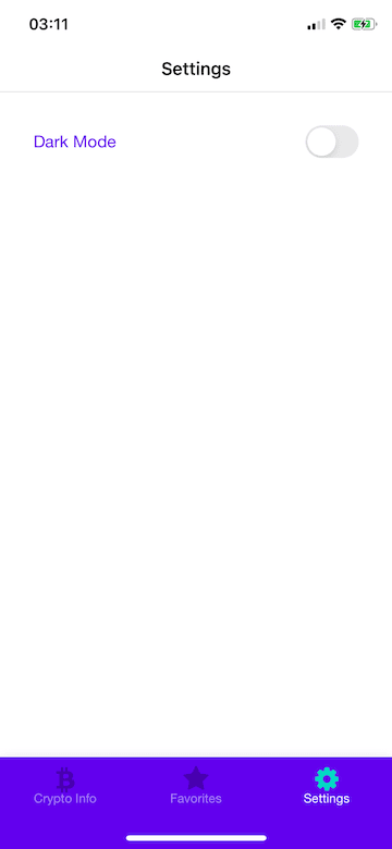
SettingsScreen
This screen contains only one setting at this moment, which is a Switch component.

import React from 'react'
import { View, StyleSheet } from 'react-native'
import { Switch, Subheading, withTheme, DarkTheme, DefaultTheme } from 'react-native-paper'
import { themePropTypes } from '../constants/propTypes'
import { useStateValue } from '../Store'
const styles = StyleSheet.create({
  container: {
    flex: 1,
    elevation: 2,
    padding: 16,
  },
  row: {
    flexDirection: 'row',
    alignItems: 'center',
    justifyContent: 'space-between',
    paddingTop: 16,
    paddingHorizontal: 16,
    width: '100%',
  },
})
function SettingsScreen({ theme }) {
  const { colors } = theme
  const [state, dispatch] = useStateValue()
  const { isDarkModeOn } = state
  const handleThemeChange = () => dispatch({
    type: 'TOGGLE_THEME',
    payload: !isDarkModeOn,
  })
  return (
    <View style={[styles.container, { backgroundColor: colors.surface }]}>
      <View style={styles.row}>
        <Subheading style={{ color: colors.primary }}>Dark Mode</Subheading>
        <Switch value={isDarkModeOn} onValueChange={handleThemeChange} />
      </View>
    </View>
  )
}
export default withTheme(SettingsScreen)
When users press on the Switch component, it dispatches an action to the context store to switch the currently used theme in the whole app.
Theming
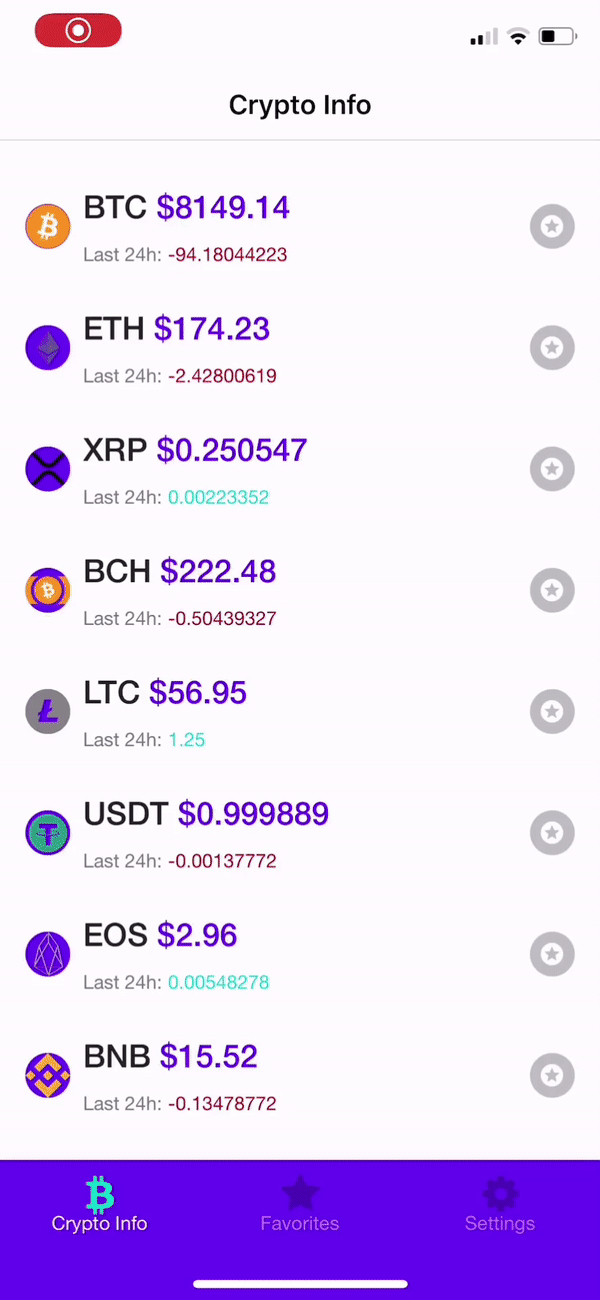
react-native-paper supports theming through the PaperProvider component, which, by default, will apply DefaultTheme to the app (light-mode in Crypto Info). Thanks to this component, every component from the library will automatically receive styles from the actual theme passed to the provider.
Custom components can receive the theme props after wrapping them up in the withTheme higher-order component function from the library. In this example app, I make use of DefaultTheme and DarkTheme from the library, but we can provide our own custom theme; those are the elements that live inside the theme object.
- dark (boolean): whether this is a dark theme or light theme.
- roundness (number): roundness of common elements, such as buttons.
- colors (object): various colors used throughout different elements.
    - primary - primary color for your app, usually your brand color.
    - accent - secondary color for your app which complements the primary color.
    - background - background color for pages, such as lists.
    - surface - background color for elements containing content, such as cards.
    - text - text color for content.
    - disabled - color for disabled elements.
    - placeholder - color for placeholder text, such as input placeholder.
    - backdrop - color for backdrops of various components such as modals.
- fonts (object): various fonts used throughout different elements.
    - regular
    - medium
    - light
    - thin
If you want to have fun with customizing your app theme, there’s a great website called https://coolors.co that can help you with choosing colors. Here’s a simple custom theme I’ve come up with in just few minutes:
customTheme
const customTheme = {
    dark: false,
    roundness: 4,
    colors: {
      primary: '#034748',
      accent: '#11B5E4',
      background: '#F1F7ED',
      surface: '#F1F7ED',
      text: '#001021',
      error: '#B71F0E',
      disabled: '#BEC6C6',
      placeholder: '#1481BA',
      backdrop: '#001021',
    },
    fonts: {
      regular: 'Helvetica Neue',
      medium: 'Helvetica Neue Light',
    },
  }
And the app looks like this now:

Summary
react-native-paper is a great library, and it’s really useful when you want to get started with working on your app idea immediately, even without design skills. Our components’ UI is clean, simple, and easily customizable. I really recommend trying it out!
Editor's note: Seeing something wrong with this post? You can find the correct version here.
Plug: LogRocket, a DVR for web apps

LogRocket is a frontend logging tool that lets you replay problems as if they happened in your own browser. Instead of guessing why errors happen, or asking users for screenshots and log dumps, LogRocket lets you replay the session to quickly understand what went wrong. It works perfectly with any app, regardless of framework, and has plugins to log additional context from Redux, Vuex, and @ngrx/store.
In addition to logging Redux actions and state, LogRocket records console logs, JavaScript errors, stacktraces, network requests/responses with headers + bodies, browser metadata, and custom logs. It also instruments the DOM to record the HTML and CSS on the page, recreating pixel-perfect videos of even the most complex single-page apps.
Try it for free.
The post Designing a UI with custom theming using react-native-paper appeared first on LogRocket Blog.


Top comments (2)
This is also beautiful website for free svg icon - custicon.com
10000+ free icons for use in web, iOS, Android, and desktop apps. Support for SVG. License: MIT, Free for commercial or personal use.
This provide svg icon and svg code and also provide the icon image and it should be free
play.google.com/store/apps/details...
How I can implement search login like one implement in this above app??