
Folder structure and code layout is just as important as the actual code itself. Clean code should be readable and easy to understand. The goal should always be for a new person to take a look at your code and be able to understand the purpose without going into the details of the code. Similarly, I like to organize my files and folders in a way that makes it easy to navigate and understand which files are related to each other.
In this part, let us add 2 features that will allow users to easily see which date is selected and the user of the component to be able to access that date and then take a look at the calendar component's folder structure and then
Section 1: Selected Date Indication
One of the most infuriating things a web application (any application for that matter) is the lack of indicators. If the user doesn't know what's selected, loading, disabled, or active, then they will get confused. As most of you know, you can test any web application as much as you want, only to have the user pick it apart by being dumb users. This is a fallacy.
If the web application is not guiding the user to use it properly, then there is a serious lack of UI/UX decisions that were made in its creation. Of course, I am not a UI/UX expert, but having worked with them and QA testers, understand its importance. So, let's take a moment to add an indication on the dates that are selected by our users.
Below is an image of the completed component and what we're going to add now is the circle around the date that is selected.

Here is the code for our DateIndicator:
import React from 'react';
import {
  getDayOfMonth,
  getMonthDayYear,
  getMonth,
  getYear,
} from '../utils/moment-utils';
import { getDatesInMonthDisplay } from '../utils/date-utils';

const DateIndicator = ({ activeDates, selectDate, setSelectDate }) => {
  const changeDate = (e) => {
    setSelectDate(e.target.getAttribute('data-date'));
  };

  const datesInMonth = getDatesInMonthDisplay(
    getMonth(selectDate) + 1,
    getYear(selectDate)
  );

  const monthDates = datesInMonth.map((i, key) => {
    return (
      <div
        className="date-icon"
        data-active-month={i.currentMonth}
        data-date={i.date.toString()}
        key={key}
        onClick={changeDate}
      >
        {getDayOfMonth(i.date)}
      </div>
    );
  });

  return <div className="bae-date-indicator">{monthDates}</div>;
};

export default DateIndicator;
Since all we need to specify a different style on an HTML element using CSS is a style applied to an attribute, we're going to take advantage of a class name called selected. The element in question currently has a class name called date-icon. But there is no rule saying I can't add more!
// We want to add `className="date-icon selected"
<div
  className="date-icon"
  data-active-month={i.currentMonth}
  data-date={i.date.toString()}
  key={key}
  onClick={changeDate}
>
  {getDayOfMonth(i.date)}
</div>
Now the real question is, how do we figure out which date is selected and only apply the selected class name to the correct one? Well... that's simple. We know that the selectDate prop is a state that is tracked by the parent component. Thankfully, this component has access to it. As each of the monthDates are constructed, we can do a match to see if the date icon being constructed matches the selectDate. But, let's think for a moment about what data we actually need to match?
I am hesitant to match on date objects themselves, because you never know if the date object is accurate to the millisecond. Not to mention, I have no clue how date objects will behave as it moves from different timezones to another. For example, if my database is in UTC time, but the end user is in PST, the date object may change according to the timezone. Normally, we would store this information as a string to prevent this, but you never know. So... we're going to take the safe route and use the following function with MomentJs to pull the month, day, and year as a string.
export const getMonthDayYear = (date) => moment(date).format('MM-DD-YYYY');
By utilising this, we can do a match like so.
const selected = getMonthDayYear(selectDate) === getMonthDayYear(i.date) ? 'selected' : '';
The ternary operation states, if the MM-DD-YYYY of selectDate matches the MM-DD-YYYY of another date, then the variable selected will be assigned a string value of selected. Otherwise, it will be an empty string. Note, that we disregard hours, minutes, and seconds, because that is information we do not care about for the purpose of this feature.
Applying this new change, let's take a look at the full component.
import React from 'react';
import {
  getDayOfMonth,
  getMonthDayYear,
  getMonth,
  getYear,
} from '../utils/moment-utils';
import { getDatesInMonthDisplay } from '../utils/date-utils';

const DateIndicator = ({ activeDates, selectDate, setSelectDate }) => {
  const changeDate = (e) => {
    setSelectDate(e.target.getAttribute('data-date'));
  };

  const datesInMonth = getDatesInMonthDisplay(
    getMonth(selectDate) + 1,
    getYear(selectDate)
  );

  const monthDates = datesInMonth.map((i, key) => {
    const selected =
      getMonthDayYear(selectDate) === getMonthDayYear(i.date) ? 'selected' : '';

    return (
      <div
        className={`date-icon ${selected}`}
        data-active-month={i.currentMonth}
        data-date={i.date.toString()}
        key={key}
        onClick={changeDate}
      >
        {getDayOfMonth(i.date)}
      </div>
    );
  });

  return <div className="bae-date-indicator">{monthDates}</div>;
};

export default DateIndicator;
As you can see, the className is now className={date-icon \${selected}}. If the date matches, it will append the string selected and add another class name attribute. From here on, let's quickly add a change to our style file.
.date-icon {
  display: flex;
  justify-content: center;
  justify-self: center;
  align-items: center;
  height: 25px;
  width: 25px;
  padding: 5px;
  cursor: pointer;
  &[data-active-month='false'] {
    color: rgba(0, 0, 0, 0.3);
  }
  &.selected {
    border-radius: 50%;
    box-shadow: 0 0 3px rgba(0, 0, 0, 0.5);
  }
}
And in our theme files from Part 2:
.bae-date-indicator {
  .date-icon {
    &.active {
      background-color: $secondaryColor;
      color: $activeTextColor;
    }
    &.selected {
      background-color: $primaryColor;
      color: $activeTextColor;
    }
  }
}
With that, your component is interactive! But what good is an interactive component if you can't get the date selected out as data?
Section 2: Extracting the date data
This is quite a simple one, but if you are not familiar with something called callbacks, then the answer may not be as obvious to you. Of course, most programmers understand callbacks early on in their work as it is used often. What we're going to do is take advantage of a callback to extract the date selected.
The main component file currently uses the React Hook called useState. For our next item, we need to pull in another hook called useEffect.
import React, { useEffect, useState } from 'react';
import { getToday } from './utils/moment-utils';
import './bae-calendar.scss';

import CalendarHeader from './components/calendar-header';
import WeekdayIndicator from './components/weekday-indicator';
import DateIndicator from './components/date-indicator';
import MonthIndicator from './components/month-indicator';
// https://uicookies.com/html-calendar/

import { presetDateTracker } from './utils/date-utils';

const themes = {
  salmon: 'salmon-theme',
  monochrome: 'monochrome-theme',
  rouge: 'rouge-theme',
};

const BaeCalendar = ({ theme, activeDates, onDateSelect }) => {
  const [selectDate, setSelectDate] = useState(getToday());

  return (
    <div className={`bae-calendar-container ${themes[theme]}`}>
      <CalendarHeader selectDate={selectDate} />
      <WeekdayIndicator />
      <DateIndicator
        activeDates={presetActiveDates.current}
        selectDate={selectDate}
        setSelectDate={setSelectDate}
      />
      <MonthIndicator selectDate={selectDate} setSelectDate={setSelectDate} />
    </div>
  );
};

export default BaeCalendar;
The hook useEffect is similar to componentDidMount and componentDidUpdate in class based react. Looking at the component code above, let's do a little experiment. We're going to add useEffect and console.log the selectDate.
const BaeCalendar = ({ theme, activeDates, onDateSelect }) => {
  const [selectDate, setSelectDate] = useState(getToday());

  useEffect(() => {
    console.log(selectDate);
  }, []);

  return (
    <div className={`bae-calendar-container ${themes[theme]}`}>
      <CalendarHeader selectDate={selectDate} />
      <WeekdayIndicator />
      <DateIndicator
        activeDates={presetActiveDates.current}
        selectDate={selectDate}
        setSelectDate={setSelectDate}
      />
      <MonthIndicator selectDate={selectDate} setSelectDate={setSelectDate} />
    </div>
  );
};

export default BaeCalendar;
Great! We see that the date is logged on the browser console. However, you'll quickly notice as you play with the component that subsequent date selections are not re-logging the newly selected date data. What's going on here?

Well, useEffect has the second argument which is currently an empty array. The items that go into this array is typically a state that we want to track. For example, if I add the following below, we now see that selecting dates triggers a log as we want it to.
const BaeCalendar = ({ theme, activeDates, onDateSelect }) => {
  const [selectDate, setSelectDate] = useState(getToday());

  useEffect(() => {
    console.log(selectDate);
  }, [selectDate]);

  return (
    <div className={`bae-calendar-container ${themes[theme]}`}>
      <CalendarHeader selectDate={selectDate} />
      <WeekdayIndicator />
      <DateIndicator
        activeDates={presetActiveDates.current}
        selectDate={selectDate}
        setSelectDate={setSelectDate}
      />
      <MonthIndicator selectDate={selectDate} setSelectDate={setSelectDate} />
    </div>
  );
};

export default BaeCalendar;
Essentially, you need to subscribe the useEffect to listen to changes to certain states. You can create more than one useEffect hook in one component to track multiple states if needed. For our purpose, since we're only tracking one, we only need to have one useEffect hook with selectDate added to the array of the second argument. Now it should behave like this.

This is great. Now we know that there is a way to track the state changes to get the data. Now, how do we give programs access to this information outside of the component? This is where callbacks come in.
Thankfully, we can add as many props to our components as we want. So, let's add a prop called onDateSelect to our parent component like so.
const BaeCalendar = ({ theme, activeDates, onDateSelect }) => {
  const presetActiveDates = useRef(presetDateTracker(activeDates || []));
  const [selectDate, setSelectDate] = useState(getToday());

  useEffect(() => {
    if (onDateSelect) {
      onDateSelect(selectDate);
    }
  }, [selectDate]);

  return (
    <div className={`bae-calendar-container ${themes[theme]}`}>
      <CalendarHeader selectDate={selectDate} />
      <WeekdayIndicator />
      <DateIndicator
        activeDates={presetActiveDates.current}
        selectDate={selectDate}
        setSelectDate={setSelectDate}
      />
      <MonthIndicator selectDate={selectDate} setSelectDate={setSelectDate} />
    </div>
  );
};
As you can see, inside of our useEffect hook, we now have an if statement that calls the onDateSelect prop function if it is a truthy (e.g. exists). Please note, that in normal circumstances, you may need to be more specific here as a user could pass in true to this prop which would break the component. However, let's take a look at how the component is used elsewhere.
<BaeCalendar
  theme="salmon"
  onDateSelect={(date) => {
    console.log(`The callback is accessing the date: ${date}`);
    return date;
  }}
  activeDates={null}
/>
As you can see, the callback function passed in can be defined outside of the component and console.log the date data giving us the following in our browser logs. Simple right? Now the component is ready to use in a form for date selections, calendars, or whatever creative things you want to create. Before we wrap things up, as developers we know that changes are inevitable. So let's take a look at how the component folders and files are organized in-case we need to modify or add more features later on.

Section 3: Folder structure of the component
There are many ways of designing a folder structure and often-times, when you start at a company, it is one of the first things you should figure out. A design pattern that is maintained by the team is an agreement that all team members sign off on (even if you weren't there when the decision was made). That being said, there is no right answer on what structure to use. In most cases, the best designs or conventions to use are dependent on the project and its requirement.
For the purpose of this small component, the folder structure is quite simple. We know that there is a index.js file holding the root component along with 4 sub-components:
CalendarHeaderWeekdayIndicatorDateIndicatorMonthIndicator
The folder structure I decided to use is one of many that are recommended on the React documentations and stems from a design methodology called Atomic Design. The basic premise of Atomic Design is that similar files are grouped together. In this case, all files related to the calendar component are grouped together.
Take a few minutes to look at the folder structure in the image.
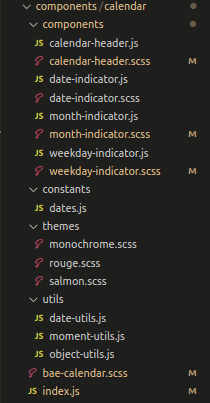
As you can see, the root of the component folder an index.js and bae-calendar.scss files. Inside of it, there is another component folder that contains the sub-components of the calendar. Next to them are the related style files. Aside from this, there are 3 folders called constants, themes, and utils. Let's take a moment to discuss why I prefer to structure my component files like this.
Organization by responsibility
Sub-components are technically still components. They each have their own responsibilities. Looking further, it should be easy to see what file / folder is responsible for what. The themes folder only contains style files. It's responsibility is clearly the styling of the separate themes we added in Part 3 of this series. The constants is the enumerated data-sets that I don't expect to change dynamically. The utils is the reusable code that can be pulled into any of the components to use. Take a moment to think about what might be inside of the utils files. Consider back in Part 1 and Part 2 when we created some logic and date-formatting.
Easy to find
If at any point, I need to make modifications to a sub-component or its related style, it is easy to locate where the changes need to take place. The name of the files and its proximity to the related files mean less clicking and searching.
Easy to move
In the future, if I decide to reuse this code or decide that I no longer need it and delete the code, I only need to do it in one place. This entire folder contains only code related to the calendar. This means that I can delete or move the folder without any risk of the component breaking. We are ensuring one of the rules of programming which is do not create side-effects (whenever possible).
Can you think of any similar patterns to this? One of them is something called duck filing which is recommended by redux. I won't go into the details, but if interested, you can read more about Atomic Design or Duck Filing.
Wrapping things up
First of all, if you've read the series and found this information helpful, please let me know and thank you for taking a peek into the process. Programming is a crazy journey with tons of information, but grasping little amounts at a time make it easier for us to continue to learn. One challenge I want you to consider is to add a feature to your calendar component which allows others to give it pre-selected dates. An example would be if the programmer knows that a person has 10 events in 2020, how will you show that on the calendar?
It's been an interesting experience writing these for the series and I hope that this information benefits you to some degree. If there is anything else you would like to know, please don't hesitate to leave a commment below.

Top comments (0)