
Optimizing your form conversion rate could be based on either strategies, tactics, or both.
In this post, we'll introduce some concepts with real examples to help you copy them for your own forms.
1. Break the ice
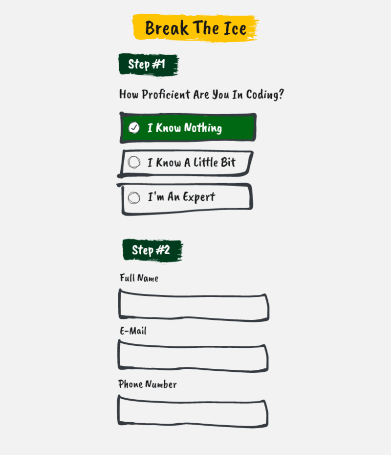
Instead of starting your form by asking for the most wanted information such as an email, name, phone number, etc, you can instead start with an ice breaker. That is a light question the users can answer without feeling an instant commitment till the beginning.
While adding another step may seem like adding more effort for your user, and more effort means less completion right? It's actually the opposite for this case, as we're not randomly adding another step but carefully breaking the ice to ease the commitment later.
2. Break it down
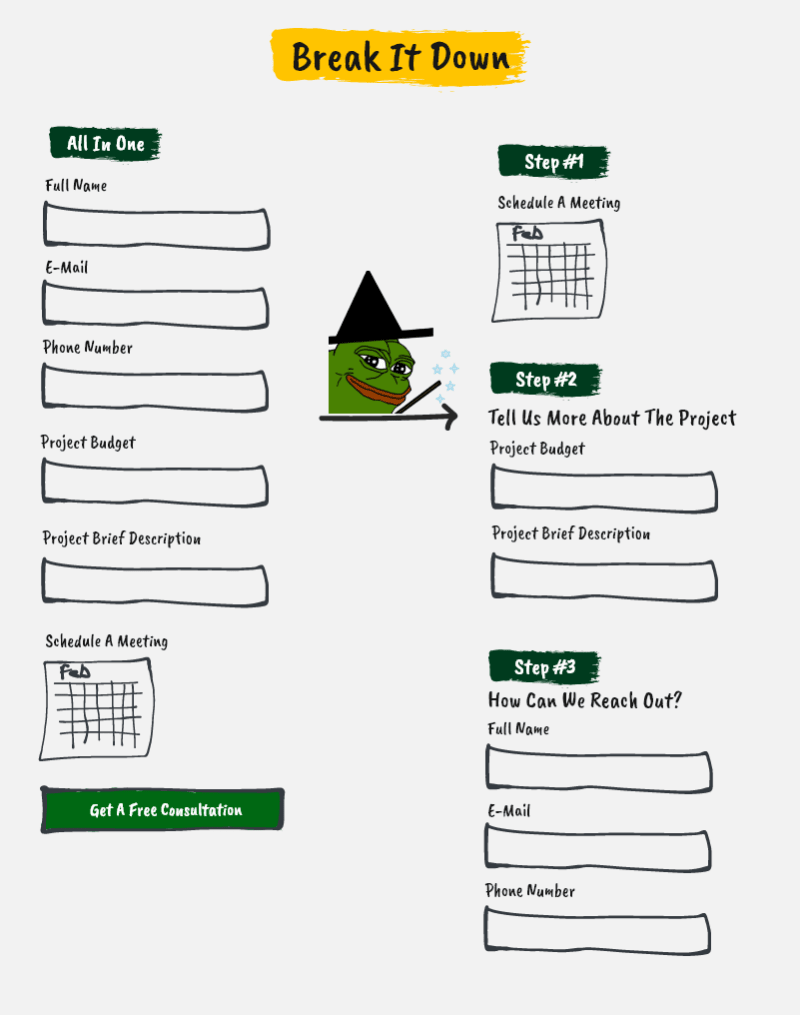
Long forms could be perceived as less time/effort consuming if you break them down. The idea here doesn't mean that we're going to fool the user. The user has to know that this is a multi-step form. We need to control what he sees in each step to reduce the cognitive load.
"In cognitive psychology, cognitive load refers to the amount of working memory resources used."
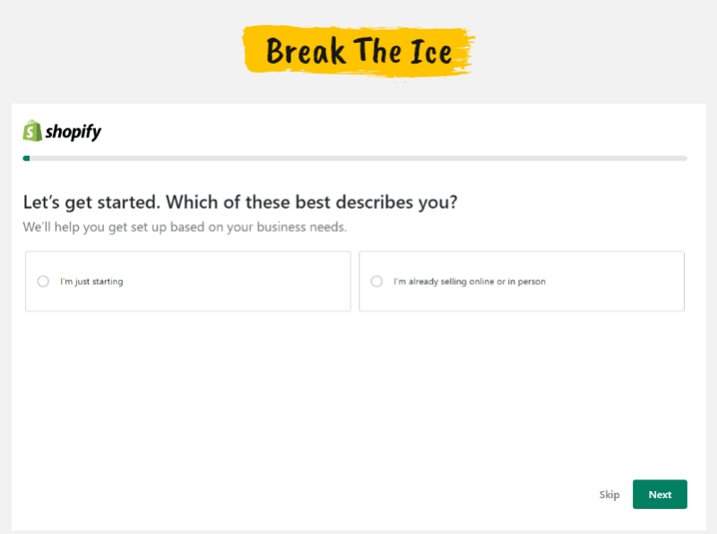
Here's an example from the Shopify sign-up form:
3. Try Value-Based CTAs

Instead of using an action-based call to action, try a value-based call to action. For Clickfunnels, they didn't use "sign up now" or "create an account", instead, they focused on the value that the user will get: building funnels. Same for Kajabi. It's not as specific as Clickfunnels, but still used a value-based call to action. To make sure you know which approach works best for you, you can A/B test them.
4. Check for contrast

This is one of the most common problems on the web and the easiest to fix. The text on your website needs a good contrast ratio so it's easier to read and accessible to your whole audience. A low-contrast text can either be read with difficulty or can't be read at all. That's because 8% of your audience have visual impairments.
A great way to check your contrast ratio is to use the web aim contrast checker tool.
Get More Free UX Tips Every Week
5. Create curiosity

One of the ways you can motivate your users is by creating curiosity. For A1-Autotransport, people can get a quote at the end of the funnel. When we learned that people are using the funnel mainly as a quote calculator, I decided to use the generated quote to nudge their curiosity. So we just blurred it just before the final step where they enter the most important information (name, email, and phone number). The result: a 3.52% uplift with a $7,672 monthly monetary contribution.
6. One column instead of multiple columns

Based on studies from nngroups and CXL, presenting the form in a one-column layout is a must-have best practice.
The CXL study had 2 groups of people completing a survey. The group who had the one-column form completed it 15.4 seconds faster than the other group.
So if you're using a multiple-column form, just change the layout to one column.
7. Personalize the paths with logic branches
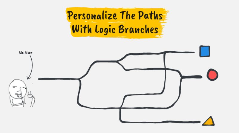
Your audience could be divided into segments. Sometimes, it makes sense to personalize the path for each segment. This way, you can craft a messaging that matches that segment.
Creating logic branches is very easy, especially with form builders like Typeform.
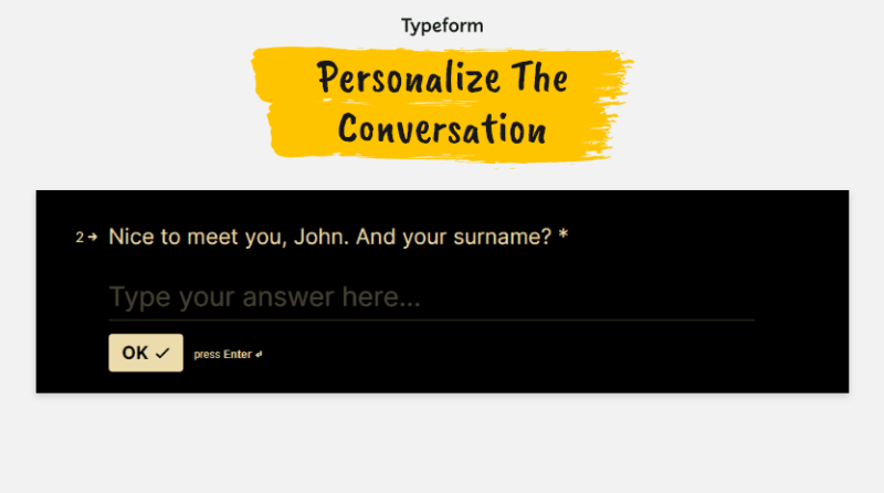
8. Personalize The Conversation
Here's another example from Typeform where you can use a user input, for example, their name, to make the copy more personalized and conversational.
9. Remove The Unnecessary
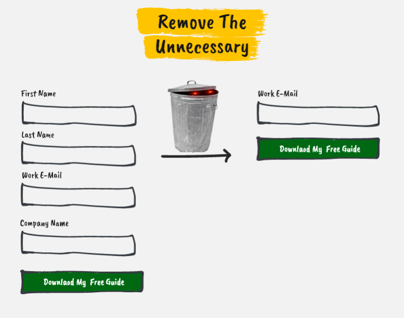
Go through each field and ask yourself: Do we really need this information? If the answer is "probably not", then remove it.
10. Use social proof to build trust
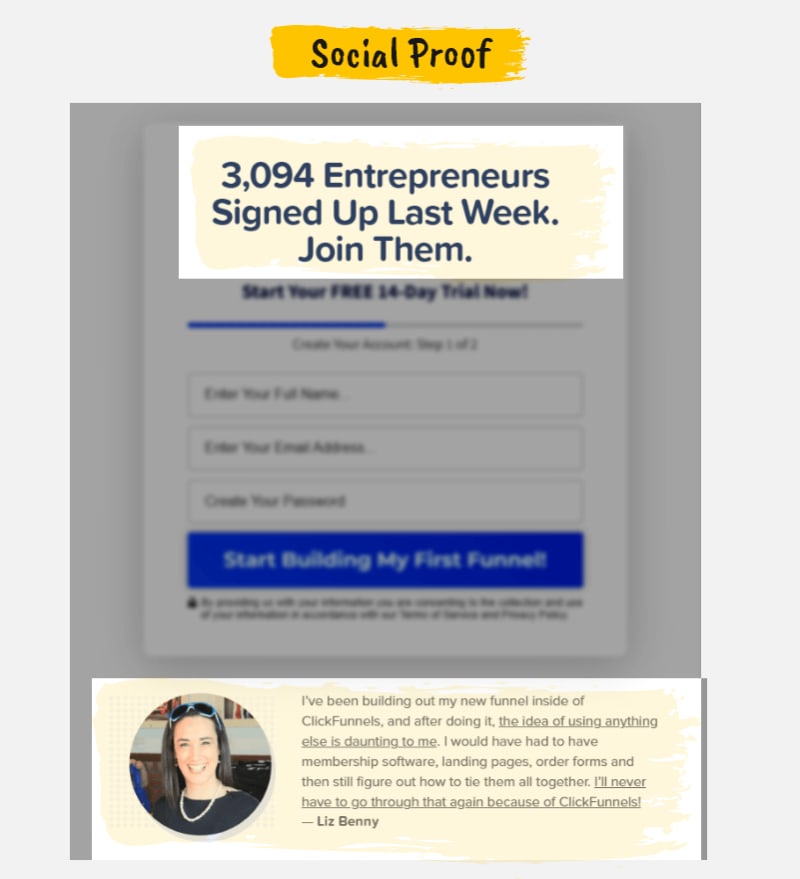
There are many ways you can use social proof to reassure your audience and make them feel that they're not alone and that they belong to a community.
11. Show the progress

If your form is broken down into multiple steps, people need to know where they are and whether they're close to the finish line or a little further. The worst thing you can do is give them no indication.
12. Conversational feedback

Treat your form as a person holding a real form and asking questions. That person can direct the (potential) customer, correct them if they made an error, and encourage them along the way. That person is your microcopy.
13. Offer incentives

At the time I'm writing this post, Shopify, Kajabi, Quickbooks, and other SaaS companies are offering special generous 3 months offers. While this isn't something you can add right away to your form as it's a business decision, this is a great conversion driver and should be considered if you have the ability.
For Binance, the incentive to complete the signup process is a $10 cashback voucher.

For The College Essay Guy, a combination of an incentive (free acess) and scarcity (until August, 31st).
14. Track Your Form User Behavior

While this is mentioned as the last tip in this post, it's actually one of the first things you need to do. Understanding the user behavior can be a great source of insights that you can use to optimize your form.
With session recordings, you can see how your customers are using the form like you're peeking over their shoulders. And this is even better than user testing as you're seeing their real behavior without the effect of your or your team's presence.
With funnels, you can see where the drop is happening and investigate that later.
Tools like Hotjar, Mouseflow, or VWO have to be in your arsenal to understand the user behavior and act on it
Conclusion
To optimize your form, you need to understand the user behavior and treat your users as humans because they are. That means creating a conversation with them, easing their effort, reassuring them, making them feel they belong, offering them great value, etc.
If you'd like to get free micro lessons like these about UX and conversion optimization, consider joining my free newsletter:

Top comments (0)