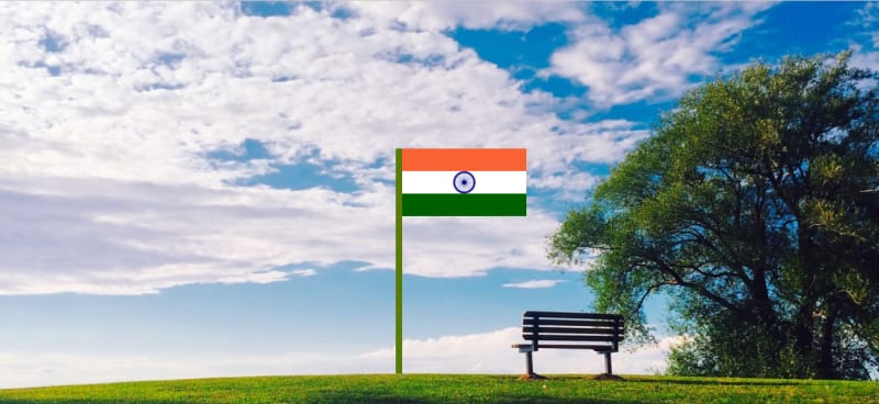
Design a beautiful animated India Flag in HTML and CSS.
index.html
<!DOCTYPE html>
<html lang="en">
<head>
    <meta charset="UTF-8">
    <meta http-equiv="X-UA-Compatible" content="IE=edge">
    <meta name="viewport" content="width=device-width, initial-scale=1.0">
    <title>India Flag</title>
    <link rel="stylesheet" href="style.css" >
</head>
<body>
    <div class="main-content">
        <div class="flag-stand"></div>
        <ul>
            <li class="orange"></li>
            <li class="white">
                <div class="ashoka-chakra-div">
                    <img src="ashoka-chakra.svg" alt="ashoka-chakra" class="ashoka-chakra">
                </div>
            </li>
            <li class="green"></li>
        </ul>
    </div>
</body>
</html>
style.css
body{
    background-image: url(https://images.wallpaperscraft.com/image/single/bench_sky_clouds_113412_1280x720.jpg);
    background-size: cover;
}
.main-content{
    position: absolute;
    bottom: 9.2%;
    left: 45%;
}
.flag-stand{
    width: 10px;
    height: 350px;
    background: #587a0a;
    float: left;
}
ul{
    list-style: none;
    margin: 0;
    float: left;
    padding: 0;
}
li{
    width: 180px;
    height: 35px;
    animation-name: stretch;
    animation-duration: 1.5s;
    animation-timing-function: ease-out;
    animation-direction: alternate;
    animation-iteration-count: infinite;
}
@keyframes stretch {
    0% {
      transition: all 0.75s ease-in-out;
      width: 185px;
    }
    50% {
      transition: all 0.75s ease-in-out;
      width: 195px;
    }

    100% {
      transition: all 0.75s ease-in-out;
      width: 205px;
    }
  }
.orange{
    background: #f96232;
}
.white{
    background: #fff;
}
.green{
    background: #006000;
}
.ashoka-chakra-div{
    width: 35px;
    height: 35px;
    margin: 0 auto;
    animation: rotate 2s linear infinite;
}
.ashoka-chakra{
    height: 100%;
    animation-delay: 9s;
}
@keyframes rotate{
    from{
        transform: rotate(0deg);
    }
    to{
        transform: rotate(360deg);
    }
}
Blog:- Beginner Developer

Top comments (0)