Youtube Short
A box plot, also known as a box and whisker plot, is a graphical representation of a dataset that shows the distribution of values in the data. It is a useful tool for visualizing the spread and skewness of a dataset, as well as identifying outliers.
The box plot can be used to compare the distribution of multiple datasets by creating a box plot for each dataset and placing them side by side. It is also possible to overlay box plots on top of each other to compare the distributions more closely.

-
Box plot is a graphical representation of a dataset that shows the distribution of values in the data.
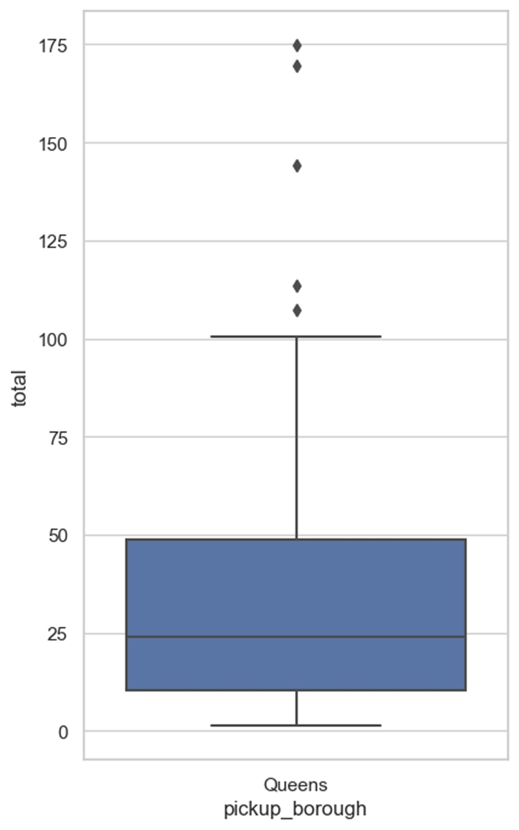
- The top line is maximum value.
- Bottom line is minimum value.
- The Centre line is Median.
- Top of the box is 75th percentile value.
- Bottom of the box is 25th percentile value.
- You see those circles outside yes those are called 'outliers'.
-
Lets see how to create one with python.
- Start by importing necessary packages.
- We will use seaborn to create the plot.
import seaborn as sns
import matplotlib.pyplot as plt
- Lets use some inbuilt dataset that comes with seaborn. called taxis. and set the style of the graph as white grid.
sns.set(style="whitegrid")

df = sns.load_dataset("taxis")
- Now define values for the x-axis and y-axis. and define a list of cities you want to create box plot for.
x = "pickup_borough"
y = "total"
cities = ["Queens"]
- Create the plot with
sns.boxplot()function, and providedfas data. set x as x y as y and order boxplot in order of cities list. Now useplt.show()function to show the graph.
ax = sns.boxplot(data=df, x=x, y=y, order=cities)

plt.show()
Final
import seaborn as sns
import matplotlib.pyplot as plt

sns.set(style="whitegrid")

df = sns.load_dataset("taxis")

x = "pickup_borough"
y = "total"
cities = ["Queens"]
ax = sns.boxplot(data=df, x=x, y=y, order=cities)

plt.show()
Result
I hope this tutorial has helped you understand the basics of box plots. If you have any questions comment them down below I will be more than happy to answer them.

Top comments (0)