This week, my team at AWS launched React UI components which are really fun to build with - I want to show you all some of what you can create!
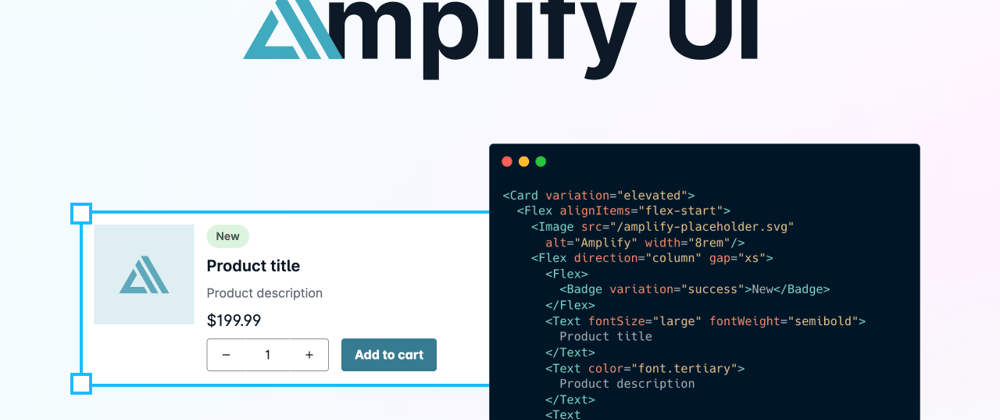
AWS Amplify UI is a set of primitive and cloud-connected components that enable customization, themability, and accessibility. There are primitive components for creating layouts, buttons, headers, ratings, and more. There are also components that connect to AWS resources to display maps and build authentication flows. Let's build a mapping application to work with the UI library!

Start an App
First, create an application - I used Next.js but you could just as easily use Create React App.
npx create-next-app amplify-ui-demo
cd amplify-ui-demo
Then, install the Amplify libraries and UI components:
npm i aws-amplify @aws-amplify/ui-react
Amplify UI doesn't come with a font by default, so you can choose one you like. The default theme uses the Inter font - we'll install that in our app as well.
npm install @fontsource/inter
At the top level of your application in /pages/_app.js, import the Amplify CSS file and inter font:
import "@aws-amplify/ui-react/styles.css";
import "@fontsource/inter/variable.css";
Build a Basic UI
Now, let's build out our app's basic UI! We'll do this in our app's home page - /pages/index.js. I'll first create an array of restaurants above my React component. Each one will have a name, cuisine, rating, price, and a (randomly generated) latitude and longitude:
const restaurants = [
  {
    name: "Mannys's Burgers",
    cuisine: "American",
    rating: 5,
    price: "$$",
    location: {
      lat: "32.385348495775",
      long: "-85.738272191934",
    },
  },
  {
    name: "Mac n Cheesy",
    cuisine: "American",
    rating: 4,
    price: "$",
    location: {
      lat: "40.385358710927",
      long: "-78.637760520167",
    },
  },
  {
    name: "Giuliano's Italian Restaurant",
    cuisine: "Italian",
    rating: 5,
    price: "$$$",
    location: {
      lat: "35.396328108119",
      long: "-87.786869702867",
    },
  },
  {
    name: "The Pink Sheep",
    cuisine: "Fine Dining",
    rating: null,
    price: "$$$$",
    rating: 3,
    location: {
      lat: "45.386348035105",
      long: "-97.535870048241",
    },
  },
];
I'll also pre-emptively import all the UI components I'll need. I'll also import the Next.js Link component.
import {
  withAuthenticator,
  Card,
  Badge,
  Heading,
  Rating,
  Text,
  Link,
  Flex,
  View,
  SearchField,
  useTheme,
  MapView,
} from "@aws-amplify/ui-react";

import NextLink from "next/link";
We'll start off by a View component which will will render as a div by default. We'll keep the Next.js Head with a title tag in it.
function Home() {
  return (
    <View>
      <Head>
        <title>RestaurantList</title>
      </Head>
    </View>
  );
}
Below the Head, let's build a header. We'll first use the View component again, but this time we'll render it as a header element instead of as a div. We'll also add some padding. Then we'll use the Flex component for flexbox. You can use props that mirror the flexbox CSS properties! We'll center the content within the row and add space around the items. We'll create another Flex and add some Links. We'll also add a heading with a level of 1 with the name of the site. Finally, we'll add another Flex with a SearchField inside of it.
<View as="header" padding="10px">
  <Flex direction="row" justifyContent="space-around" alignItems="center">
    <Flex>
      <NextLink href="">
        <Link>Home</Link>
      </NextLink>
      <NextLink href="/about">
        <Link>About</Link>
      </NextLink>
      <NextLink href="/shop">
        <Link>Shop</Link>
      </NextLink>{" "}
    </Flex>
    <Heading level={1} textAlign="center">
      RestaurantList
    </Heading>
    <Flex>
      <SearchField />
    </Flex>
  </Flex>
</View>
After that, let's loop through our restaurants and add Cards for each. We'll create a Flex here so that we can display a map next to the cards in the future. Then we'll add a View component with a maxWidth set. We'll loop through the restaurants and create a Card for each. Each Card will have information about the Restaurant on the left side, and then a rating on the right. The Rating component will render the star rating for each restaurant!
<Flex>
  <View maxWidth="800px">
    {restaurants.map((restaurant) => (
      <Card variation="elevated" key={restaurant.name} margin="10px">
        <Flex direction="row" justifyContent="space-between">
          <Flex direction="column">
            <Heading level={3}>{restaurant.name}</Heading>
            <Badge size="large" variation="info" width="fit-content">
              {restaurant.cuisine}
            </Badge>
            <Text color="grey">{restaurant.price}</Text>
          </Flex>
          <Flex direction="column">
            <Rating value={restaurant.rating} maxValue={5} />
          </Flex>
        </Flex>
      </Card>
    ))}
  </View>
</Flex>
Now your UI should look like this:

Theming
Amplify UI is fully themeable -- you can make it so the components fully match your brand or style. There are some example themes used within the Amplify UI docs that totally change how the UI looks!
In this case, I'll change up some of the colors used. I'll use green as the primary theme color and yellow as the secondary. I'll add the theme object to the _app.js file. Amplify UI has colors builtin which is where the green and yellow are coming from, but you could also set these values to completely custom colors.
const earthyTheme = {
  name: "earthTheme",
  tokens: {
    colors: {
      brand: {
        primary: {
          10: { value: "{colors.green.10}" },
          20: { value: "{colors.green.20}" },
          40: { value: "{colors.green.40}" },
          60: { value: "{colors.green.60}" },
          80: { value: "{colors.green.80}" },
          90: { value: "{colors.green.90}" },
          100: { value: "{colors.green.100}" },
        },
        secondary: {
          10: { value: "{colors.yellow.10}" },
          20: { value: "{colors.yellow.20}" },
          40: { value: "{colors.yellow.40}" },
          60: { value: "{colors.yellow.60}" },
          80: { value: "{colors.yellow.80}" },
          90: { value: "{colors.yellow.90}" },
          100: { value: "{colors.yellow.100}" },
        },
      },
    },
  },
};
To use the theme, import the ThemeProvider component.
import { ThemeProvider } from "@aws-amplify/ui-react";
Then, wrap the top-level application component in the ThemeProvider and pass the theme prop set to the theme object.
function MyApp({ Component, pageProps }) {
  return (
    <ThemeProvider theme={earthyTheme}>
      <Component {...pageProps} />
    </ThemeProvider>
  );
}
Using Themes in Components
You can also use attributes from themes directly within your components in order to style them. Inside the Home component in index.js, use the useTheme hook.
const { tokens } = useTheme();
Then, let's set the background color of the header to the primary color from the theme:
<View as="header" padding="10px" backgroundColor={tokens.colors.brand.primary[40]}>
If the primary brand color changes in the future, the header will update to match!
Cloud Connected Components
Amplify UI also offers cloud connected components so that you can connect to AWS services directly from React components. First, install the Amplify CLI. If it's your first time using Amplify, you'll need to configure it as well.
npm install -g @aws-amplify/cli
Then, initialize Amplify within your project:
amplify init
When prompted, choose a name for your project and then respond "Yes" to initialize with the defaults. Choose your AWS Profile as well.
Now, add authentication to your project by running:
amplify add auth
Press enter for the default configuration, then choose Username and "No, I am done".
Then add mapping to your app:
amplify add geo
Answer the questions as follows (though choose any name for the map):
? Select which capability you want to add: Map (visualize the geospatial data)
✔ Provide a name for the Map: · map53122572
✔ Who can access this Map? · Authorized and Guest users
Available advanced settings:
- Map style & Map data provider (default: Streets provided by Esri)

✔ Do you want to configure advanced settings? (y/N) · no
Run amplify push to deploy your resources.
You'll then need to configure Amplify within your application code. Inside the ./pages/_app.js file add the following:
import awsExports from "../src/aws-exports";
import { Amplify } from "aws-amplify";

Amplify.configure(awsExports);
Let's first add a map component to the app. Inside the Flex and under the close of the </View> for the restaurant cards, let's add a MapView. The latitude and longitude are for the United States, you may want to play around with the zoom level.
<MapView
  initialViewState={{
    latitude: "37.0902",
    longitude: "-95.7129",
    zoom: 4,
  }}
></MapView>
Let's also add markers for each of our restaurants. We'll use react-map-gl for these.
Install the package:
npm i react-map-gl
Import the markers:
import { Marker } from "react-map-gl";
Then, inside the MapView tags, render the Markers.
{
  restaurants.map((restaurant) => (
    <Marker
      key={restaurant.name}
      latitude={restaurant.location.lat}
      longitude={restaurant.location.long}
    />
  ));
}
Now you'll have a map!

Now let's add an authentication flow so users need to sign in to view the map. Wrap the Home component in the higher-order withAuthenticator component. Now you'll be prompted to create a user and sign in!
export default withAuthenticator(Home);

You could also use database data instead of a JavaScript object by using Amplify's data categories.
Studio
You can also use Amplify Studio to go from Figma designs to cloud-connected code. Under the hood, the generated components will all use Amplify UI. Check out this tutorial to learn how to build a similar application using that workflow.
Conclusion
In this tutorial, we built a UI with both primitive and cloud-connected Amplify UI components. If you'd like to disconnect your app from the cloud and delete the authentication and geo resources, run amplify delete. As you build with Amplify UI, we'd love to hear your feedback!


Top comments (1)
Great..
I am happy to meet you.
I want to work with you.
Thanks.