 anirbmuk
/
toggle-button-vue
A toggle-button component using Vue3
This blog post aims to create a simple Toggle-Button component with Vue3, which can also be integrated with a form, via v-model.
Sometimes it is important to create these UI components on your own, instead of relying on heavier UI libraries. When you do this, you get to learn a few more intricate stuff, which you may ignore while using ready-made solutions, and also, you make it light-weight by excluding features you may not even need.
The ToggleButton Component
Props:
-
options(array) -
modelValue(string)
defineProps({
  modelValue: {
    type: String,
    default: ''
  },
  options: {
    type: Array as PropType<KeyValue<string>[]>,
    required: true
  }
})
Emits:
-
update:model-value(string)
defineEmits<{
  (e: 'update:model-value', value: string): void
}>()
Let's talk about the props.
The options array is a list of key-value objects, which are displayed as buttons.
<template v-for="option of options" :key="option.value">
  <button
    type="button"
    :class="{ selected: modelValue === option.value }"
    @click="$emit('update:model-value', option.value)"
  >
    {{ option.label }}
  </button>
</template>
The modelValue prop is an interesting one. It should be named modelValue (case-sensitive), if you want this component to have a data-binding. When a custom component has this prop, and it is bound to a v-model, the value flows into this component and is applied to the underlying model.
If you want the component to have a 2-way data-binding, you also need to define an emit called update:model-value (again, case-sensitive). You write your logic to emit this event with the new value, every time a new button is clicked.
...
@click="$emit('update:model-value', option.value)"
...
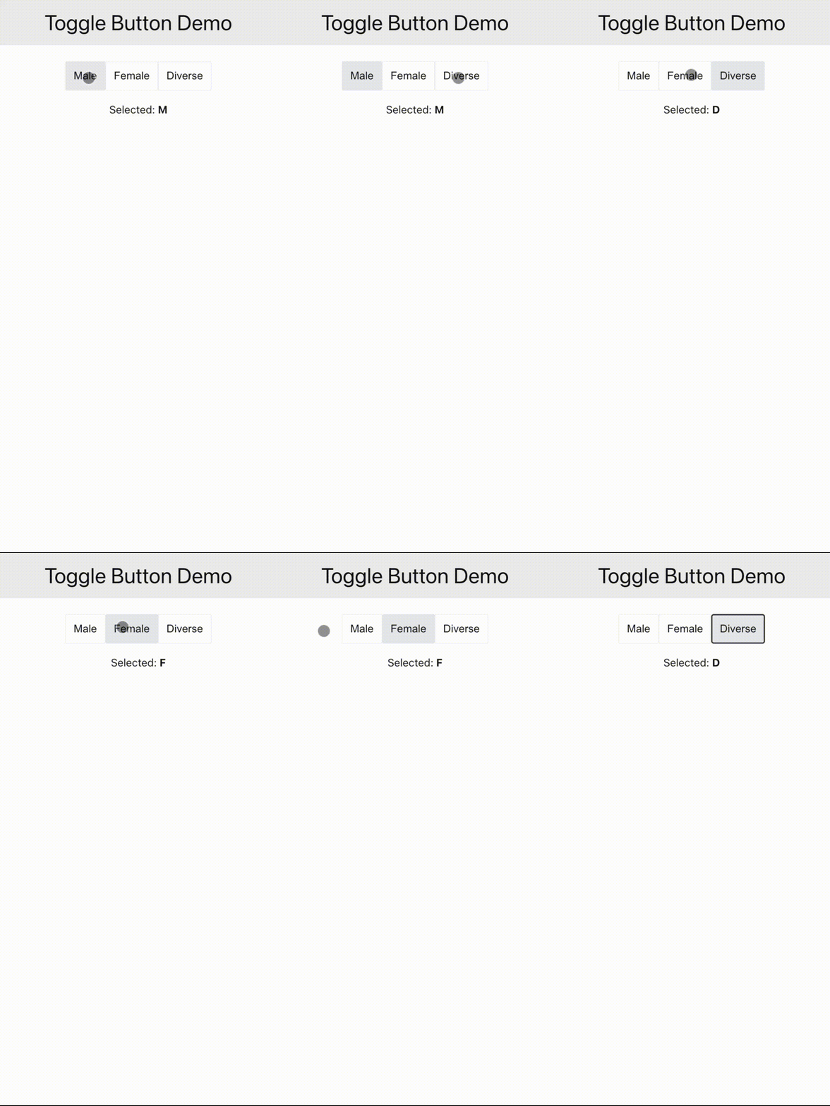
Now that your component is ready for 2-way binding, you can use it in your application:
<ToggleButton :options="options" v-model="selected" />
...
const options = [
  {
    label: 'Male',
    value: 'M'
  },
  {
    label: 'Female',
    value: 'F'
  },
  {
    label: 'Diverse',
    value: 'D'
  }
] satisfies KeyValue<string>[]

const selected = ref<string>('F')
That's all folks. Refer to the GitHub repo for the complete code!


Top comments (0)