
Definitely NextJS has positioned itself as the best React framework at present, offering all the benefits of the library we love so much, in addition to offering extras such as SSR and configuration for SEO.
So, the purpose of this post is to show how easy and intuitive it can be to make a navbar in NextJS with the help of TailwindCSS. For more complexity, I will make a second post in which we will add a global status for the elements of our Navbar to change.
Setup and configuration
So, the first thing that we need is install NextJS with NextCli, in my case I prefer to use Yarn.
yarn create next-app
After creating our application, we proceed to install tailwind and the dependencies we need:
yarn add tailwindcss@latest postcss@latest autoprefixer@latest postcss-cli
After installing our dependencias, we need to do some modifications in App.js and create new files. Let's start by creating the file postcss.config.js , which will be located in the root of the project:
touch postcss.config.js
Inside the file, we will place the following configuration
// postcss.config.js
module.exports = {
  plugins: {
    tailwindcss: {},
    autoprefixer: {},
  },
}
After this, we will create the file tailwind.config.js with the following command
npx tailwindcss init --full
This generates a tailwind.config.js file that we can modify and custom like we want.
Now, we can delete the default generate style created by Next and we need to create two files in the styles folder: main.css and tailwind.css.
Inside the tailwind.css file we need to add this content
/* ./styles/tailwind.css */
@tailwind base;
@tailwind components;
@tailwind utilities;
After that we must modify the App.js and Index.js pages so that they do not conflict with the deleted files.
/* ./pages/index.js               */
import Head from 'next/head';

export default function Home() {
  return (
    <div>
      <Head>
        <title>Create Next App</title>
        <link rel='icon' href='/favicon.ico' />
      </Head>
      <div>Hello World</div>
    </div>
  );
}
/*   ./styles/_app.js              */
import '../styles/main.css';

function MyApp({ Component, pageProps }) {
  return <Component {...pageProps} />;
}

export default MyApp;
So, before we can work with Tailwind in our Next App, we need to generate a script that compiles the Tailwind classes in our main.css file. Therefore, in the package.json we need to add some scripts
{
  "name": "ourapp",
  "version": "0.1.0",
  "private": true,
  "scripts": {
    "dev": "next dev",
    "build": "next build",
    "start": "next start",
    "build:css": "postcss styles/tailwind.css -o styles/main.css",
    "build:watch": "postcss styles/tailwind.css -o styles/main.css --watch",
    "prod:build": "NODE_ENV=production yarn run build:css && yarn run build"
  },
  "dependencies": {
    "autoprefixer": "^10.1.0",
    "next": "10.0.4",
    "postcss": "^8.2.1",
    "postcss-cli": "^8.3.1",
    "react": "17.0.1",
    "react-dom": "17.0.1",
    "tailwindcss": "^2.0.2"
  }
}
Finally, we need to execute build:css
yarn build:css
And now we can use Tailwind in all out application :D .
Create the directory
Before we start, I'd like to show you the architecture I prefer to use in this type of application
And now we need to insert our component in the Layout. In this case we don't create a layout container, so we add the component directly in Index.js.
/* ./pages/index.js               */
import Head from 'next/head';
import { Navbar } from '../components/Navbar';

export default function Home() {
  return (
    <div>
      <Head>
        <title>Create Next App</title>
        <link rel='icon' href='/favicon.ico' />
      </Head>
      <Navbar />
      <div>Hello World</div>
    </div>
  );
}
Start our component
/*  ./components/Navbar.jsx     */

export const Navbar = () => {
  return (
    <div>

    </div>
  )
}
From the 17 React version it's no neccesary to import react in our functional components.
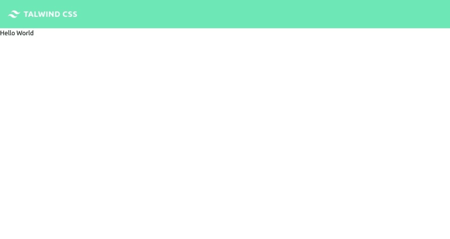
We will start by defining the grid which in this case will be flex, the padding and the background color
/*  ./components/Navbar.jsx     */

export const Navbar = () => {
  return (
    <>
      <nav className='flex items-center flex-wrap bg-green-300 p-3 '></nav>
    </>
  );
};
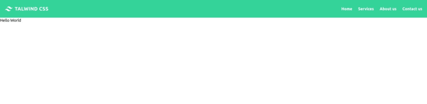
Next offers us its beautiful and useful tool Link for the redirection inside our SPA, so in this case we will use it for the logo and it will redirect us to the "Home" or main view of our application.
/*  ./components/Navbar.jsx     */
import Link from 'next/link';

export const Navbar = () => {
  return (
    <>
      <nav className='flex items-center flex-wrap bg-green-300 p-3 '>
        <Link href='/'>
          <a className='inline-flex items-center p-2 mr-4 '>
            <svg
              viewBox='0 0 24 24'
              xmlns='http://www.w3.org/2000/svg'
              className='fill-current text-white h-8 w-8 mr-2'
            >
              <path d='M12.001 4.8c-3.2 0-5.2 1.6-6 4.8 1.2-1.6 2.6-2.2 4.2-1.8.913.228 1.565.89 2.288 1.624C13.666 10.618 15.027 12 18.001 12c3.2 0 5.2-1.6 6-4.8-1.2 1.6-2.6 2.2-4.2 1.8-.913-.228-1.565-.89-2.288-1.624C16.337 6.182 14.976 4.8 12.001 4.8zm-6 7.2c-3.2 0-5.2 1.6-6 4.8 1.2-1.6 2.6-2.2 4.2-1.8.913.228 1.565.89 2.288 1.624 1.177 1.194 2.538 2.576 5.512 2.576 3.2 0 5.2-1.6 6-4.8-1.2 1.6-2.6 2.2-4.2 1.8-.913-.228-1.565-.89-2.288-1.624C10.337 13.382 8.976 12 6.001 12z' />
            </svg>
            <span className='text-xl text-white font-bold uppercase tracking-wide'>
              TalwindCSS
            </span>
          </a>
        </Link>
      </nav>
    </>
  );
};
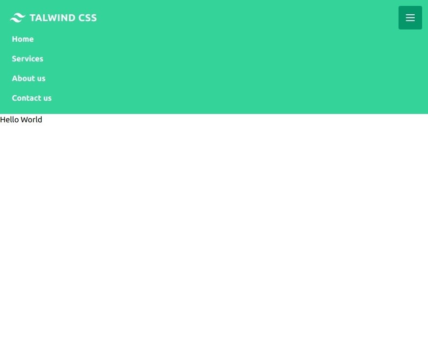
For now we have a simple view. Now we will proceed to add the hamburger menu that will be seen in smartphones and tablets:
/*  ./components/Navbar.jsx     */
import Link from 'next/link';

export const Navbar = () => {
  return (
    <>
      <nav className='flex items-center flex-wrap bg-green-300 p-3 '>
        <Link href='/'>
          <a className='inline-flex items-center p-2 mr-4 '>
            <svg
              viewBox='0 0 24 24'
              xmlns='http://www.w3.org/2000/svg'
              className='fill-current text-white h-8 w-8 mr-2'
            >
              <path d='M12.001 4.8c-3.2 0-5.2 1.6-6 4.8 1.2-1.6 2.6-2.2 4.2-1.8.913.228 1.565.89 2.288 1.624C13.666 10.618 15.027 12 18.001 12c3.2 0 5.2-1.6 6-4.8-1.2 1.6-2.6 2.2-4.2 1.8-.913-.228-1.565-.89-2.288-1.624C16.337 6.182 14.976 4.8 12.001 4.8zm-6 7.2c-3.2 0-5.2 1.6-6 4.8 1.2-1.6 2.6-2.2 4.2-1.8.913.228 1.565.89 2.288 1.624 1.177 1.194 2.538 2.576 5.512 2.576 3.2 0 5.2-1.6 6-4.8-1.2 1.6-2.6 2.2-4.2 1.8-.913-.228-1.565-.89-2.288-1.624C10.337 13.382 8.976 12 6.001 12z' />
            </svg>
            <span className='text-xl text-white font-bold uppercase tracking-wide'>
              Talwind CSS
            </span>
          </a>
        </Link>
        <button className=' inline-flex p-3 hover:bg-green-600 rounded lg:hidden text-white ml-auto hover:text-white outline-none'>
          <svg
            className='w-6 h-6'
            fill='none'
            stroke='currentColor'
            viewBox='0 0 24 24'
            xmlns='http://www.w3.org/2000/svg'
          >
            <path
              strokeLinecap='round'
              strokeLinejoin='round'
              strokeWidth={2}
              d='M4 6h16M4 12h16M4 18h16'
            />
          </svg>
        </button>
      </nav>
    </>
  );
};

Excellent, now we will proceed to add the view to be had in computers:
/*  ./components/Navbar.jsx     */
import Link from 'next/link';

export const Navbar = () => {
  return (
    <>
      <nav className='flex items-center flex-wrap bg-green-400 p-3 '>
        <Link href='/'>
          <a className='inline-flex items-center p-2 mr-4 '>
            <svg
              viewBox='0 0 24 24'
              xmlns='http://www.w3.org/2000/svg'
              className='fill-current text-white h-8 w-8 mr-2'
            >
              <path d='M12.001 4.8c-3.2 0-5.2 1.6-6 4.8 1.2-1.6 2.6-2.2 4.2-1.8.913.228 1.565.89 2.288 1.624C13.666 10.618 15.027 12 18.001 12c3.2 0 5.2-1.6 6-4.8-1.2 1.6-2.6 2.2-4.2 1.8-.913-.228-1.565-.89-2.288-1.624C16.337 6.182 14.976 4.8 12.001 4.8zm-6 7.2c-3.2 0-5.2 1.6-6 4.8 1.2-1.6 2.6-2.2 4.2-1.8.913.228 1.565.89 2.288 1.624 1.177 1.194 2.538 2.576 5.512 2.576 3.2 0 5.2-1.6 6-4.8-1.2 1.6-2.6 2.2-4.2 1.8-.913-.228-1.565-.89-2.288-1.624C10.337 13.382 8.976 12 6.001 12z' />
            </svg>
            <span className='text-xl text-white font-bold uppercase tracking-wide'>
              Talwind CSS
            </span>
          </a>
        </Link>
        <button className=' inline-flex p-3 hover:bg-green-600 rounded lg:hidden text-white ml-auto hover:text-white outline-none'>
          <svg
            className='w-6 h-6'
            fill='none'
            stroke='currentColor'
            viewBox='0 0 24 24'
            xmlns='http://www.w3.org/2000/svg'
          >
            <path
              strokeLinecap='round'
              strokeLinejoin='round'
              strokeWidth={2}
              d='M4 6h16M4 12h16M4 18h16'
            />
          </svg>
        </button>
        <div className='hidden w-full lg:inline-flex lg:flex-grow lg:w-auto'>
          <div className='lg:inline-flex lg:flex-row lg:ml-auto lg:w-auto w-full lg:items-center items-start  flex flex-col lg:h-auto'>
            <Link href='/'>
              <a className='lg:inline-flex lg:w-auto w-full px-3 py-2 rounded text-white font-bold items-center justify-center hover:bg-green-600 hover:text-white '>
                Home
              </a>
            </Link>
            <Link href='/'>
              <a className='lg:inline-flex lg:w-auto w-full px-3 py-2 rounded text-white font-bold items-center justify-center hover:bg-green-600 hover:text-white'>
                Services
              </a>
            </Link>
            <Link href='/'>
              <a className='lg:inline-flex lg:w-auto w-full px-3 py-2 rounded text-white font-bold items-center justify-center hover:bg-green-600 hover:text-white'>
                About us
              </a>
            </Link>
            <Link href='/'>
              <a className='lg:inline-flex lg:w-auto w-full px-3 py-2 rounded text-white font-bold items-center justify-center hover:bg-green-600 hover:text-white'>
                Contact us
              </a>
            </Link>
          </div>
        </div>
      </nav>
    </>
  );
};
So, now we hace the deskopt view:
After of this, we need a function that shows or hidden the menu when we click in the hamburger menu. For this we create a state using the useState hook and a function for the button when we click on it:
/*  ./components/Navbar.jsx     */
import Link from 'next/link';
import { useState } from 'react';

export const Navbar = () => {
  const [active, setActive] = useState(false);

  const handleClick = () => {
    setActive(!active);
  };

  return (
    <>
      <nav className='flex items-center flex-wrap bg-green-400 p-3 '>
        <Link href='/'>
          <a className='inline-flex items-center p-2 mr-4 '>
            <svg
              viewBox='0 0 24 24'
              xmlns='http://www.w3.org/2000/svg'
              className='fill-current text-white h-8 w-8 mr-2'
            >
              <path d='M12.001 4.8c-3.2 0-5.2 1.6-6 4.8 1.2-1.6 2.6-2.2 4.2-1.8.913.228 1.565.89 2.288 1.624C13.666 10.618 15.027 12 18.001 12c3.2 0 5.2-1.6 6-4.8-1.2 1.6-2.6 2.2-4.2 1.8-.913-.228-1.565-.89-2.288-1.624C16.337 6.182 14.976 4.8 12.001 4.8zm-6 7.2c-3.2 0-5.2 1.6-6 4.8 1.2-1.6 2.6-2.2 4.2-1.8.913.228 1.565.89 2.288 1.624 1.177 1.194 2.538 2.576 5.512 2.576 3.2 0 5.2-1.6 6-4.8-1.2 1.6-2.6 2.2-4.2 1.8-.913-.228-1.565-.89-2.288-1.624C10.337 13.382 8.976 12 6.001 12z' />
            </svg>
            <span className='text-xl text-white font-bold uppercase tracking-wide'>
              Talwind CSS
            </span>
          </a>
        </Link>
        <button
          className=' inline-flex p-3 hover:bg-green-600 rounded lg:hidden text-white ml-auto hover:text-white outline-none'
          onClick={handleClick}
        >
          <svg
            className='w-6 h-6'
            fill='none'
            stroke='currentColor'
            viewBox='0 0 24 24'
            xmlns='http://www.w3.org/2000/svg'
          >
            <path
              strokeLinecap='round'
              strokeLinejoin='round'
              strokeWidth={2}
              d='M4 6h16M4 12h16M4 18h16'
            />
          </svg>
        </button>
        {/*Note that in this div we will use a ternary operator to decide whether or not to display the content of the div  */}
        <div
          className={`${
            active ? '' : 'hidden'
          }   w-full lg:inline-flex lg:flex-grow lg:w-auto`}
        >
          <div className='lg:inline-flex lg:flex-row lg:ml-auto lg:w-auto w-full lg:items-center items-start  flex flex-col lg:h-auto'>
            <Link href='/'>
              <a className='lg:inline-flex lg:w-auto w-full px-3 py-2 rounded text-white font-bold items-center justify-center hover:bg-green-600 hover:text-white '>
                Home
              </a>
            </Link>
            <Link href='/'>
              <a className='lg:inline-flex lg:w-auto w-full px-3 py-2 rounded text-white font-bold items-center justify-center hover:bg-green-600 hover:text-white'>
                Services
              </a>
            </Link>
            <Link href='/'>
              <a className='lg:inline-flex lg:w-auto w-full px-3 py-2 rounded text-white font-bold items-center justify-center hover:bg-green-600 hover:text-white'>
                About us
              </a>
            </Link>
            <Link href='/'>
              <a className='lg:inline-flex lg:w-auto w-full px-3 py-2 rounded text-white font-bold items-center justify-center hover:bg-green-600 hover:text-white'>
                Contact us
              </a>
            </Link>
          </div>
        </div>
      </nav>
    </>
  );
};
And that it's all. Now we have our beatufil and simple Navbar using NextJS and TailwindCSS.
I recommend a lot that you visit the documentation of Tailwind and Next.
Both are powerful frameworks with great documentation that will allow us to stand out more and learn every day to improve as developers.
I hope to write the second part of this article soon, where with the help of useContext we will add a user section and change the navbar view depending if the user is logged in or not.
Plus: If you love React and you're looking for a simple and beautiful icons definitively you'll love HeroIcons. Here I let you their official page :D
Merry Christmas and enjoy with your families.


Top comments (17)
In this example we're using only the Home page. What if I want to use the NavBar for every page?
Should I import it on _app.js or _document.js?
In that case is better that you create a Layout in the Pages folder, if you need more help please let me know
I tried this code which works nicely. Thank you very much.
But I seem to have a problem when it gets down to mobile size. Then the hamburger no longer works - it cannot be clicked. The hamburger works fine in tablet size. Any idea why this is and how to fix it?
Hi, I tried this code. And it works nicely. To obtain a menu opening transition I added useRef hook, and so when active set the menu content height equal to refElement.current.scrollHeight + 'px'.
Here my example:
dev-to-uploads.s3.amazonaws.com/up...
Can you share the useRef function. it'll be helpful
NextJS has built in PostCSS support so why are you running PostCSS from the command line?
I prefer using a different file that tailwind.css, but you're right. You can work directly with the tailwind.css file and you don't need to run Postcss from the command line :D
Just wanted to say thank you ❤️ This was perfect!
Hola, yo estoy usando el componente Image para el logo como puedo darle estilos con Taildwind? Probé con className pero no funcionó tampoco con css module
Very useful resource, Thank You.
Ade
Just borrowed your mobile menu approach for a Web3 Dapp... gracias!
I implemented this on iloveto.fish Thank you! Great work :D
After testing lots and lots of NavBars, this one is the best. Thank you
thank you so much for this blog. It has really helped me with a project I am working on.
I have been developing web applications for 2 years now. Tailwind and your blog made my work much easier thanks to that.
Any suggestions for animating/transitioning this? I've tried using HeadlessUI and React-Transition-Group and neither have worked with this tutorial.
I added an overlay and then
<divclassName="fixed inset-0 bg-gray-800 navbar-backdrop opacity-80"
onClick={handleClick}
<
</div>