Today I learn about CSS Grib.
.container {
    display: grid;
}
To use the grid, first need to declare display: grid; on the parent element.
.container {
  display: grid;
  grid-template-rows: 50px 200px;
  grid-template-columns: 100px 200px;
  // Or shorthand
  grid-template: 50px 200px / 100px 200px;
}
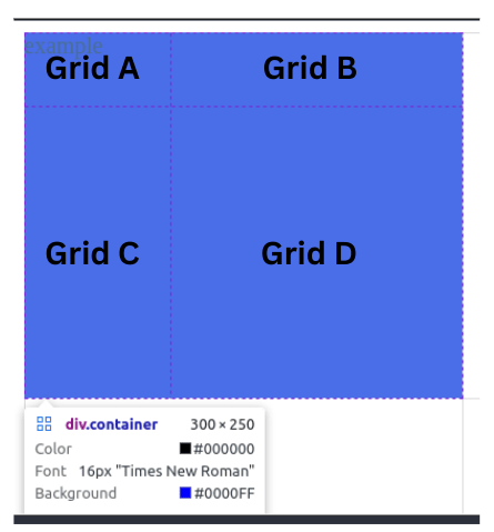
Then we can set the columns and rows for the grid. Example above show that we create a grid with 2 x 2. Where the
- Grid A is 100px * 50px
- Grid B is 200px * 50px
- Grid C is 100px * 200px
- Grid D is 200px * 200px
.item {
  background-color: blue;
  grid-row-start: 1;
  grid-row-end: 3;
  grid-column-start: 2;
  grid-column-end: 3;
  // Or shorthand
  grid-row: 1/3;
  grid-column: 2/3
}

To place the grid item on the parent's grid, we can use grid-column-start, grid-column-end, grid-row-start and grid-row-end. Example here show that we set the item to locate at row number 1 to row number 3 and column number 2 to column number 3.
.container {
  grid-column-gap: 20px;
  grid-row-gap: 20px;
  // Or shorthand
  gap: 20px
}

If we want to create some gap between the grid then we can use grid-column-gap for gap between column only. grid-row-gap for gap between row only. Or gap for both row and column.
.container {
    display: grid;
    grid-template-columns: 100px 200px 100px;
    grid-template-rows: 50px 200px 50px;
    grid-template-areas:
      'header header header'
      'content content ....'
      'footer footer footer';
}

.header {
    background-color: blue;
    grid-area: header;
}

.content {
    background-color: yellow;
    grid-area: content;
}

.footer {
  background-color: red;
  grid-area: footer;
}
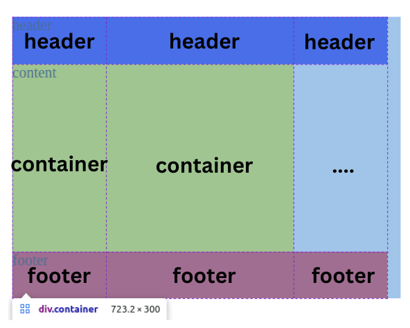
Another great thing about CSS Grid is the grid-template-areas as you can see example above how easy it is the setup the section according to the arrangement we set on the grid-template-areas then we only set which area to take for the section without the use of grid-row and grid-column. The first row is header header header, second row is container container .... the .... is use to represent empty space, one . only also can be use. Then last row is footer footer footer. Easy way to arrange the content.
Thanks for your time to finish read about my post. Feel free to share your idea and thought! 😸
let life = {
  first: 'eat',
  second: 'sleep',
  third: 'code',
  forth: 'repeat',
};

const {first, second, third, forth} = life

function capital(word) {
  return word[0].toUpperCase() + word.slice(1)
}

console.log(`${capital(first)}, ${capital(second)}, ${capital(third)}, ${capital(forth)}!`);
Andrew Tan


Top comments (0)