
Text is one of the most important parts in a web page. It normally will make up for the majority of the content, and it is key for accessibility: the font family, color, size, spacing, etc. will influence on the user experience and how accessible the page will be.
...And, conveniently for us, all those attributes can be set using CSS 😊
In this post, we are going to provide general recommendations on styles to improve the accessibility of the text. Some recommendations will be omitted because they fall out of the scope of this series as they are not directly related to CSS (e.g. don't use images for text). Also, some others will be reviewed by themselves at later posts due to their importance (e.g. color contrast).
With that in mind, let's see a few CSS suggestions to improve accessibility of the text:
Don't build a wall of text
You have experienced websites, books, or presentations with large blocks of text that discourage you to keep reading and make you lose your attention. That is the dreaded wall of text.
Those blocks of text are barrier to the content: letter and words mix and crumble, it is difficult to read, difficult to follow, people with cognitive disabilities have difficulties tracking their location on them...
While mixing content (interlacing lists, adding images, etc.) is a way of breaking the wall, you can also avoid it with CSS. It is a matter of playing with the size and spacing of the text blocks that cause it:
Narrow the content
Having a narrower text block makes it easier for users with certain reading and vision disabilities to keep their place while reading.
The recommendation is to have lines with an average of 80 characters or less, and designers recommend 45 to 75-character lines as the ideal measure. That's a big range, but take into account that, unless you are using monospaced fonts, not all characters and glyphs have the same width (e.g. an M is wider than an I.)
The ch unit is really convenient in this case: it represents the width of the glyph zero (0) which will make a good average when setting the width. Taking an average of 45 and 75, a width of 60ch sounds like a good estimate:
p {
  max-width: 60ch;
}
Better use of spacing
The wall of text is not only caused by wide blocks of texts. It also happens when text is too close together. It is important to:
- Add line spacing within the text blocks.
- Add spacing between content blocks.
As specified in the WCAG 2.1 criteria, it is ideal if the line spacing is at least space-and-a-half within the text blocks, and block spacing is at least 1.5 times larger than the line spacing.
That can be translated into something like this in CSS:
p {
  line-height: 1.5em;
  margin: 2.25em;
}
Notice how using the relative units help set up the spacing without having to know the exact value of the font-size.
Pick easy to read fonts
Don't leave your users playing the "is that an uppercase I, a lowercase l, or a number 1?" game. Pick a font that is easy to read and in which all the letters, numbers, and special characters are clearly different.

There are four different types of fonts:
- Cursive/Script: fonts that look like handwriting.
- Decorative/Fantasy: fonts that include some art or graphical elements.
- Serif: fonts that include slight embellishment in each character.
- Sans-serif: fonts without serifs or embellishments.

For accessibility purposes, it is better to avoid the script and decorative fonts because they are tougher to read. They still could be used in a decorative section or title, but they are a poor choice for the whole text.
There is no preference between serif or sans-serif, just make sure that all the characters can be distinguished easily... which may end up being tougher than what it seems.
And don't forget the fallbacks!
Remember that not everybody has the same fonts on their computers. When you specify a font family, always provide fallback values, and end with a default type:
p {
  font-family: Verdana, Arial, sans-serif;
}
Increase the font sizes
The times of small resolution monitors and 12px fonts are long gone. Most browsers have a default font size of 16px, and even that is starting to look tiny in the fancy 4K and 8K monitors.

While the font size should depend on the selected family and adapt to the type and size of the device and viewport, a default font size of 20px is not uncommon anymore (DEV uses a 21px in their articles).
But remember: as mentioned in a previous post, it is advisable to use font-relative units for the text. That way, if users configure their browsers with a specific size, all the text will automatically adjust to the users' needs.
p {
  font-size: 1.25rem; /* equivalent to 20px when root size is 16px */
}
Avoid full justified text
When text has full justification (it is justified on both sides), it leaves uneven spacing between words and it creates "rivers of white" that run down the page:
People with cognitive and visual disabilities have a tough time with this type of text alignment, which makes it really difficult for them to read.
The recommendation then is to not fully justify the text. Keep the default alignment (left) or justify only to one side.
On the bright side: text is left-aligned/justified by default. So there is no need to specify that value... just don't change it, or at least don't set text-align to justify.
Conclusion
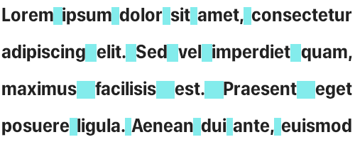
Let's look at the following example:

Both paragraphs have the same content (the famous Lorem Ipsum) but they look completely different.
The first paragraph looks like a wall of text with lines too close together and tiny text. For the second paragraph, we applied the different recommendations from this post. The result? It looks narrower and taller, but also more spacious and easier to read.
Make text more readable and accessible by limiting its width, adjusting its size and family, and playing with the right spacing.

Top comments (0)