
Today I'll continue to improve the library and suggest discussing another important topic - the accessibility and usability of your interface.
What is accessibility?
An accessible site is a site, access to the contents of which can be obtained regardless of any violations by the user, and the functioning of which can be carried out by a wide variety of users.
Remember that accessibility is not a tool to make your interface convenient for a certain group of users, it is an opportunity to make your interface convenient for all your users.
As the web.dev blog writes accessibility concerns can be split into four broad categories:
- Vision
- Motor/dexterity
- Auditory
- Cognitive
If you think that your project does not have users from the described groups, you're very wrong. For example, any user will be grateful if, as an alternative, you give the opportunity to control the interface from the keyboard.
Keyboard controls
Keyboard control can be convenient not only for users with restrictions since this is a more efficient way to move around the site (if everything is done on the site for this).
Focus on an element (for example, a link, button, or input field) shows which element is currently ready for keyboard input. To change the focus on an element you need to use the TAB key or the SHIFT + TAB key combination.
Just try to do it
Depending on your browser, the interactive elements on which the focus is located will be highlighted. This is very important, without this it'll be impossible to use the keyboard to navigate the site. If you don’t like how it looks by default, you can style it with the :focus CSS pseudo-class.
The second important point that you need to pay attention to is the order of your elements when navigating from the keyboard.
If the order of focus seems wrong, you should reorder the elements in the DOM to make it more natural. If you want something to appear earlier on the screen, move it earlier in the DOM.
It'll look like the normal focus order:
And it'll look like an order changed using styles:
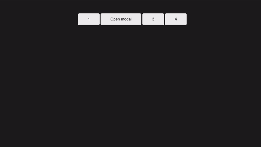
Now let's look at this issue when using the library. If we add a list of interactive elements and add a layout of the modal window after this list, the order will correspond to the layout, but not to our ideas about the correct focus. For example, it might look like this:
This is how it looks now.

We have 4 buttons, one of them opens the modal window by clicking, but after opening the modal window, the focus remains on the buttons. It would be much more convenient if the focus automatically moved us to the modal window.
Implementing autofocus
First of all, for automatic focusing inside the modal window, we need a list of elements that can get the focus state after opening the modal window
export const FOCUSING_ELEMENTS = [
    'a[href]',
    'area[href]',
    'button:not([disabled]):not([aria-hidden])',
    'input:not([disabled]):not([aria-hidden])',
    'select:not([disabled]):not([aria-hidden])',
    'textarea:not([disabled]):not([aria-hidden])',
    '[tabindex]:not([tabindex^="-"])',
];
Now we need a method to get all the interactive elements for the active modal window
/**
 * Get a list of node elements that may be in focus
 *
 * @returns {Array<HTMLElement>} list of nodes
 */
getFocusNodesList(): HTMLElement[] {
    if (!this.$modal) return [];
    const nodes = this.$modal.querySelectorAll<HTMLElement>(FOCUSING_ELEMENTS.join(', '));
    return Array.from(nodes);
}
The method for autofocus will have the following algorithm:
- We get a list of interactive elements if the list is empty (so empty that there is no button to close inside the modal window) we simply interrupt the method;
- If the list has several interactive elements, we do
.focus()on the first of an element that isn't a close button; - If the modal window has only a close button, then do
.focus()on this button.
/**
 * Set focus on an element inside a modal
 */
setFocus() {
    const nodesList = this.getFocusNodesList();
    if (!nodesList.length) return;
    const filteredNodesList = nodesList.filter(
        (item) => !item.hasAttribute(this.closeAttribute),
    );
    (filteredNodesList.length ? filteredNodesList[0] : nodesList[0]).focus();
}
Since we are trying to change the default logic of the focus operation, we should not do this as a mandatory part of the library, so we'll add a new option isAssignFocus which will be responsible for autofocus (with the default value of true). Call the "setFocus" function after opening the modal window
preparationOpeningModal(event?: Event) {
    if (this.hasAnimation) {
        ...
        const handler = () => {
            if (this.isAssignFocus) this.setFocus();
            ...
        };
        this.$modal?.addEventListener('animationend', handler);
    } else {
        if (this.isAssignFocus) this.setFocus();
        ...
    }
}
If the modal window has an animation when opened, we will focus on the element only after the animation is complete.
That's what we got
Focus control inside a complex element
For complex elements, you need to work extra to make it easy to control with the keyboard. Part can be done using the only markup for this tabindex is suitable. The native interactive element has focus, but tabindex makes any UI element available for focus.
There are three types of tabindex values:
- A negative value (usually
tabindex="-1") means that the item is not accessible via sequential keyboard navigation, but can be focused with JavaScript or a visual click -
tabindex="0"means that the element must be focused when sequentially navigating the keyboard - A positive value (
tabindex="1",tabindex="2",tabindex="100") means that the element must be focused in sequential navigation using the keyboard, with its order determined by the value of the number. This completely contradicts the natural order of focus that we discussed earlier and is the antipattern
Focus control
Earlier we implemented autofocus, but this showed another problem, after all the interactive elements (or elements with tabindex="0") are over, focusing continues on the following elements outside the modal window. This is usually not a problem if you use a modal window as a hint that doesn't block the main content. But if we use a full-size modal window (also with a scroll lock), this isn't the behavior that we expect to see.
Let's give users the opportunity to choose whether they want to control the focus inside the modal window or not.
First of all, we need to get a list of interactive elements
/**
 * Leaves focus control inside a modal
 *
 * @param {KeyboardEvent} event - Event data
 */
controlFocus(event: KeyboardEvent) {
    const nodesList = this.getFocusNodesList();
    if (!nodesList.length) return;
}
After that we filter all the hidden elements and then we determine whether the modal window is the currently active element, if not, we set the focus on the first element in order. If the active element is already in the modal window, we get the index of the active element and, depending on the index and the keys pressed, decide which element will be focused next. Here we have two special cases that we need to handle on our own:
- If the
SHIFTkey is pressed and we're focused on the first element, then we need to next focus on the last interactive element inside the modal window - If the
SHIFTkey isn't pressed and we're focused on the last element, then we need to next focus on the first interactive element inside the modal window
controlFocus(event: KeyboardEvent) {
    ...
    const filteredNodesList = nodesList.filter(({offsetParent}) => offsetParent !== null);
    if (!this.$modal?.contains(document.activeElement)) {
        filteredNodesList[0].focus();
    } else {
        const index = filteredNodesList.indexOf(document.activeElement as HTMLElement);
        const length = filteredNodesList.length;

        if (event.shiftKey && index === 0) {
            filteredNodesList[length - 1].focus();
            event.preventDefault();
        }

        if (!event.shiftKey && length && index === length - 1) {
            filteredNodesList[0].focus();
            event.preventDefault();
        }
    }
}
Now add a handler for clicking on TAB and individual options in the configuration file
/**
 * Modal constructor
 *
 * @param {ConfigType} param - Config
 */
constructor({
    ...
    isAssignFocus = true,
    isFocusInside = true,
}: ConfigType) {
    ...
    this.isAssignFocus = isAssignFocus;
    this.isFocusInside = isFocusInside;

    this.onKeydown = this.onKeydown.bind(this);
}

/**
 * Event keydown handler
 *
 * @param {KeyboardEvent} event - Event data
 */
onKeydown(event: KeyboardEvent) {
    if (event.key === KEY.TAB) this.controlFocus(event);
}

/**
 * Add event listeners for an open modal
 */
addEventListeners() {
    ...
    if (this.isFocusInside) document.addEventListener('keydown', this.onKeydown);
}

/**
 * Remove event listener for an open modal
 */
removeEventListeners() {
    ...
    if (this.isFocusInside) document.removeEventListener('keydown', this.onKeydown);
}
Our current result:

Semantic information
Sometimes semantic markup is not enough to fully convey the information that your content carries. In such cases, you can use ARIA attributes. ARIA is a set of special attributes that can add a description to your markup. This is a separate large section with its good practices and recommendations. For the library, we'll consider only a part (and perhaps we'll return to this topic in the future when we write modal window templates).
Adding aria-hidden="true" to an element removes this element and all its children from the accessibility tree. This can improve the assistive technology user experience. In our case, this attribute should hide the modal window at the moment when it is not active and show when the open method is called. Add aria-hidden="true" to our markup and implement attribute control in libraries.
/**
 * Set value for aria-hidden
 *
 * @param {boolean} value - aria-hidden value
 */
setAriaHidden(value: boolean) {
    this.$modal?.setAttribute('aria-hidden', String(value));
}

open(event?: Event) {
    ...
    this.setAriaHidden(false);
    ...
}

close(event?: Event) {
    ...
    this.setAriaHidden(true);
    ...
}
The modal window is already a familiar element of any site, but the browser will not be able to understand that part of the content that appears is a modal window, but we can suggest using role. role="dialog" is great for our markup. role="dialog" is used to mark up an HTML-based application dialog box or a window that separates the content or interface from the rest of the web application or page. Dialogs are usually placed on top of the rest of the page using overlay. As you can see, the role simply tells the browser what kind of component is in front of it.
That's all for now, this time we touched on a very interesting and important topic. The library itself you can find on GitHub will be glad to your ⭐
 Alexandrshy
/
keukenhof
Alexandrshy
/
keukenhof
Lightweight modal library 🌷
Keukenhof
Micro library for creating beautiful modal windows
Table of Contents
Installation
For install, you can use npm or yarn:
npm install keukenhof
yarn add keukenhof
CDN link
<script src="https://unpkg.com/keukenhof@1.1.0/dist/index.js"></script>Example
<div id="modal" class="modal">
    <div class="modal__overlay" data-keukenhof-close></div>
    <div class="modal__container" role="dialog">
        <div class="modal__wrapper">
        <button
            class="modal__button modal__button--close"
            data-keukenhof-close
        >
            Close modal
        </button>
        <main class="modal__main">
            <h2 class="modal__title">Title</h2>
            <p class="modal__desc">
                Lorem ipsum dolor sit amet consectetur adipisicing elit
            </p>
<a href="#" class="modal__link">More information</a>…This is the final part of writing the basic functionality (this doesn't mean that I'll no longer work on the side project, there are still a lot of steps that I want to implement, for example, write documentation, write a project page, publish my project on Product Hunt and much more). Now I can use the library to create templates because I miss HTML/CSS 😄 Thank you all for your interest in the article. See you soon 👋

Top comments (0)