
This is Part 1 of a three-part series covering the Gatsby plugin gatsby-image:
Part 1: Graphql, generated files & markup
Part 2: Responsive images 101
Part 3: Controlling src-set, breakpoints and styling
Disclaimer: This is for the reader who has used gatsby-image before & understands what it is capable of, but needs a more in-depth understanding in order to control it better. (Written in 12/2019 & based on gatsby 2.18.x, gatsby-image 2.2.x, gatsby-transformer-sharp 2.3.x and gatsby-plugin-sharp 2.3.x)
On first sight, the Gatsby plugin gatsby-image is a jack of all trades plugin. But gatsby-image is essentially just a node module that exports a React component, and it works hand-in-hand with 2 other plugins: gatsby-plugin-sharp and gatsby-transformer-sharp, which do the heavy lifting on the server/build side.
Used together they can achieve the following:
- Generating a bunch of image files into your /public/static folder based on an input image file and a graphql query that describes what kind of images you want (gatsby-plugin-sharp)
- Produce markup and css to take care of the appearance of these images on the page (full width, cover/contain, etc.) (gatsby-image)
- Getting a smooth appearance of a newly loaded image, e.g. by first showing a blurred base-64 image and replacing it with a full-resolution one, once it is loaded. This is known as the "blur up" technique popularized by Medium and Facebook (gatsby-image)
- Prevent image jumping, when the image loads due to the exact image size not known before loading(gatsby-image)
- Give you lazyloading by using IntersectionObserver in the browser (gatsby-image)
Note: You could probably use gatsby-image's image generating capacities exclusively, without using the gatsby-image component (and the quite opinionated markup), by writing your own markup. To do this you would have to query the appropriate fields that would be needed to satisfy a native <img> element, or your custom markup with <picture> and <source> elements.
Fluid vs. Fixed
Before you work with gatsby-image you have to make a binary decision about the type of image you are working with: Is it fixed or fluid?
From the Gatsby Docs:
"To decide between the two, ask yourself: "do I know the exact size this image will be?" If yes, it's the first type [Fixed]. If no and its width and/or height need to vary depending on the size of the screen, then it's the second type. [FLUID]"
The result of your fixed or fluid graphql query is then passed respectively to the fixed or fluid property of your gatsby-image component. The markup that gatsby-image outputs will differ if it's a fluid or a fixed image.
The graphql query
Fixed
A query for a fixed image could look like the following:
{
  imageSharp {
    fixed(width: 400) {
      ...GatsbyImageSharpFixed
    }
  }
}
Here, GatsbyImageSharpFixed is a fragment. It is equivalent to this query:
{
  imageSharp {
    fixed(width: 400) {
      base64
      width
      height
      src
      srcSet
    }
  }
}
Fluid
The following is a query for a fluid image:
{
  imageSharp {
    fluid(maxWidth: 1200) {
      ...GatsbyImageSharpFluid
    }
  }
}
It is equivalent to this query (without using a fragment):
{
  imageSharp {
    fluid(maxWidth: 1200) {
       base64
       aspectRatio
       src
       srcSet
       sizes
    }
  }
}
(Note the additional "sizes" parameter in the fluid query above)
Here's the source code of these fragments, so you know what they contain.
The generated image files
With your graphql query you decide which images are being generated: the dimensions and the formats (jpg/png, webp, base64). The images will be saved into your /public/static folder. Each image will get its own folder, and each image version will get its own folder within this folder.
Fixed
In the case of a fixed query, it will generate images that have the width/height you specified in your graphql query PLUS it will try to generate higher resolution images for retina displays: 150% and 200% of the size you specified (but only if the source image actually has that many pixels available).
Fluid
If you haven't indicated a maxWidth in your graphql query it will generate images with the widths of 800px, 400px and 200px (in case your original image isn't smaller than 800px width). If you do have indicated a maxWidth (example), then it will generate images with 100% , 50% and 25% maxWidth.
If the indicated maxWidth exceeds the width of the original image, it will still try to produce 50% and 25% width images (as long as these don't exceed the original image width), but the maximum size will be the original image. If the indicated maxWidth is smaller than the width of the original image, it will also generate images bigger than the indicated maxWidth, namely 150% and 200%, this is to satisfy retina displays.
If you want more control over which sizes are generated, check out Part 3 of this series.
👀 TIP: If you're using VS Code you can see the dimensions of images in your workspace at the lower bar on the right side.
The generated markup
Fixed
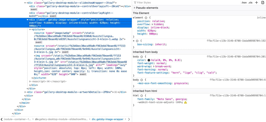
A relatively positioned wrapper <div class="gatsby-image-wrapper"> that has the proportions of the image it contains (see width and height). Inside this wrapper we see a <picture> element that contains several <source> elements and one <img> element. The <img> element is positioned absolutely and takes up the whole width and height of its parent.
Fluid
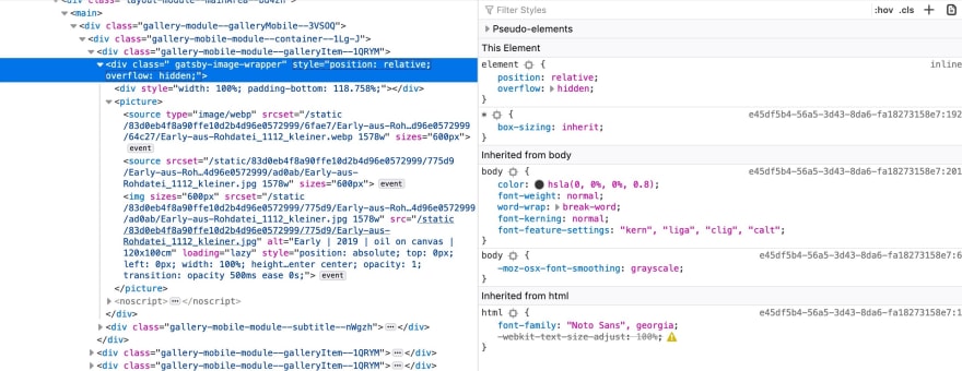
This looks similar to the fixed one, except that <div class="gatsby-image-wrapper"> doesn't have a defined width or height anymore. Instead, we have an additional child element, an empty <div> that has a procentual padding-bottom. This percentual padding happens to be the exact aspect ratio of the image it contains. Thanks to this, the <img> element can be positioned absolutely again and take up the whole width and height of its parent.
👉 Continue with Part 2 of this series about gatsby-image: "Responsive images 101"

Top comments (0)