
Note: This article was originally published on my blog. It has since been updated on my site.
Semantic HTML isn't just some buzzword that people throw around for no good reason—it's an important concept in front-end development that gives meaning to your HTML markup. When you use semantic HTML, you not only make it easier for sighted users to understand your markup, but you also help unsighted users who rely on screen readers to make sense of your content organization. This is just one part of creating a more accessible user experience.
In this guide, we'll take a look at everything you need to know about building a more accessible user experience through semantic HTML. We'll also touch on some more general accessibility best practices towards the end of the guide.
What Makes HTML Accessible?
Accessibility is a hot topic in front-end development, yet it's also frequently overlooked or executed poorly, even on some of the world's most popular apps and websites. Developers tend to design a user experience with sighted users in mind, forgetting about users who rely on screen readers. Worse still, they may end up using color combinations that have too low of a contrast, or violating a number of other HTML accessibility best practices.
Accessible HTML conveys meaning and content organization to both sighted and unsighted users. Moreover, it uses the right HTML elements for the task at hand, rather than trying to force an element into a different role. Part of creating an accessible user experience means learning how to make the most of semantic HTML.
Unfortunately, developers tend to fall into a number of common traps that violate HTML accessibility best practices. In the following section, we'll take a look at how to use semantic HTML to create an accessible user experience.
Semantic HTML Basics
So let's just clear this up now—there are only two non-semantic HTML elements: <div> and <span>. By definition, this means that anything else is semantic HTML: an element that has some sort of inherent meaning. Some of these are depicted below:

Think of <div>s and <span>s as generic containers: They're simply there for grouping things at either the block or inline level. Beyond that, you can't really attach any meaning to a div: It's just a box.
With all of that in mind, is it fair to say that the term "semantic HTML" a bit overused? Yes—one could argue that there's no need to talk about semantic HTML when pretty much 99% of HTML is semantic.
However, just because <div> and <span> are the only non-semantic HTML elements out there doesn't mean that it's less likely for people to abuse them, rather than using the right HTML elements for the task at hand.
Before we move on, let's do a quick recap of the most notable semantic HTML elements and how they should be used on a website.
Main
The <main> element represents the main content region of a website:
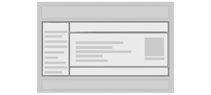
Typically, you'll want to wrap everything in <main> except for your navigation header and footer. Also, note that a page should only ever have one <main> present to avoid confusing screen readers and search engine crawlers.
Header and Footer
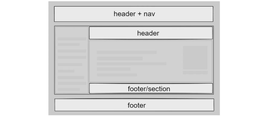
You can think of the <header> element as a container for certain "visible metadata" on your page. For example, you can use it at the top of an article to group your title, publication date, tags, and so on. You can also use header elements at the top of material cards, where you'll usually find things like thumbnails, titles, and other descriptive information about the card and its contents. Finally, you can also wrap your site's navbar in a <header> to set it apart from the main content of your site. If a <header> element is at the very top level of your HTML and is not a descendant of other semantic HTML elements, it'll have an implicit aria role of banner, meaning screen readers will say something like "banner landmark" when they encounter it.
On the other hand, a <footer> should be used for anything that logically follows your content, essentially providing additional information. For example, you can wrap an About the Author section in a footer, or a "you may also like" section at the end of an article. Of course, it should also be your go-to element for the literal footer of your website.
The only thing to keep in mind is that <header> and <footer> should never appear as children of each other. In other words, never put a header in a footer, or vice versa.
Article and Section
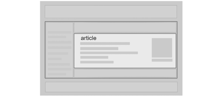
Simply put, an <article> is a self-contained piece of content that people would understand if you were to redistribute it externally. This means that blog posts, articles, and forum threads are a perfect use case for the <article> element.
On the other hand, <section> represents... well, a section. This one typically confuses people because they're not sure what the difference is between a <section> and a plain old <div>. What makes a section inherently semantic? Well, for one, sections typically have a heading. And if you omit one, you'll get an HTML validation warning. Sections are good for things like:
- Comment sections at the end of an article.
- The literal sections of a blog post or article, as delineated by headings.
- "Chapters" (this one is brought up frequently, but it makes little sense in the context of the web).
Don't use a <section> just to avoid using a <div>. There's nothing taboo about using divs, so long as you're not misusing them.
Nav
Simply put, use a <nav> to group primary or secondary navigation links, either in your top navigation bar or a table of contents, sidebar, breadcrumb links, and so on. Note that you shouldn't stick every single link on your site in a <nav>. Just because something is a link does not mean that it's part of some navigation on your site. So while it's perfectly fine to use multiple <nav>s on your site, you should use this element sparingly and only if it makes sense to do so.
Other Semantic HTML Elements
When talking about semantic HTML, people usually stop at just the generic bunch: nav, main, article, section, header, footer, and aside. But remember: Everything is semantic except for divs and spans. Here are some of the more notable elements:
- Forms and their inputs (
<form>,<input>,<button>,<textarea>). - Text: anchors (
<a>), paragraphs (<p>), lists (ul/ol/li), headings (h1-h6). - Inline markup (e.g.,
<strong>,<em>,<mark>). - Images (
<img>), figures (<figure>), tables (<table>), audio (<audio>), video (<video>).
... and much more. I won't delve into everything here. In a nutshell, any element that can be described as more than just a generic "container" is considered to be semantic HTML.
Creating an Accessible User Experience with Semantic HTML
Now that we've done a quick review of what semantic HTML is, we're ready to look at examples of what you should and should not do in order to create an accessible user experience. For a list of browsers that support HTML accessibility, check out html5accessibility.com.
Don't Use Divs for Interactive Elements
Using divs for user interactions is a terrible practice for web accessibility. In other words, don't do this:
<div tabindex="0" role="button" id="toggle"></div>
If an element's role is <button>, it may as well just be a <button> to begin with.
Worse still, don't add an event listener that checks to see if the user pressed the Enter key as a pseudo-click (I've definitely never done this):
document.getElementById('toggle').addEventListener('keyup', keyEvent => {
    if (keyEvent.key === 'Enter') {
      doSomething();
    }
});
Just because something is possible with JavaScript and HTML doesn't mean that it's a good idea 😉 (or that it's truly accessible for keyboard and screen reader users). You certainly can do this, but it will take some work to ensure that it's truly accessible. And even then, you'll still get HTML validation warnings because you're trying to dress up a <div> as something that it's clearly not.
Use buttons, anchors, and form inputs for interactive elements on your website. These semantic HTML elements already receive mouse and keyboard focus, have widespread browser support, and respond to user input both with the Enter key and with a traditional mouse click. They are meant to be used as buttons, links, checkboxes, and so on.
Unfortunately, this rule is broken frequently on the web, mainly because of JavaScript frameworks.
Twitter's buttons are divs all the way down (they're using role="button" here):

Gmail also uses divs for its buttons:

Facebook's like button is a div with an image inside it:

But there are sites that do get this right!
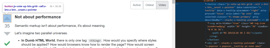
The StackExchange network uses <button> elements with nested SVGs:
As does the new Reddit interface (the old one is still using divs):

Q: Should I Use an Anchor or a Button?
This is a good (and common!) question, mainly because developers are concerned with how their user interfaces look. And the answer is simply that it depends on what the button does. If it directs someone to a different page, then that's really an anchor's job; the only way to do it with a button is via JavaScript. So it's perfectly fine to use an anchor in this case and to style it like a button.
Remember: To an unsighted user navigating your site, it won't be important what an element looks like, but rather what the element does. The best that a screen reader can do is to tell you what it is that you've encountered on a page. A screen reader can't possibly infer that a regular old <button> will take you to a different URL—that's the job of an anchor, after all.
So, if your "button" is supposed to direct users to a different page, using <button> would create a frustrating user experience for unsighted people, especially if the button text doesn't clearly indicate that clicking it will take you to a different page or site. In fact, this would be frustrating for sighted users, too, since anchors show a link preview in the bottom-left of your browser when they receive focus or hover events, whereas a button that "silently" directs a user to a different page will not show any such indicator upon focus/hover.
Now, on the other hand, if the button doesn't direct a user to a particular site, then it's perfectly fine (and more sensible) to use <button>. Add a JavaScript click listener to dictate what happens when a user clicks that button. Here are some examples:
- Toggle an option or setting.
- Serve as a button in a game.
- Submit a like/upvote on a particular post.
- Submit a comment/post on a site.
Note that some buttons have inherent functions in HTML. For example, a button with type="submit" is used in forms to trigger a form submission event. In this particular use case, an anchor or div would be a completely inappropriate and hacky substitute.
Use More Lists!
I have to say: <ol> and <ul> are probably the two most underrated semantic HTML elements out there. Things are listed are everywhere on the web, yet you rarely see them rendered using lists!
A screen reader won't detect that a <div> is a collection of ordered or unordered items because divs convey absolutely zero meaning—they're not semantic HTML. Note that a <div> has no implicit ARIA role, meaning a screen reader won't narrate anything special when it encounters that <div> (but it will still read its contents). This means that if you have multiple, separate <div>s that each serve as lists, their items will meld together when narrated, and that could get confusing.
On the other hand, when it encounters an <ol> or <ul>, a screen reader will explicitly tell a user that there's a "list with X elements" up ahead. Moreover, the screen reader will narrate when it has exited a list (e.g., NVDA says "out of list"), giving an unsighted user a better sense of where they are on the page.
Here are a few great use cases for HTML lists:
- Navigation links in menus and sidebars.
- Feeds and posts (e.g., blog posts, social media feeds, forum posts, replies and comments). In most cases, you'll want to use an ordered list since these items are usually sorted by a given parameter, like date published.
- Pagination trails. A pagination trail is literally a numbered list of pages—it doesn't get any simpler than that!
- Grouped tags and links (e.g., post tags or social media links). Use unordered lists!
Just because lists render with bullet points or numbers by default doesn't mean that they must be reserved for textual lists. In terms of semantic HTML, a list is the perfect container for a group of related items, ordered or not.
The best part is that <li> elements, like <div>s, can accept any flow content (block or inline), including more nested lists. You have nothing to fear with these elements. You should already be resetting margin and padding on your website anyway, so the only thing that remains is resetting list-style and customizing the appearance of your lists on a case-by-case basis.
Let's take another look around the web!
Google renders search results using divs, but an ordered list would probably make more sense here since the top search results are not there by coincidence (i.e., the ordering matters):
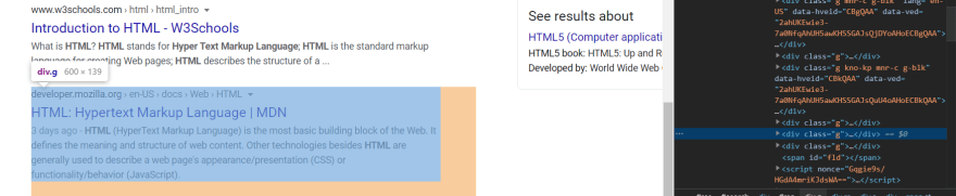
Note: Google has hidden elements that provide accessibility guidance to users with screen readers and other assistive technologies, so this "violation" isn't really a big deal. That may apply to some of the other sites and apps, too, though I haven't tested them.
Twitter uses divs for replies:

So does Reddit, both for its old and new interfaces:

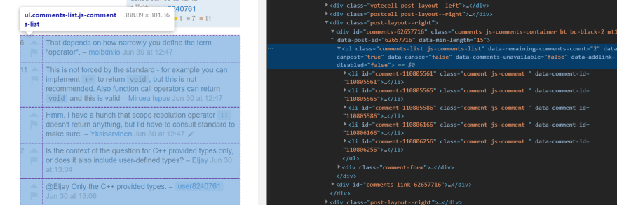
StackOverflow gets it right again, using an unordered list for comments (though an ordered list may make more sense here since comments are sorted by the date they're posted):
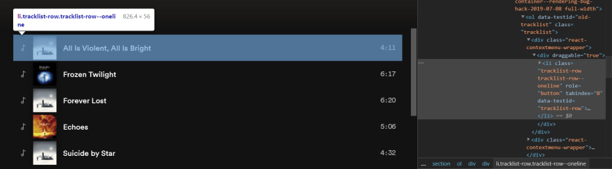
And so does Spotify, where songs are rendered in an ordered list:
Here's another great example of using a list properly, this time from GitHub:

Notice from these examples that a "list" is really an abstract concept. You shouldn't view <li> as an element that can only contain text. Clearly, it can also contain links, buttons, more lists, images, and anything else that you can think of.
Don't Use Spans for Inline Positioning
Another common mistake is to use <span>s to achieve inline positioning. Developers are taught early on that there's a distinction between block-level and inline elements in HTML; the two classic examples that get brought up are divs and spans, respectively. But while it's true that spans are inline elements, they're not intended to be used for inline positioning. Spans are used to isolate inline portions of text, typically for one of two reasons:
- Styling some of the text differently.
- Injecting content into the text with JavaScript.
A good example of the second case is if you have text with placeholders, like X comments or X posts, and those placeholder counts need to get set via JavaScript (e.g., once an API call finishes). You'd isolate the placeholders with spans and give them IDs so their text can get set. Here's a real example of that from GitHub's own UI:

In addition, note again how the tabs themselves are rendered in a list. Yay!
If you want inline positioning on block-level elements, <span> is not the right tool for the job. Instead, use CSS to position your elements inline (e.g., with Flexbox).
Don't Abuse ARIA
You may have heard the term "ARIA" used in the context of HTML, but what exactly does it mean?
As defined by the W3 Consortium, ARIA stands for Accessible Rich Internet Applications. It's a set of built-in HTML attributes that developers can use to provide a better user experience to people using assistive technologies like screen readers.
However, as I mentioned before, just because something is available to you doesn't mean that you should abuse or misuse it. Per W3's documentation on ARIA:
Web developers MAY use the ARIA role and aria-* attributes on HTML elements, in accordance with the requirements described in wai-aria-1.1, except where these conflict with the strong native semantics or are equal to the implicit ARIA semantics of a given HTML element. These constraints are intended to prevent developers from making assistive technology products report nonsensical user interface (UI) information that does not represent the actual UI of the document.
Here, "strong native semantics" refers to the fact that semantic HTML elements have intrinsic ARIA roles. You can explore these in the MDN Web Docs for a particular element. For example, the <ol> tag has an implicit ARIA role of list:

Notice that elements also have a set of permitted ARIA roles and permitted content. For example, the descendant of an <ol> or <ul> should only ever be one of <li>, <script>, or <template>—anything else, and an HTML validator will give you an error. Here's an example of such an error:
Element div not allowed as child of element ol in this context.
"Permitted ARIA roles" goes back to the whole "don't use divs as buttons" argument, though it encompasses a much wider issue of misusing elements in general or trying to get an element to masquerade as something completely different. HTML has a diverse set of semantic elements that you can use to build most user interfaces that come to mind—don't resort to hacks.
Use the Right Heading Levels for Your Content
Have you ever used a lower heading level, like h5 or h6, simply because you needed the text to be a smaller font size? While headings do have default font sizes, you shouldn't just pick a level based on the font size that you need. HTML headings communicate your content's hierarchy to screen readers, search engine crawlers, and HTML validation tools. Basically, don't skip levels and go from an h2 to an h6. Imagine how confusing it would be for someone using a screen reader to hear that your content jumped from heading level two to six all of a sudden! Without seeing your site, they'd think that something must've gotten lost in translation.
Use the <time> Element for Dates
This is another underrated semantic HTML element. Basically, use the <time> element for dates and times. For example, you can wrap the publication date in a <time> for a forum post, blog post, article, video, and so on.
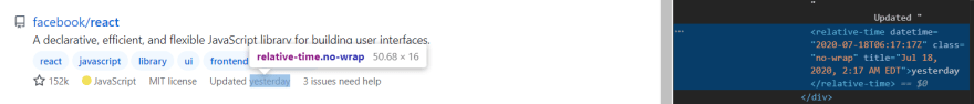
GitHub uses web component extensions for the <time> element in its UI:
StackOverflow uses <time>:

And so does Twitter:

It's certainly not the end of the world if you don't use <time>, so long as the date itself is part of some other semantic element (e.g., a paragraph or heading) that will make sense in the context in which it's narrated.
General Tips for HTML Accessibility
Semantic HTML is just one piece of the accessibility puzzle—there's a lot more that goes into creating a better user experience on your site. Let's go over some of the finer details.
Don't Overuse the title Attribute
Native tooltips should not be relied upon to give users any indication of what an interactive element represents. Moreover, don't combine it with an aria-label because both may end up getting narrated by a screen reader, and that can get really annoying.
Give Images a Descriptive alt Attribute
It helps to close your eyes for a moment and imagine that you're hearing the words that you type. You want to paint a picture without going into excessive detail, like mentioning colors, shapes, and so on (unless those are the central focus of the image). You also don't want to start your alt attribute with "An image of..." or "A picture showing..." because that's already a given (screen readers will narrate the <img> tag as a graphic/image).
Use aria-hidden and alt="" Strategically for Certain Images
Sometimes, you want to hide content from screen readers to avoid presenting irrelevant information to unsighted users. Examples include blog post thumbnails and user avatars. While these elements are usually visible to the sighted user, they're not essential for an unsighted user and can sometimes confuse screen readers. Imagine how annoying it would be if a screen reader were to say Profile photo for user X and then immediately follow that up by reading the user's name—it's repetitive. For this reason, you can use the aria-hidden attribute, or simply set the image's alt tag to be empty. Alternatively, you can use background images (unless you need lazy loading).
Mind Your Color Contrast
So far, the focus has been on making the web a more accessible experience for unsighted users. But that doesn't mean that you should neglect your sighted users. In particular, you'll want to follow best practices with regard to color usage on the web. Here are some general tips:
- Stick to one or two colors for your theme. Shades of a single primary color are usually more than enough and can give your site a more cohesive and branded look.
- Use colors to convey a sense of elevation and content hierarchy. For example, an element that's lighter than its background is typically perceived as being elevated, while a darker element is depressed into the page. This is especially true for dark mode themes.
- Don't use font weights or colors that reduce the contrast between your primary text and its background. You want to maintain at least WCAG AA compliance.
Use Responsive Typography
Smashing Magazine has an excellent guide on responsive and fluid typography, which is about ensuring that your font size scales up and down smoothly (like it does on this site!) depending on the screen width. That way, it's not too large on a mobile device, but it's sufficiently large on a tablet or desktop. Stick to using a minimum font size of 16px for your primary body text and around 12–14px for secondary text. Anything smaller than 12px is going to be terribly difficult to read on a mobile device. At the same time, you don't want your font size to be too large, especially on mobile.
Building a More Accessible Web: Next Steps
I highly recommend that you install a screen reader yourself to audit your own site for accessibility issues. Follow along with the narration. If nothing seems to make sense or flow right, then you have a problem. I personally prefer the NVDA screen reader; it's free and easy to use.
There's also a fantastic tool called WAVE that basically runs an accessibility audit on any given URL and shows the results right there in an interactive session.
I hope you found this guide helpful! If you have any questions, let me know down below.

Oldest comments (2)
What do you say about semantics in dashboard admin apps? Is it necessary or is it not?
Peers think that semantics in dashboard is useless and I can't argue with that
Hmm, that's actually a good point. And in my experience, it really depends on your end users. If a majority of your users are not using assistive technologies, then semantics may not be as important for your needs (though it doesn't hurt to write semantic HTML anyway—in other words, it doesn't get in the way, and there's hardly any downside to it).
I can only think of these two benefits of writing semantic HTML, even if your users are not using assistive technologies like screen readers: