
As discussed in last week’s article, data is the core of every learning algorithm and we need lots of it to create a good intelligent product, but most of the time the type of algorithm we are going to use highly depends on what kind of information we are dealing with. To get some sense of the information we are working with, we use data visualization techniques.
What is data visualization?

Data visualization refers to an efficient graphical representation of data or information, for example, taking a spreadsheet’s content and converting it into a bar or line chart. It is a particularly efficient way of communicating when the information we are dealing with is numerous or complex, as for example, a time series.
From a formal point of view, the representation can be considered as a mapping between the original data (usually numeric) and graphic elements, for example, lines or points in a chart. The mapping determines how the attributes of these elements vary according to the data, like a bar chart is a mapping between the length of a bar and the magnitude of a variable.
Why do we visualize data?
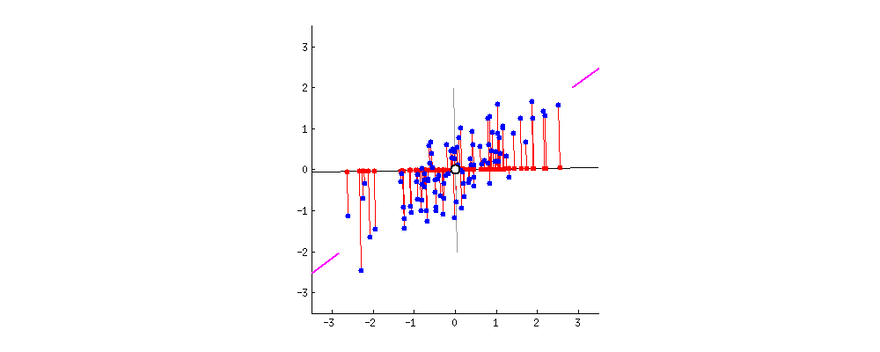
To determine what’s the best learning algorithm for our problem, we need to understand our data. Most of the time it’s hard to have an intuition of the data we are working with and some algorithms only work on specific datasets. For example, a Linear Regression algorithm won’t work on a dataset that is not Linearly Separable.

You likely heard about the old saying: a picture is worth a thousand words, but sometimes in the field of learning it’s hard to find a compelling visualization for your data.
Visualization methods
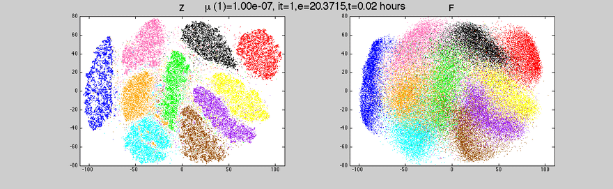
As we humans cannot visualize in more than 3 dimensions (although some mathematicians can gain intuition in 4 dimensions), we have to reduce the dimensions of our dataset so we can visualize it properly. Two of the main methods to reduce dimensions are Principal Component Analysis (PCA) and t-Distributed Stochastic Neighbor Embedding (t-SNE).
Principal Component Analysis (PCA)
PCA is a dimensionality reduction method that is often used to reduce the dimensionality of large data sets, by transforming a large set of variables into a smaller one that still contains most of the information in the large set.
The main steps of PCA are:
- calculate the mean of each column
- center the value in each column by subtracting the mean column value
- calculate covariance matrix of centered matrix
- calculate eigendecomposition of the covariance
So, PCA tries to reduce the number of variables of a dataset, while preserving as much information as possible, the only downside of PCA is that it works well with multidimensional data that is linearly separable. If the dataset is not linearly separable PCA will often lose a lot of information.
t-Distributed Stochastic Neighbor Embedding (t-SNE)
The main difference between t-SNE and PCA is that t-SNE is a non-linear dimensionality reduction algorithm.
- It takes a set of points in high dimensional data and converts it into low dimensional data.
- It is a non-linear method and adapts to underlying data performing different transformations in different regions.
- It’s incredibly flexible and often finds a structure where other dimensionality reduction algorithms can’t.
These were just a few insights into data visualization. At aiflow.ltd, we automatically create visualizations for you, to make sure you get a sense of your data. If you’re curious to find out more, subscribe to our newsletter and see our other articles.
References:

Top comments (0)