
Let's see how and when we can handle those lovely boxes.
If you prefer to watch the video version it's right here :
1. Navigation
A. A space-between navigation.
HTML :
      <nav class="flex-nav nav-1">
        <img src="rocket.png" />

        <ul>
          <li>Accueil</li>
          <li>Forum</li>
          <li>Blog</li>
        </ul>
      </nav>
CSS :
.nav-1{
    display: flex;
    justify-content: space-between;
    align-items: center;
}
B. Centered navigation.
HTML :
      <nav class="flex-nav nav-2">
        <ul>
          <li>Accueil</li>
          <li>Forum</li>
          <li>Blog</li>
        </ul>
      </nav>
CSS :
.nav-1{
  display: flex;
    justify-content: center;
    align-items: center;
}
C. Left / Right navigation.
HTML :
      <nav class="flex-nav nav-3">
        <img src="rocket.png" />

        <ul>
          <li>Accueil</li>
          <li>Forum</li>
          <li>Blog</li>
        </ul>
      </nav>
CSS :
.nav-1{
    display: flex;
    justify-content: start;
    align-items: center;
}
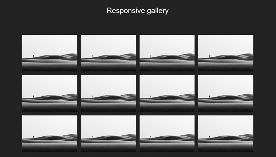
2. Responsive gallery
HTML :
    <div class="gallery">

        <div class="item"><img src="https://images.unsplash.com/photo-1590244930261-c2a2e4a70b2b?crop=entropy&cs=tinysrgb&fit=crop&fm=jpg&h=400&ixlib=rb-1.2.1&q=80&w=500">
        </div>
        <div class="item"><img src="https://images.unsplash.com/photo-1590244930261-c2a2e4a70b2b?crop=entropy&cs=tinysrgb&fit=crop&fm=jpg&h=400&ixlib=rb-1.2.1&q=80&w=500">
        </div>
        <div class="item"><img src="https://images.unsplash.com/photo-1590244930261-c2a2e4a70b2b?crop=entropy&cs=tinysrgb&fit=crop&fm=jpg&h=400&ixlib=rb-1.2.1&q=80&w=500">
        </div>
        <div class="item"><img src="https://images.unsplash.com/photo-1590244930261-c2a2e4a70b2b?crop=entropy&cs=tinysrgb&fit=crop&fm=jpg&h=400&ixlib=rb-1.2.1&q=80&w=500">
        </div>

        <div class="item"><img src="https://images.unsplash.com/photo-1590244930261-c2a2e4a70b2b?crop=entropy&cs=tinysrgb&fit=crop&fm=jpg&h=400&ixlib=rb-1.2.1&q=80&w=500">
        </div>
        <div class="item"><img src="https://images.unsplash.com/photo-1590244930261-c2a2e4a70b2b?crop=entropy&cs=tinysrgb&fit=crop&fm=jpg&h=400&ixlib=rb-1.2.1&q=80&w=500">
        </div>
        <div class="item"><img src="https://images.unsplash.com/photo-1590244930261-c2a2e4a70b2b?crop=entropy&cs=tinysrgb&fit=crop&fm=jpg&h=400&ixlib=rb-1.2.1&q=80&w=500">
        </div>
        <div class="item"><img src="https://images.unsplash.com/photo-1590244930261-c2a2e4a70b2b?crop=entropy&cs=tinysrgb&fit=crop&fm=jpg&h=400&ixlib=rb-1.2.1&q=80&w=500">
        </div>

        <div class="item"><img src="https://images.unsplash.com/photo-1590244930261-c2a2e4a70b2b?crop=entropy&cs=tinysrgb&fit=crop&fm=jpg&h=400&ixlib=rb-1.2.1&q=80&w=500">
        </div>
        <div class="item"><img src="https://images.unsplash.com/photo-1590244930261-c2a2e4a70b2b?crop=entropy&cs=tinysrgb&fit=crop&fm=jpg&h=400&ixlib=rb-1.2.1&q=80&w=500">
        </div>
        <div class="item"><img src="https://images.unsplash.com/photo-1590244930261-c2a2e4a70b2b?crop=entropy&cs=tinysrgb&fit=crop&fm=jpg&h=400&ixlib=rb-1.2.1&q=80&w=500">
        </div>
        <div class="item"><img src="https://images.unsplash.com/photo-1590244930261-c2a2e4a70b2b?crop=entropy&cs=tinysrgb&fit=crop&fm=jpg&h=400&ixlib=rb-1.2.1&q=80&w=500">
        </div>

    </div>
CSS :
.gallery {
    display: flex;
    justify-content: center;
    flex-wrap: wrap;
    width: 80%;
    max-width: 1300px;
    margin: 70px auto 0;
}
3. Center on X and Y

html :
    <div class="container-center">
      <div class="yellow-bloc"></div>
    </div>
CSS :
.container-center  {
    width: 300px;
    height: 300px;
    background: rgb(49, 156, 206);
    margin: 0 auto;
    display: flex;
    justify-content: center;
    align-items: center;
}

.yellow-bloc{
    width: 50px;
    height: 50px;
    background: yellow;
}
All right, if you want to see all the use cases, you can jump on the YouTube video (at the beginning of the article). !
Source code :
https://github.com/Ziratsu/Flexbox-use-cases
Come and take a look at my brand new Youtube channel :
https://www.youtube.com/channel/UCiukrDWz1wqlHAvIdqgqmQg
Be one of the first pioneers who follow me uh ? ⛰️
YT : https://www.youtube.com/c/TheWebSchool
See you next time for some quick tutorials !
Enzo.

Top comments (0)