
The cover photo is a screenshot of a Troy Skyline by Jordi Rué created with HTML and CSS. You'll find the code in an embedded codepen in this article.
Introduction
CSS is the language that sits at the presentation level of the Web alongside HTML and JavaScript.
CSS is easy to start with but it's not simple to work with because it has some features that might seem frustrating at first. These features are what makes CSS such a beautiful language to work with.
If you have been working with CSS for a while now, you'll already know what I am talking about. Examples include the CSS cascade and specificity. In reality CSS cascade and specificity are part of the "popular ones", there are others and what is possible with them.
Let's begin.
In no particular order, here is an incomplete list of what make CSS such a beauty to work with, you might think that you are already familiar with them because you've read about them before and know how to use them.
I'll encourage you to read on because we are going to discuss what makes them an absolute beauty to work it, therefore, you will surely learn something. They are:
- The Cascade
- Property computation based on font size
- Relative units
- CSS variables
- The
attr()function - Art
The Cascade
The cascade is the "C" in CSS and it is the algorithm that defines how to combine property values from different sources (source). The cascade can be employed to handle properties that is not supported by some browsers.
When a browser encounters one of the properties it does not support it will fail graciously. What am I talking about? Let's find out.
Take the following code snippet, if the browser does not support the linear-gradient property the browser will use the background-color property. Why? The reason for this behavior is that browsers ignore properties that they do not understand.
.selector {
    background-color: #1560bd;
    background-image: linear-gradient(to right, red, yellow);
}
Therefore, you can be rest assured that a browser that fails to render the gradient will definitely apply the background color. That is simply beautiful. You can think of it as a backup when something goes wrong in such situations.
Property computation based on font size
When you style an HTML element with CSS and you make use of the font-size property with relative unit values, other properties declared afterwards with relative units will be computed by the browser based on the value of this font size.
Armed with this knowledge you will know beforehand the resulting values of other properties in that selector because you have a source of origin for their computation which is the font-size property.
In the following code, the font-size of main is set to 3em and the margin-left property is set to 1em. You might think that the computed margin-left property value will be 16px but that is not the case. The computed value will indeed be 48px. Why?
When the value of the font-size is set to 3em the browser will compute a value of 48px which is 16px * 3 (assuming default browser font size is unchanged), afterwards you declared margin-left property as 1em , the browser will read this saying: use the default font size of this element, in this case 48px. When we increment this value to 2em the browser will compute 96px for the margin-left property.
main {
    font-size: 3em;    /* 48px computed by the browser */
    margin-left: 1em;  /* This will also result in 48px */
}
Based on the code snippet above, if you decide to add a padding-bottom value of 0.5em, what will be the computed value?
Without checking in your browser what is the computed values of the font-size and padding-bottom in the following code snippet?
main {
    font-size: 32px;
    margin-left: 1em;
    padding-bottom: 0.5em;
}
Relative units
Relative units as their name implies, work in relation with other units or themselves. They are pretty useful in creating responsive typography that scales with the browsers' viewport.
You can read the article entitled Precise control over responsive typography.
CSS variables
Most programming languages have variables. CSS also have variables that simplify the developer workflow and saves repetition in the code base.
When a variable is declared, you can use its value in an appropriate location in your code base. If this variable value is changed, the changes will reflect anywhere it's used in the codebase.
Have a look at the following example:
:root {
    --font-color: #1560bd;
    --general-margin: 20px;
}

main {
    color: var(--font-color);
    margin: var(--general-margin);
}
Whether you are learning about CSS variables for the first time or you are using them already, you should read the following post by @adactio which talks about the behavior of CSS variables and CSS cascade.

And if you are using a preprocessor like SCSS, have a look at the article by Ana Tudor on css-tricks entitled "When Sass and New CSS Features Collide".
It talks about the conflict between CSS variables and Sass. What she detailed therein is valid when this article was published.
The attr function
The attr function is part of the function available in CSS others include calc, url, max, min e.t.c. The attr function is used to extract an attribute from HTML element which can then be manipulated with CSS. There are so many use cases for this, but one comes to mind: styling broken images.
There are situations when an image fails to load, when this happens you can customize what the user will see in-place of the image. The main ingredient is the attr function which is used to extract the image alt attribute (if it exists).
.image-container {
    postion: relative; /* Necessary to position the alt text */
}

.image-selector {
    display: block;
    position: relative;

    /* Include image width, this is important */
}

/* For Chrome browsers*/
.image-selector::before {
    content: " ";
    background-color: #eee;
    width: 100%;
    height: 100%;
    display: block;
    position: absolute;
    border: 1px dashed #aaa;
    border-radius: 4px;
}

.image-selector::after {
    content: attr(alt);
    position: absolute;
    width: 100%;
    height: 100%;
    top: 1px;
    left: 0px;
    text-align: center;
    font-weight: bold;
}

/**
 * The method for styling broken images using
 *  pseudo-elements works in both Firefox and Chrome
 *  browser, but the only defect in this approach is
 *  that, in Firefox the alt text of the image still
 *  shows alongside the alt text generated using CSS content
 *  property, but directly targeting the alt attribute
 *  works.
 */
.image-selector[alt] {
    text-align: center;
    font-weight: bold;
    color: #999;
}
If an image is broken you get something similar to the image below.

Art
You might think CSS is just for styling web pages, but it can be used to create beautiful stunning art. The possibilities are endless and you are only limited by your imagination.
The following pen is entitled: "Troy skyline". It was created using just HTML and CSS by Jordi Rué.
Here is another one, a landscape image created with just HTML and CSS by Ben Evans.
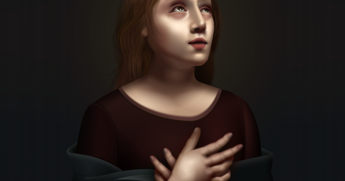
Finally, a renaissance painting by Diana A. Smith called PureCSS Gaze made with HTML and CSS.

You can check her GitHub repo for the source:
 cyanharlow
/
purecss-gaze
cyanharlow
/
purecss-gaze
HTML/CSS drawing in style of italian renaissance painting. Hand-coded entirely in HTML & CSS.
Pure CSS Gaze
An ongoing series in which I create art using only CSS and HTML.
Inspired by Italian renaissance.
Rules I have for myself:
- All elements must be typed out by hand
- Only Atom text editor and Chrome Developer Tools allowed.
-
SVG use is limited, and all shapes can only use hand-plotted coordinates and bezier curves - without the aid of any graphics editor.(Note: at one point I was using one or two SVG elements but I eventually grew tired of them and they've since been deleted, so this rule no longer applies. No offense to SVG.)
Because of the artistic nature of this project I have not concerned myself with cross-browser-compatibility, so the live preview will most likely look laughable in anything other than chrome.
cyanharlow.github.io/purecss-gaze
Conclusion
What you can do with CSS is only limited by your imagination. Have fun!
Updated August 8, 2020: Updated the code for styling broken images.


Top comments (2)
Sick stuff man !
Amo css / excelente aporte, gracias Habdul.