
As Software engineering students, we tend to focus on the functionality of our code rather than the way it is presented. While CSS is generally used based on the structured design of our React code, it can be used in a completely different way. For that reason I consider it a chaotic neutral. CSS can be used in React in a way that ignores restrictions and the general authority and order of our code. Many of the React components we have are children to a parent component. The child is generally under the authority of the parent, meaning that any restrictions or boundaries on the parent are passed down to the child component.
They are also initially rendered in a static position where the elements render in order, as they appear in the document flow. There are other position settings that can be used to change where in the document flow an element is or whether it is even included in the document flow at all. We'll discuss some more below.
main {
  width: 90vw;
  margin: 5rem auto;
  max-width: 620px;
}
This is something that I learned the hard way when styling my website application. Looking at the CSS above and looking at the code of my application, we created a structure for the size of the container inside of the parent component's tag which is the container for all our child components we render on the page inside of the body. Now there are multiple ways that you can display your code using React. For the images displayed on the site, some of the image sources are inside of our db.json while some others are coded directly into the React component itself. One thing they both have in common is that when displayed, they will follow the restrictions given to them from their parent component and its CSS styling.
`return (
    <>
      <div className="background-home"></div>
      <div className="home-page">
        <div className="head-logo">
          <h1>Welcome to The Reptile Store</h1>
          <img src="https://i.pinimg.com/736x/28/f0/2c/28f02c2fbaf3032fb199b544e8d48af0--woodburning-lizards.jpg" alt="lizard logo" />
        </div>
      </div>
      <div className="new-reptile-form">
        <h2>New Reptile</h2>
        <form onSubmit={handleSubmit}>
          'More code in here'
        </form>
      </div>
    </>
 )`
The code above is a child component rendered within our , therefore is restricted to the given container dimensions. What if we wanted to render something inside of a child that does not adhere to the order it is designed? When designing a website you want to do everything you can to make the application a pleasure to use. This means that not only does it need to function well but you also want it to be physically appealing to the user. The appearance helps to bring users to your site and makes it seem more professional. A great way to make your site unique is to give it a background image that catches someone's attention. That can be difficult however if what is rendered on the home page is a component with a container. Let's look at the home page coded below.
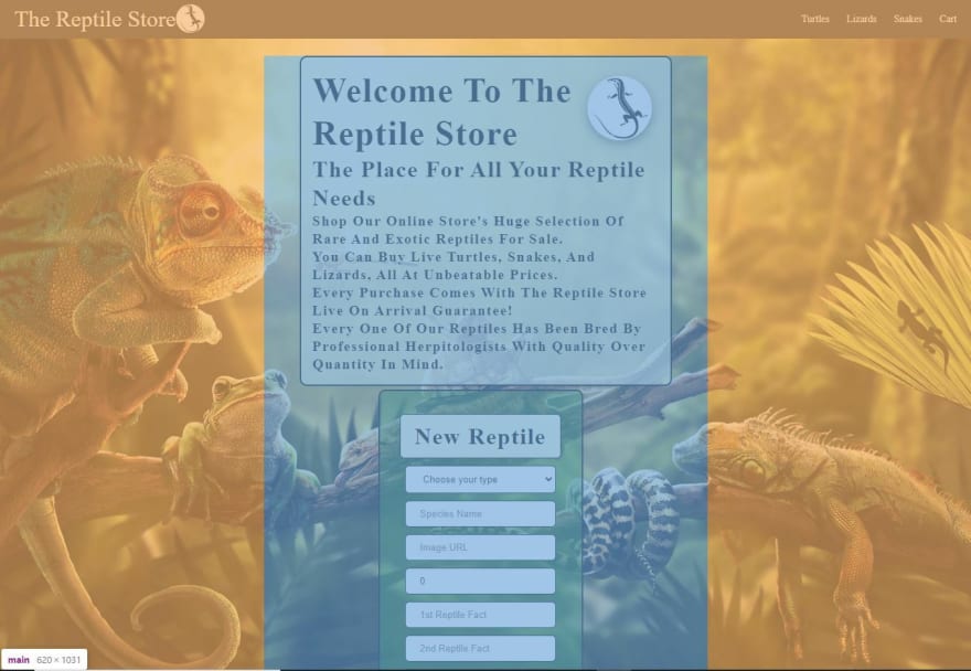
Looking at the picture above we can see what is rendered on the home page. When first attempting to display the background image it is displayed inside of the blue shaded container area. The image position is static when first placed and it had a relevant location rendering as another div in line with the other two in the component. This was a problem as its dimensions were controlled by the structures set in its parent component. This makes for a bad experience if you are someone trying to use the website and want a visually good experience. That was when it came time to learn about 'position:' when it comes to CSS.
Using position we can tell different elements inside of a component how to render based on its position to other elements or even the entire page. It can even be used to fix the element to the page or keep it from disappearing when scrolling. Great for navigation bars and background images!
.background-home {
  background-image: url("https://wallpapercave.com/wp/8pH3E4U.jpg");
  background-size: cover;
  position: fixed;
  left: 0;
  width: 100%;
  top: 56px;
  height: 100vh;
}
.home-page {
  display: flex;
  position: relative;
  flex-direction: column;
  justify-content: space-evenly;
  align-items: center;
  padding: 1rem 1rem;
  margin: 5px 50px;
  border: solid;
  border-radius: 10px;
  border-width: 2px;
  background-color: rgba(245, 245, 220, 0.7);
  box-shadow: 0 5px 15px rgba(0, 0, 0, 0.1);
}
.new-reptile-form {
  box-sizing: content-box;
  display: flex;
  position: relative;
  flex-direction: column;
  align-items: center;
  padding: 2rem 1rem;
  margin: 5px 160px;
  width: 250px;
  box-shadow: 0 5px 15px rgba(0, 0, 0, 0.1);
  border: solid;
  border-width: 2px;
  border-radius: 10px;
  background-color: rgba(22, 124, 22, 0.5);
}
Man that's a lot of code there! The most important piece of CSS in all three of these classes is the position. If you notice for the .background-home class, position is fixed. The element is positioned relative to the browser window so it takes up no space in the document flow. At the same time we set the position of each other div to relative where the element is positioned relative to its normal position.
Overall, React has been an important tool to learn in Software engineering but just as important is CSS in making an application special. It is what makes someone's code individualist and a form of art. What makes it more difficult is that we have plenty of guidance on the fundamentals of coding in JavaScript and React but very little on CSS. So if you are able to learn a lot about CSS it demonstrates to others your determination and creativeness.


Top comments (0)