
Introduction
In this post, we’ll learn about positioning schemes, which we can use to change an element’s position.
This is a post in a series about topics covered in Josh Comeau's CSS for JavaScript Developers course. These posts will be brief, polished versions of my notes, and I'll write about new things I learned or deepen my understanding of something already familiar to me.
Quick reference
The position property
The position property allows us to specify a positioning scheme. It accepts the values: static, relative, absolute, fixed, and sticky.
static is the default value; an element with this value set is called a statically-positioned or non-positioned element. An element using a value other than static is called a positioned element.
Inset properties
position works with the inset properties top, right, bottom, and left to control the precise location of a positioned element.
Let’s take a closer look at each of these positioning scheme values.
Static
static is the default value for position, and it places the element in the normal flow of the document. Inset properties do not affect the element’s position.
Relative
The element gets placed in the normal flow of the document like static and inset properties offset it relative to itself. This offset does not affect the layout of other elements, and the element takes up space as if it were statically positioned. The offset acts as a cosmetic effect.
Absolute
absolute removes the element from the normal document flow and positions it relative to its nearest positioned ancestor. If there is no positioned ancestor, the element gets positioned relative to the initial containing block (the containing block of the root <html> element, a box the size and position of the viewport).
No space gets made for absolutely-positioned elements in the page layout; other elements act as if they do not exist.
Fixed
Fixed elements behave similarly to absolutely-positioned elements, but they are always positioned relative to the initial containing block. This causes the element to appear fixed on the page, regardless of scrolling.
Note that an element using the filter, perspective, and transform properties or the will-change: transform declaration becomes the containing block of any fixed descendants, causing the fixed elements to act absolutely-positioned. In other words, elements with these properties cannot have fixed descendants.
Sticky
sticky causes the element to act like a relatively-positioned element until it reaches a threshold, at which point it becomes fixed relative to its nearest scrollport (i.e., the closest ancestor that manages overflow) until its container goes out of view. Space is made for the element in the layout, even when it acts fixed.
The threshold is specified by the inset properties: for example, a sticky element with top: 10px would be relatively-positioned until the element is 10 pixels from the top of its nearest scrollport. Once that threshold is met, the element is fixed 10 pixels from the top of its nearest scrollport.
In this example, the box sticks to the viewport but is only sticky while its container is in view:
Positioning in the wild
I found it helpful to understand positioning by seeing its use in the real world. Here are a few examples of positioning types that I found.
Absolute: Facebook notification badge
This notification badge on Facebook uses absolute positioning to appear above the news icon:
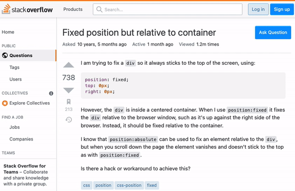
Fixed: StackOverflow header
Headers commonly use fixed positioning to stick to the top of the page when the user scrolls:
Sticky: iPhone product page
Both the white “iPhone 13” header and product image on this page are sticky:

Relative
I couldn’t find a good example for relative positioning. Please suggest one!
Let's connect
If you enjoyed this post, connect with me on LinkedIn, GitHub, and Twitter! You can also subscribe to my mailing list to get the latest content and news from me.
References
- Chris Coyier | Sticky Positioning in CSS: How it Works, What Can Break It, and Dumb Tricks
- CSS-Tricks | position
- Josh Comeau | CSS for JavaScript Developers
- MDN | position
- MDN | Positioning
- W3C | CSS Positioned Layout Module Level 3
Cover photo by Omar Flores on Unsplash.


Top comments (0)