
Intro
If you are a web developer or have ever had the pleasure of writing a frontend, you must know what CSS is. If you've ever written a front-end for a fairly large web service, you've probably come across the fact that when you open a file with styles which were written a year ago, you can't understand anything at all!
Understanding large CSS files is quite challenging. And different preprocessors do not improve the development experience, but rather make it more difficult. I highly recommend not using preprocessors in 2022. CSS has a lot of power and in my opinion preprocessors are not worth the build time added and the cognitive complexity added by the SASS/SCSS/etc syntax. The problem with large CSS files cannot be solved in any way except for adequate code separation.
Another common problem with CSS is the fact that sometimes it is very difficult to tell from the name of the class about appearance and meaning of the element to which it will be applied.
And BEM methodology was once invented to solve both problems. I know that many people consider it obsolete and, to be honest, six months ago I thought the same way. However, you just need to understand the essence and you will immediately change your mind! BEM is not about naming, as it might seem, it is about the logic of splitting the interface into component parts, called BEM entities.
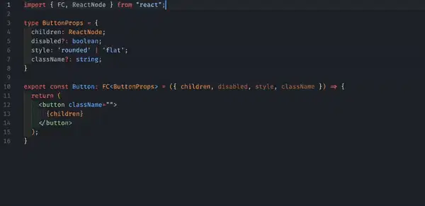
And actually if you follow the BEM methodology and some convention about splitting source code files, you can come to a utopian world of the future, where there are styles for ONE element in ONE file, and when reading the code, there is no reaction like this:

But what if we go further and consolidate such conventions not in words and in linters, but in the very essence of writing styles? That is what I propose to talk about today.
Main idea
You probably know what css-loader is and how it allows you to work with CSS modules. If this is not the case, then let me remind you what it is using the example of a React component:
import styles from './Button.css';

export const Button = ({ children }) => {
  return <button type="button" className={styles.Button}>{children}</button>;
}
Convenient, isn't it?
If the development is carried out using the BEM methodology, then it may look something like this:
import cls from 'classnames';
import styles from './Button.css';

// type: primary | secondary

export const Button = ({ children, type }) => {
  return (
    <button
      type="button"
      className={cls(styles.Button, {
        [styles.Button_type_primary]: type === 'primary',
        [styles.Button_type_secondary]: type === 'secondary'
      })}
    >
      {children}
    </button>
  );
}
In BEM, such entities are called modifiers. Usually, they are used to give a certain look to an element. In the example above, the button could change color depending on its type.
Also, it is not difficult to guess that in order to work with modifiers, we need some kind of auxiliary tool so as not to manually concatenate classnames. In the example above, the classnames NPM package serves as such a tool. Pay attention to popularity - 11M downloads/week.
Wait! But after all, if we have specific naming rules, can't we ourselves write a function by analogy with cls, which could include certain modifiers, depending on the options passed, but with a more convenient API for our case. Let's try:
import styles from './Button.css';

const cls = (base, mods) => {
  let names = Object.entries(mods).map(([modName, modVal]) => {
    return `${base}_${modName}_${modVal}`;
  });

  return names.concat([base]).join(' ');
}

// type: primary | secondary

export const Button = ({ children, type }) => {
  return (
    <button
      type="button"
      className={cls(styles.Button, { type })}
    >
      {children}
    </button>
  );
}
It looks cool! But it is inconvenient that you need to carry the cls function around with you. In addition, it is very difficult to foresee all scenarios for the use of such a function. For example, if the BEM modifier is boolean, then the value of the true modifier can be omitted and just a name can be used, such as 'Button_disabled'.
Well, meet!
Implementation
To get started, just watch a small demo:
In a nutshell, everything that I wrote about above is merged together, and TypeScript support has also been added.
All this is called functional BEM and you can learn more about the project here. All @fbem packages are open-source projects and distributed under the MIT license, which means that you can use them in your projects right now.
The project is based on a special loader for webpack named @fbem/css-loader, which allows you to import special BEM functions from CSS files. A BEM function always has two arguments: modifiers object, where key is the name of the modifier and value is its value; the second one is an array of mixes (a term from the BEM methodology). It's just an array of strings that will be added to the end of the resulting classname.
@fbem/css-loader is very similar to css-loader (and actually a fork of it) and has almost the same set of options and functionality. You can even use it with different style preprocessors by simply chaining loaders together in webpack config. But be sure to pick up if you need them 😏.
As I wrote above, it is more convenient to work with CSS when it is adequately divided into files. Even more convenient when there is a rule "one file - styles for one DOM node".
For these purposes, a special package was developed, which contains only one function - compose. This function allows you to combine several BEM functions into one and to split styles into as many files as you want. Take a look:
import { compose } from '@fbem/utils';

import { cnButton as modDisabled } from './_disabled/button_disabled.css';
import { cnButton as modStyle } from './_style/button_style.css';
import { cnButton as base } from './button.css';

const cnButton = compose(base, modDisabled, modStyle);

cnButton({ style: 'flat', disabled: true }, ['mix']); // 'button button_style_flat button_disabled mix'
Conclusion
In this article I showed a method (and tools for implementing this method) of organizing styles in a project. More information can be found in the project's GitHub repository. PR/star welcome :) I hope I managed to interest you in my experiments in optimizations of writing styles process. Also, I hope you enjoyed the article and would be grateful if you could share it with someone.
Thank you.
Original article: https://vladivanov.me/css-from-chaos-to-order

Top comments (0)