Introduction
Swipe actions, or swipe gestures, are something that's very common in mobile apps. In its most common form, the "swipe to dismiss" pattern is something you might have seen in email apps, for example, where you swipe left to delete an email. Some apps now even let you customize the action happening when you swipe left or right (hence swipe actions), and you don't necessarily have to dismiss something either; an example would be the "swipe to reply" pattern implemented in some messaging apps.
In this post, we will go over how to implement swipe actions in Flutter using the Dismissible widget. We will implement a "swipe to delete" action for a (very) simple messaging app, with a confirmation dialog, as well as a "swipe to star (favorite)" action.
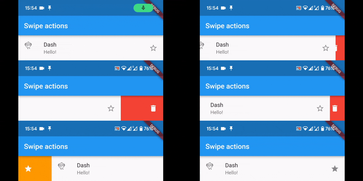
In case you're still unsure about what a "swipe action" looks, here's what we'll be building in this post:
At the end, if actions for swiping left or right are not enough for you, we will show how to easily implement multiple "slide" actions with the flutter_slidable package.
The Dismissible widget
We can make any widget "dismissible" by wrapping it with the Dismissible widget:
Dismissible(
  key: UniqueKey(),
  child: const ListTile(
    leading: Icon(Icons.flutter_dash),
    title: Text('Dash'),
    subtitle: Text('Hello!'),
  ),
),
At a minimum, this widget requires a child, which can be any widget we want to dismiss/swipe/slide, as well as a key. With the above code snippet, what we have is a regular ListTile widget which disappears when swiped in any horizontal direction.
Directions
By default, a dismissible widget can be swiped left or right. But we can customize this.
Dismissible(
  key: UniqueKey(),
  direction: DismissDirection.endToStart,
  onDismissed: (DismissDirection direction) {
    log('Dismissed with direction $direction');
  },
  child: ...
),
With endToStart, our widget can only be swiped from its end to the start. In our case, this is a swipe to the left. However, this is either right-to-left or left-to-right depending on the reading direction of the Flutter app's locale. English is read from left to right, so endToStart is right to left.
Below are the possible DismissDirection values:
-
endToStart- Can be swiped left (or right depending on reading direction). -
startToEnd- Can be swiped right (or left depending on reading direction). -
horizontal- Can be swiped both left and right. -
up- Can be swiped up. -
down- Can be swiped down. -
vertical- Can be swiped both up and down. -
none- Cannot be swiped, or dismissed.
The none value might seem a bit redundant, as you could just not wrap a widget with the Dismissible widget at all. But there might be cases where you have a list of dismissible widgets, and might want to dynamically choose whether a specific item in the list can be dismissed or not. In that case, you could use none.
The onDismissed callback is called after a widget is swiped and dismissed. It is called with the direction it was dismissed in. If your widget should only be swiped in one direction, you might not use this, but if you use the horizontal or vertical directions, you could check in which direction the widget was dismissed if you want to react differently for each direction.
Swipe, but don't dismiss
The "swipe to dismiss" part has been quite easy so far, it already works! But what if you don't want to dismiss? The confirmDismiss callback parameter is called before the widget is dismissed, and returns a Future<bool>. If false is returned, the widget is not dismissed.
This helps if, for example, you want to a confirm a dismissal or deletion; you could show a dialog so that the user can confirm their action. Or maybe your swipe action might never dismiss the widget at all; in that case you'd just always return false.
Implementing swipe actions
Now that we have a basic Dismissible widget working, let's implement some swipe actions for our messaging app. When swiping left, we want to delete a message. When swiping right, we want to "star"/favorite the message.
Swipe to delete
Here's our widget so far:
Dismissible(
  key: UniqueKey(),
  direction: DismissDirection.endToStart,
  onDismissed: (DismissDirection direction) {
    log('Dismissed with direction $direction');
    // Your deletion logic goes here.
  },
  child: const ListTile(
    leading: Icon(Icons.flutter_dash),
    title: Text('Dash'),
    subtitle: Text('Hello!'),
  ),
),
This is really all we need for the "swipe to delete" action. The widget is dismissed as soon as we finish swiping, so for a basic demo this is enough. In a real app, you might have to add some additional logic in the onDismissed callback, for example to actually delete the message from your database.
Confirm dismissal/deletion
A problem with "destructive" swipe actions such as "swipe to delete" is that a user could easily swipe something left accidentally. For our deletion swipe action, we can make use of the confirmDismiss callback to ask the user if they really want to delete their message.
Dismissible(
  key: UniqueKey(),
  direction: DismissDirection.endToStart,
  onDismissed: (DismissDirection direction) {
    log('Dismissed with direction $direction');
    // Your deletion logic goes here.
  },
  confirmDismiss: (DismissDirection direction) async {
    final confirmed = await showDialog<bool>(
      context: context,
      builder: (context) {
        return AlertDialog(
          title: const Text('Are you sure you want to delete?'),
          actions: [
            TextButton(
              onPressed: () => Navigator.pop(context, false),
              child: const Text('No'),
            ),
            TextButton(
              onPressed: () => Navigator.pop(context, true),
              child: const Text('Yes'),
            )
          ],
        );
      },
    );
    log('Deletion confirmed: $confirmed');
    return confirmed;
  },
  child: const ListTile(
    leading: Icon(Icons.flutter_dash),
    title: Text('Dash'),
    subtitle: Text('Hello!'),
  ),
),
A bit lengthier than before, but if we extract the AlertDialog part to a method or widget, the code is not very complicated.
Background
Right now, it's not clear that swiping will actually delete the message, even if we do show a confirmation dialog. We can specify a background parameter, which is of course a widget, and show a colored background with an icon.
Dismissible(
  key: UniqueKey(),
  direction: DismissDirection.endToStart,
  ...
  background: const ColoredBox(
    color: Colors.red,
    child: Align(
      alignment: Alignment.centerRight,
      child: Padding(
        padding: EdgeInsets.all(16.0),
        child: Icon(Icons.delete, color: Colors.white),
      ),
    ),
  ),
  child: const ListTile(
    leading: Icon(Icons.flutter_dash),
    title: Text('Dash'),
    subtitle: Text('Hello!'),
  ),
),
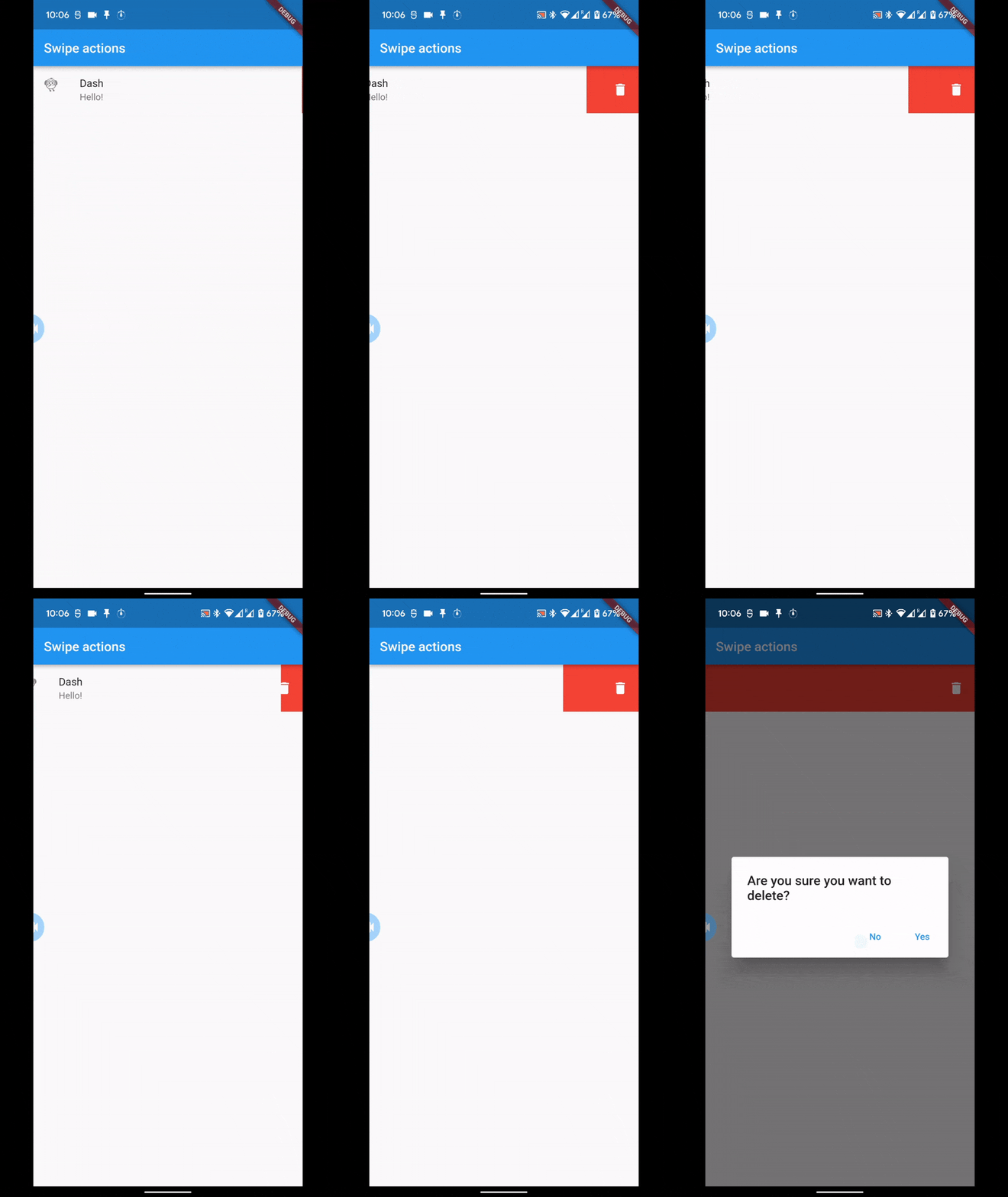
Here's how the deletion flow looks below, with the confirmation dialog.
Swipe to star
Now, here's where it gets a little trickier! For the "swipe to star" action, we don't want to dismiss the widget after swiping to the right, but we also want to behave differently depending on the swipe direction.
First, we change the direction of our Dismissible widget to horizontal, as we want to swipe both left as well as right. Second, both our onDismissed and confirmDismiss callback functions need to be updated.
For both functions, our deletion logic should only be called if the direction is endToStart. If not, we can assume it's startToEnd and include our starring logic.
Dismissible(
  key: UniqueKey(),
  direction: DismissDirection.horizontal,
  onDismissed: (DismissDirection direction) {
    log('Dismissed with direction $direction');
    if (direction == DismissDirection.endToStart) {
      // Your deletion logic goes here.
    }
  },
  confirmDismiss: (DismissDirection direction) async {
    if (direction == DismissDirection.endToStart) {
      final confirmed = await _confirmDeletion(context);
      log('Deletion confirmed: $confirmed');
      return confirmed;
    } else {
      log('Starring');
      // The widget is never dismissed in this case. Your star logic goes here.
      setState(() {
        _isStarred = !_isStarred;
      });
      return false;
    }
  },
  background: const ColoredBox(
    color: Colors.red,
    child: Align(
      alignment: Alignment.centerRight,
      child: Padding(
        padding: EdgeInsets.all(16.0),
        child: Icon(Icons.delete, color: Colors.white),
      ),
    ),
  ),
  child: ListTile(
    leading: const Icon(Icons.flutter_dash),
    title: const Text('Dash'),
    subtitle: const Text('Hello!'),
    trailing: Icon(_isStarred ? Icons.star : Icons.star_outline),
  ),
),
We've updated the message widget to show a filled star if it's starred, or an outlined star if not, and keep track of this with a simple boolean field in the state, just to keep things simple.
One thing to note here is that since we never want to dismiss the widget when we star a message, we always return false in confirmDismiss. Because of this, the onDismissed callback is never called, so our starring logic should be called in confirmDismiss, if the direction is what we expect.
Secondary background
There's one thing left; the background! We now show the red background with the trash icon when swiping both left and right. For starring, we would like to show an orange background with a star icon, and since we swipe right, the icon should be on the left. The Dismissible widget makes it very easy to have a separate background depending on the swipe direction.
For this case, we're going to have both a background and a secondaryBackground.
Dismissible(
  ...
  background: const ColoredBox(
    color: Colors.orange,
    child: Align(
      alignment: Alignment.centerLeft,
      child: Padding(
        padding: EdgeInsets.all(16.0),
        child: Icon(Icons.star, color: Colors.white),
      ),
    ),
  ),
  secondaryBackground: const ColoredBox(
    color: Colors.red,
    child: Align(
      alignment: Alignment.centerRight,
      child: Padding(
        padding: EdgeInsets.all(16.0),
        child: Icon(Icons.delete, color: Colors.white),
      ),
    ),
  ),
  child: ListTile(...),
),
Notice that the red deletion background is now actually the secondaryBackground, and the new orange background as the background, because of the directions.
Here is the "swipe to star" action implementation in action:
And that is all for the swipe-able message list tile! You can check out the full widget and app code in the source code here.
More on the Dismissible widget
We've gone over a lot of what the Dismissible widget can do, but its constructor accepts a few more optional arguments which we could make use of.
-
VoidCallback onResize- A callback function called (multiple times) just before the widget is dismissed, while being resized (contracted). Note: it's actually the background you see being contracted. -
Duration? resizeDuration- The duration of the resizing/contracting that happens before the widget is dismissed. If you set this to a long enough duration, you can see the background widget slowly being "squeezed up" and disappearing. Set this tonulland the background widget doesn't resize; it just stays there. -
Map<DismissDirection, double> dismissThresholds- This is a useful one. It's a map of directions to a "threshold" (defaults to 0.4), which means that you have to drag a widget at least 40% in a given direction to actually perform the dismissal and the callbacks to be called. So you could raise or reduce the "sensitivity" of your swipe-able widgets. -
Duration movementDuration- Not to be confused withresizeDuration, this is the duration of the widget sliding back to its place in case dismissal was not confirmed, or if you've already swiped past the threshold and the widget keeps moving on its own. -
DismissUpdateCallback? onUpdate- Is called while the widget is being dragged. The details include the direction as well as whether the threshold has been reached. A use case for this, mentioned in the documentation, is that you could dynamically change the background of the dismissible widget as soon as the threshold is reached, rather than always displaying it.
Slide actions with flutter_slidable
We can now implement swipe-able widgets with different actions depending on the direction. If you want to do even more actions with a swipe, you can try out the flutter_slidable package. On swiping/sliding, the background reveals multiple actions that can be done.
We won't go into the implementation details here; the pub.dev page is already quite helpful! But here is what these "slide actions" would look like using the package:
Wrapping up
In this tutorial, we showed how to implement swipe actions (or gestures) to swipe to delete or star a message.
We also dug a little deeper into the Dismissible widget and what it can do (but of course the documentation also goes a good job explaining this!).
You can find the full source code here.
If you found this helpful and would like to be notified of any future tutorials, please sign up with your email here.


Top comments (0)